深圳地标平安金融中心观光层

深圳/平面设计师/4年前/700浏览
版权
深圳地标平安金融中心观光层
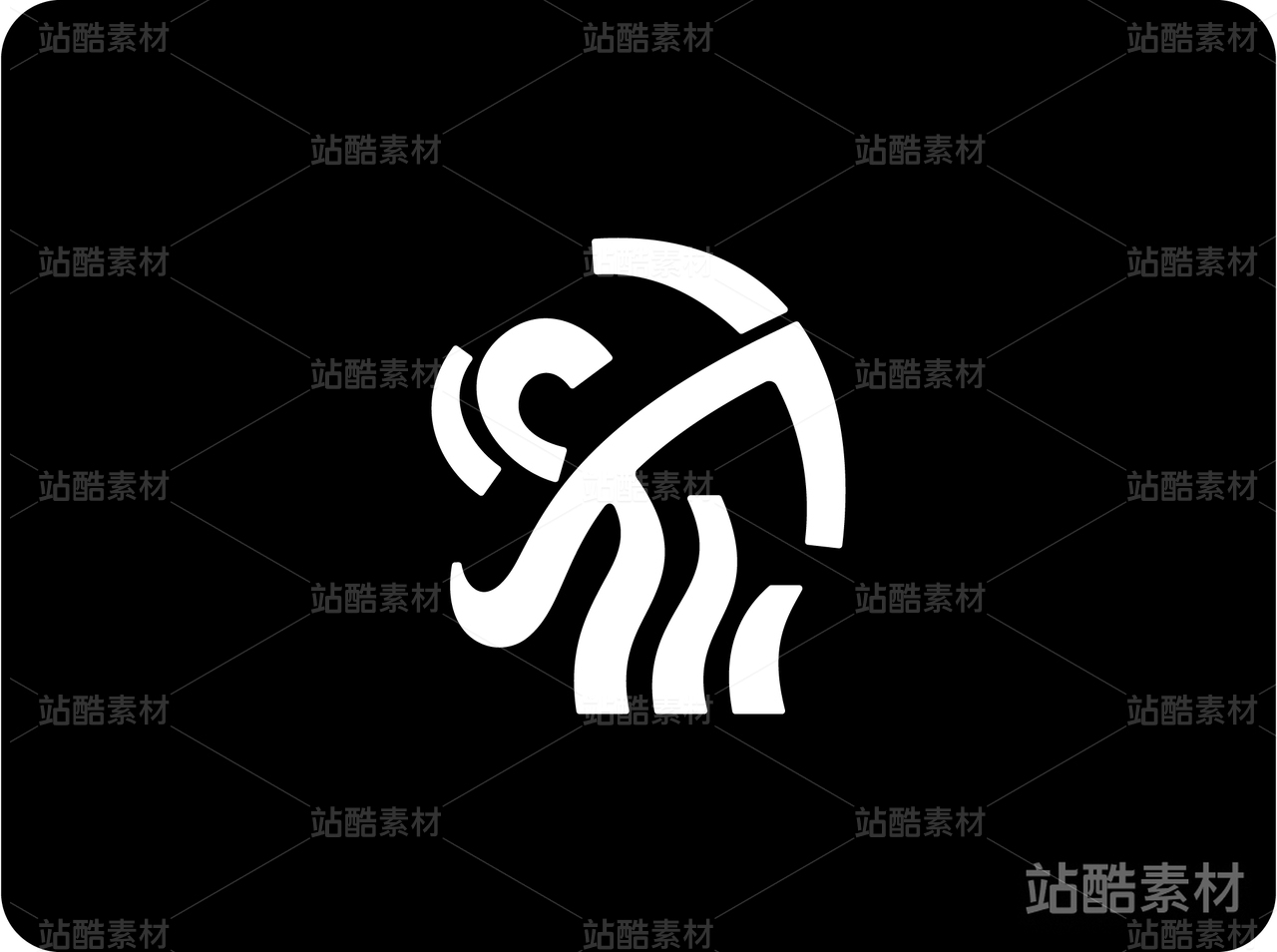
平安金融中心观光层视觉识别系统设计
创作背景:
曾在laserbrand担任设计经纪人兼主创设计师时,设计中标世界第二高楼平安金融中心观光层logo及整套品牌视觉识别系统,创意灵感源于深圳是“设计之都”,将建筑抽象成两根线条呼应设计之都同时体现其建筑特征,一抹蓝色笔刷体现其直充云霄观摩天地大美而不言的高度。感激60多岁的马老板能接受我这么抽象的视觉表达方式。
创作释意:
一、观光属性
取天空一抹蓝色和抽象云彩作为视觉载体,直观亲和的烘托高度、自由的氛围,传达旅游观光属性。
二、国际化气质
平安观光层的层高已经决定其世界级的高度,故其观光层logo应呈现出简约、国际化现代感的气质。
三、楼宇基因
将平安金融中心楼宇外立面进行简化处理,提取出符合其特质的楼宇基因。
四、自由/艺术
将其外立面简化处理为两根线组成:1是概括其超高度;2便于识别,简约现代化,3、艺术气质。
Interpretation of creation:
1. tourism attributes
A touch of blue in the sky and abstract clouds are taken as visual carriers to convey the nature of tourism with an intuitive and intimate setting height and free atmosphere.
2. international temperament
The height of the pingan sightseeing floor has determined its world-class height, so the logo of the sightseeing floor should present a simple, international and modern temperament.
3. Building genes
The facade of Ping An Financial Center is simplified to extract building genes in line with its characteristics.
4. Freedom/art
The facade is simplified into two lines: 1 is to summarize its super height; 2 easy to identify, simple and modern, 3, artistic temperament.


3
举报
声明
9
分享
相关推荐


评论你的想法~
表情
喜欢TA的作品吗?喜欢就快来夸夸TA吧!
推荐素材


你可能喜欢


相关收藏夹


登录注册
3登录即可同步推荐记录哦
9登录即可加入我的收藏
评论登录即可评论想法
分享分享