原创设计 | 大师傅烘焙品牌空间设计

老品牌对品牌文化的深度挖掘和再塑
老品牌对品牌文化的
深度挖掘和再塑
Deep excavation and reshaping of
brand culture by old brands
项目名称 | 大师傅烘焙店 (五桂堂店)
设计团队 | 重庆空袋子设计
项目类别 | 品牌升级
完工时间 | 2023.04
项目面积 | 168㎡
项目地址 | 涪陵区人民东路五桂堂
Project Name | MASTER
Design Team | KONDAS DESIGN
Project Category | Brand Upgrade
Completion time| 2023.04
Project area | 168㎡
Project Address | Wuguitang, Renmin East Road, Fuling District
BRAND
DESIGN
1991年创立于重庆涪陵的大师傅烘焙店一直以来都是当地的骄傲。然而随着时间的推移,其标志设计和店面风格逐渐显露出年代感,不再能与年轻一代产生共鸣。为了焕发新生,在涪陵区五桂堂的店面进行了品牌的全面升级。
MAster, founded in 1991 in Fuling, Chongqing, has always been a local pride. However, over time, its logo design and storefront style gradually revealed a sense of era and no longer resonated with the younger generation. In order to rejuvenate, a comprehensive brand upgrade has been carried out in the store of Wuguitang in Fuling District.

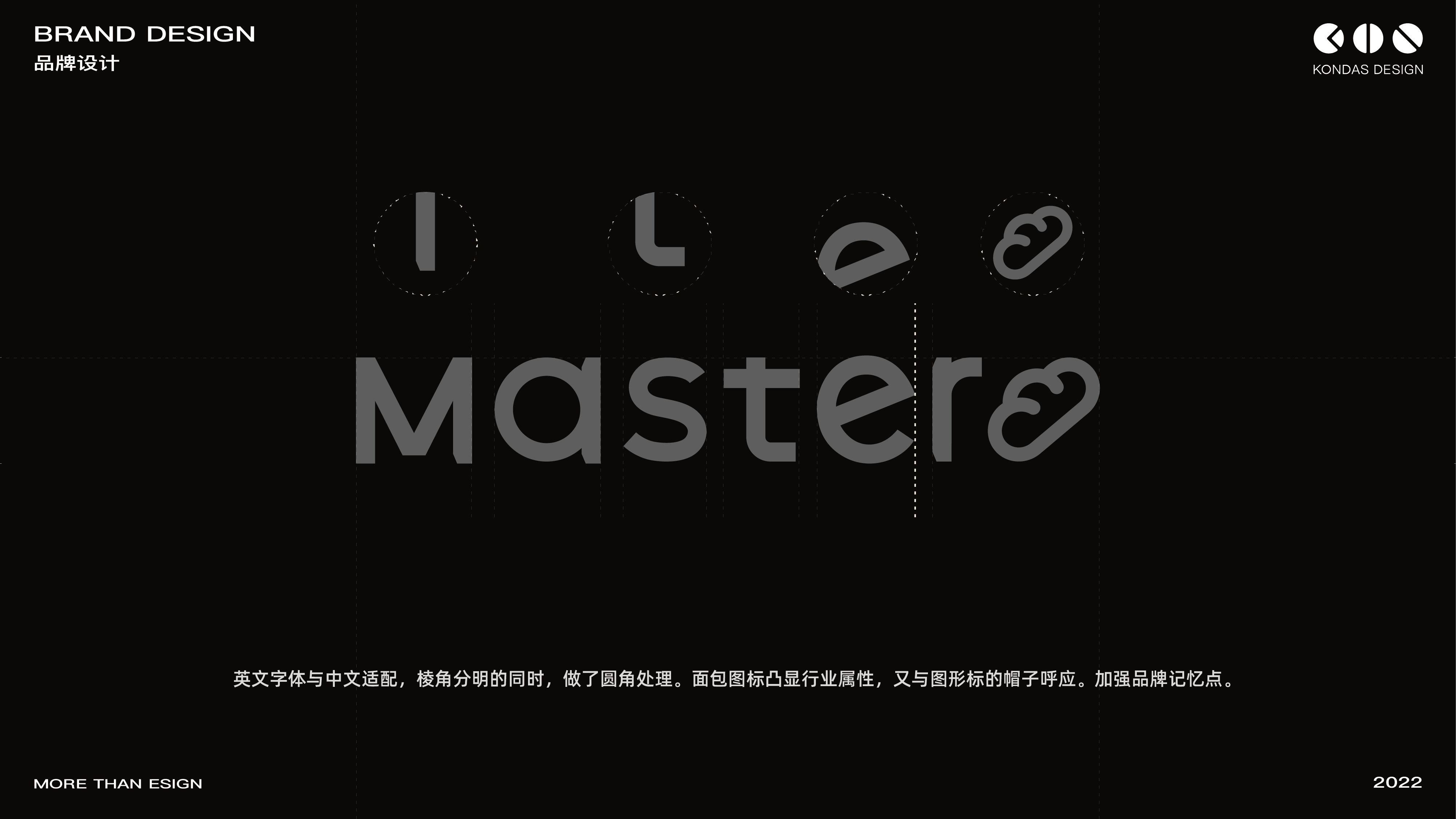
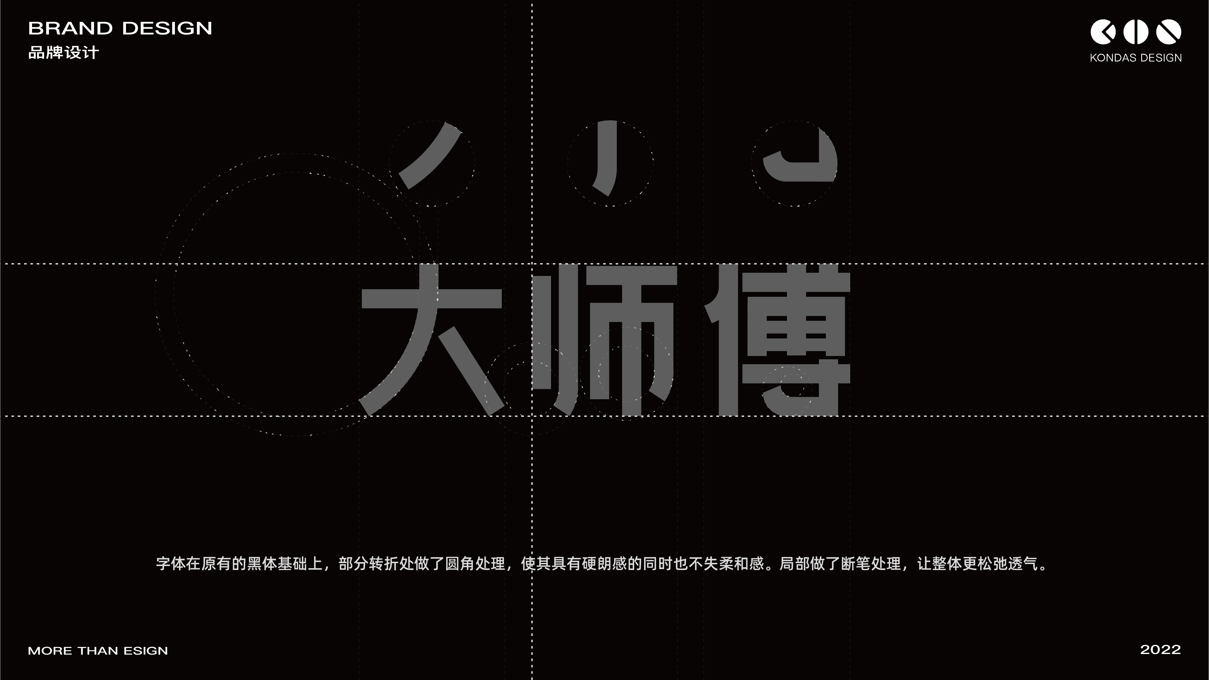
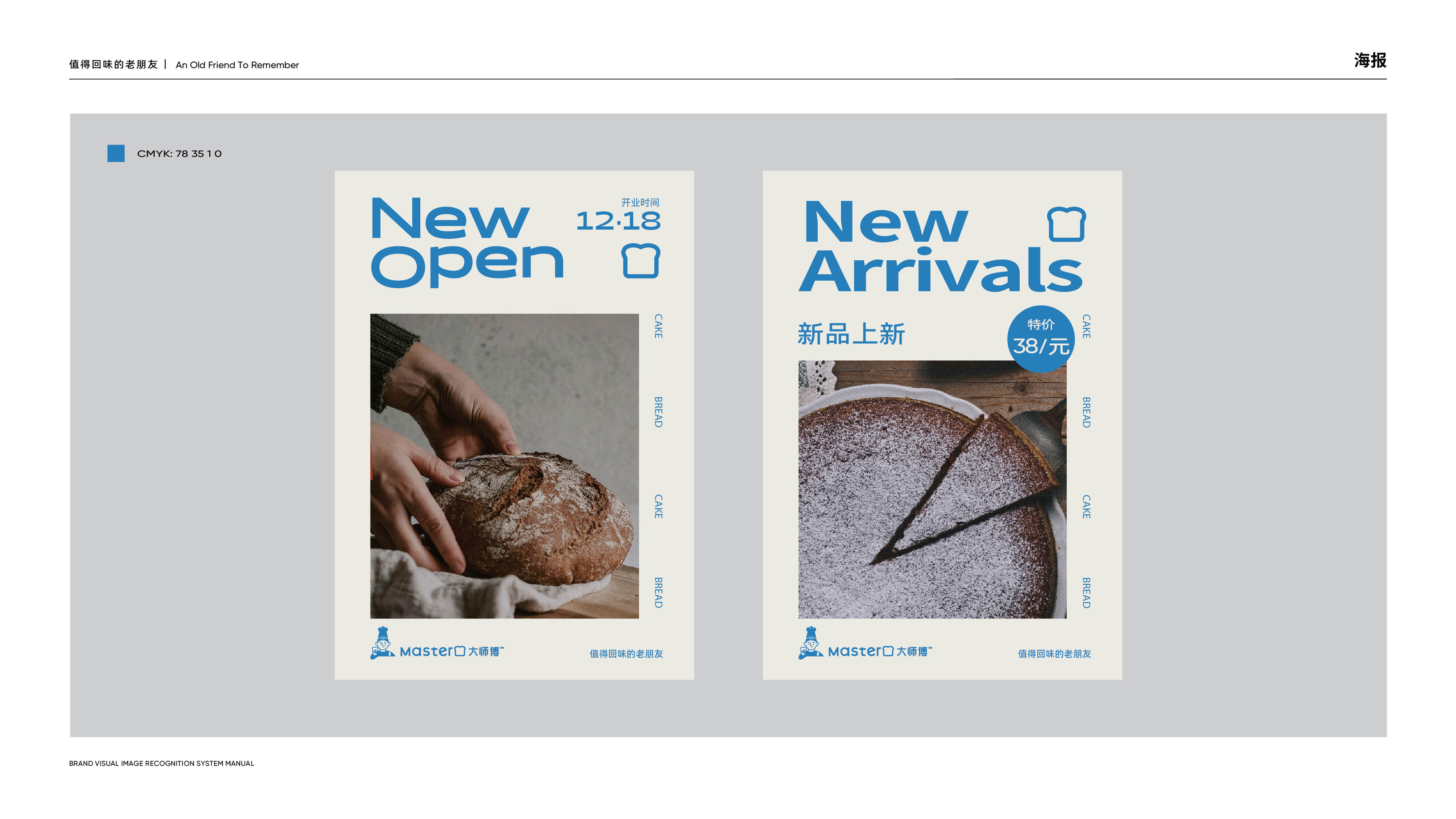
重新设计的中文LOGO在原有的黑体基础上进行了微妙的改动,转折处的圆角处理使整体更具柔和感, 呼应了品牌追求的温暖和亲切。 英文LOGO也同样如此,并添加了面包图标,进一步提升了品牌的视觉统一性和辨识度。
The redesigned Chinese logo has undergone subtle changes based on the original bold font, with rounded corners at the turning points giving the overall design a softer feel, echoing the warmth and warmth that the brand pursues. The same applies to English logos, with the addition of bread icons, further enhancing the brand's visual unity and recognition.
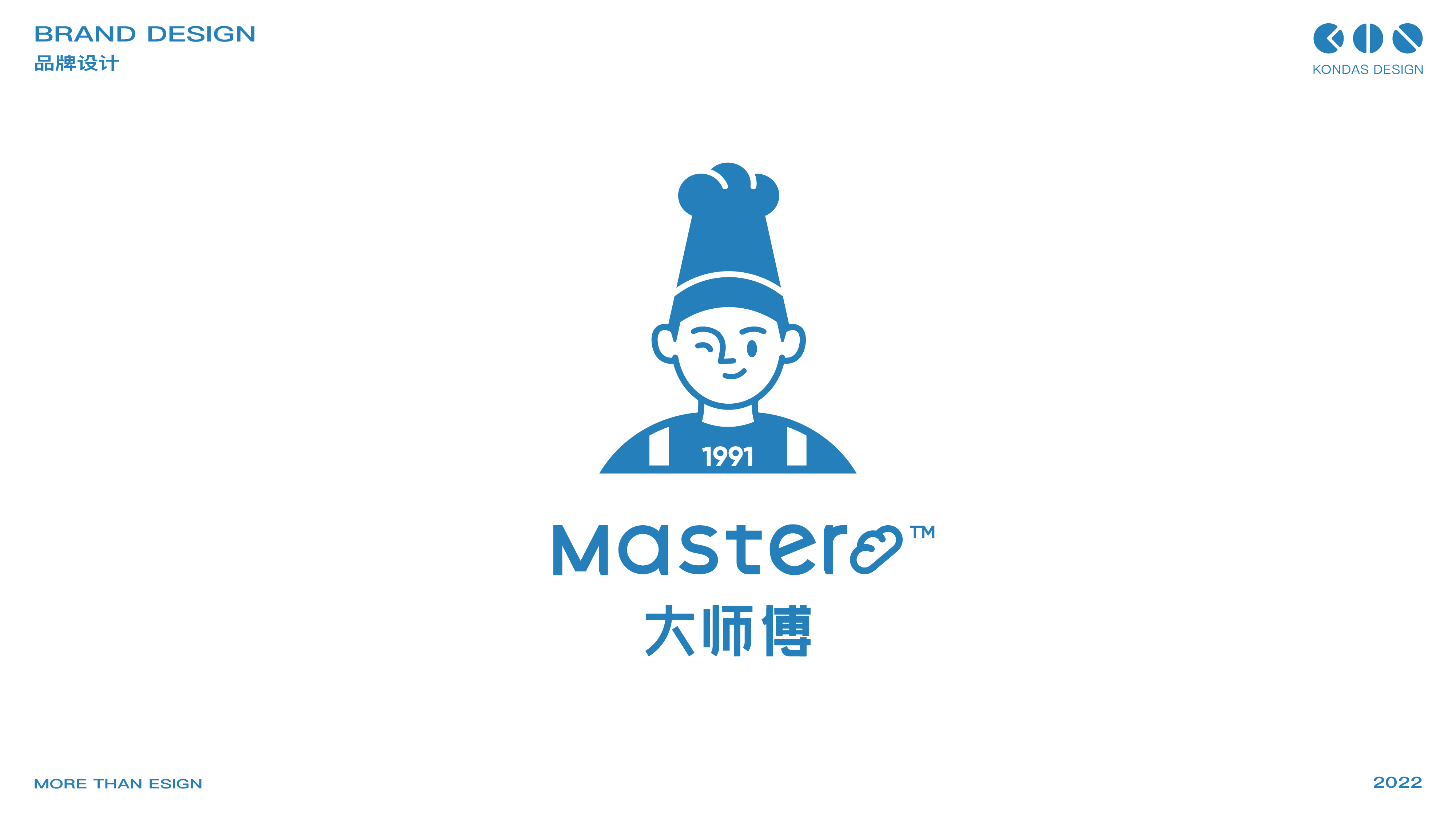
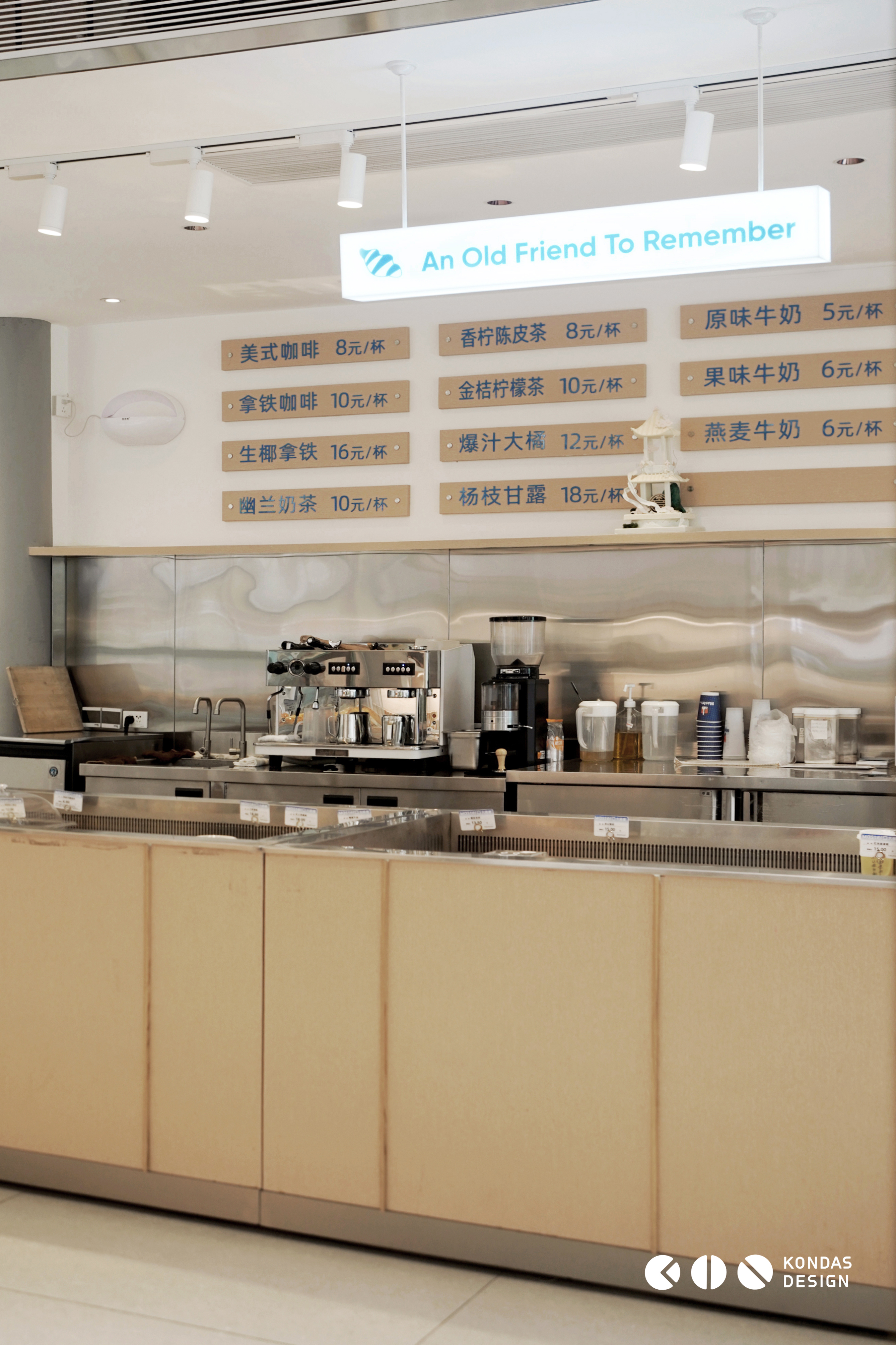
根据大师傅的SLOGAN “值得回味的老朋友” 巧妙地结合了面包和亲和力的IP形象,图形标志中的面包形象与英文LOGO相呼应,而胸前的1991则是公司与顾客之间情感联系的象征, 将过去和现在连接在一起, 与年轻顾客迅速建立情感共鸣。 为了与 “平稳升级” 这一理念相契合, 深蓝色的沉稳被年轻感十足的Baby蓝色系所取代,呈现出清新、轻快的视觉效果。
According to the master's SLOGAN "Memorable Old Friend", it cleverly combines the image of bread and affinity with the IP logo. The bread image in the graphic logo echoes the English logo, while the 1991 on the chest is a symbol of emotional connection between the company and customers, connecting the past and present, and quickly establishing emotional resonance with young customers. In order to align with the concept of "smooth upgrade", the composure of deep blue has been replaced by the youthful Baby blue series, presenting a fresh and lively visual effect.


INTERIOR
DESIGN
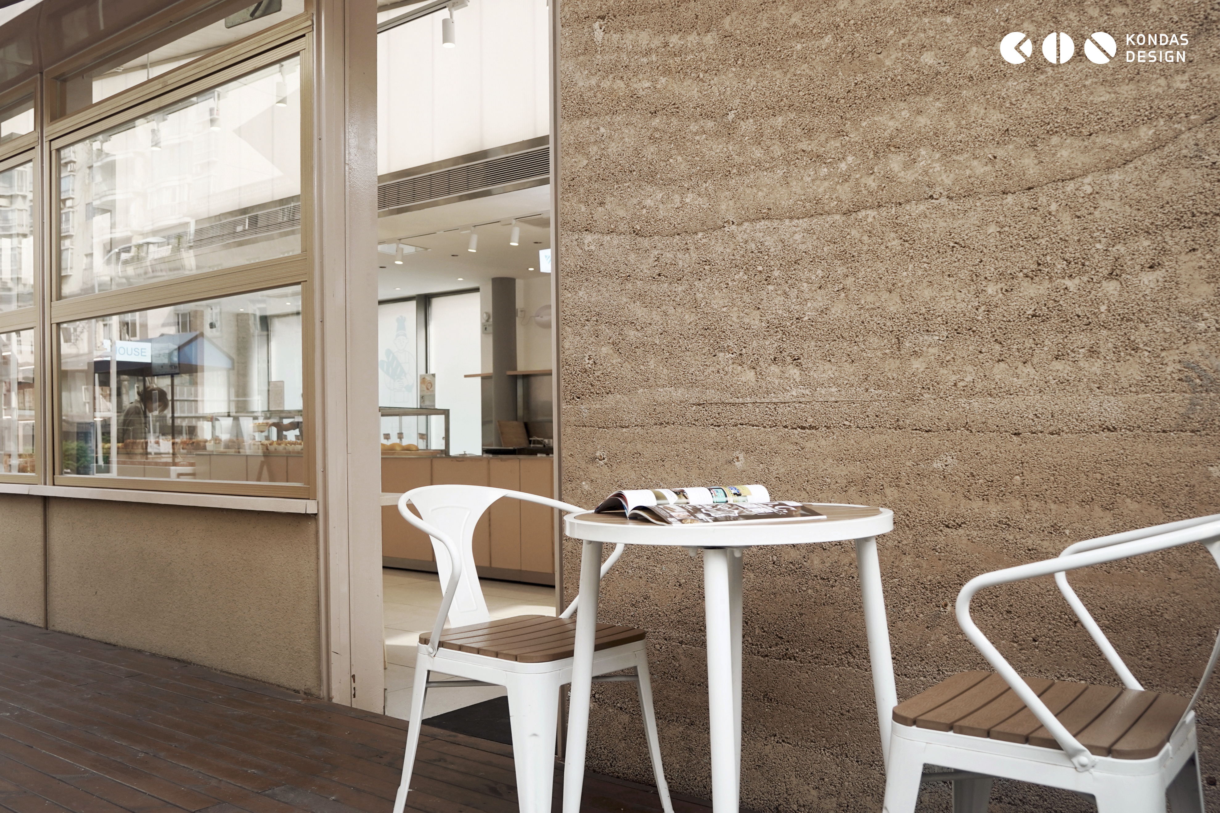
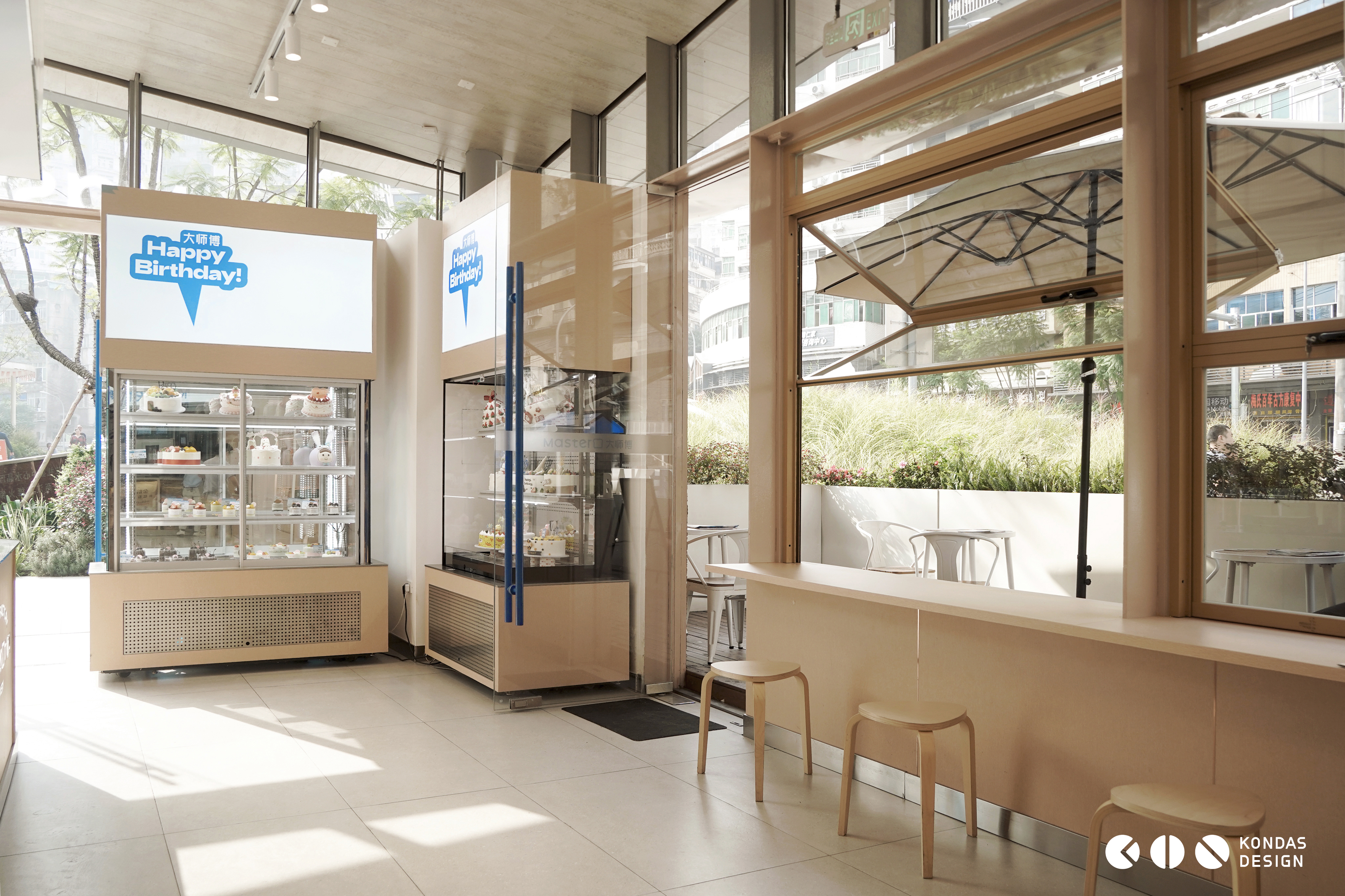
新店选址在涪陵区人民东路一条斜坡上, 地理位置优越, 覆盖了周边多个小区和学校。 在这样的地理环境下, 为了吸引顾客的目光, 为了吸引顾客进店消费,店面外墙保留原有夯土材料设计了简洁明亮的门头, 突出品牌形象和中英文LOGO,使顾客能够迅速记住。
The new store is located on a slope of Renmin East Road in Fuling District, with a superior geographical location that covers multiple surrounding communities and schools. In such a geographical environment, in order to attract customers' attention and to attract them to enter the store for consumption, the exterior wall of the store retains the original rammed earth material and designs a simple and bright front door, highlighting the brand image and Chinese and English logos, so that customers can quickly remember.


店内空间设计为了符合现代年轻人的审美标准, 采用简约、清新、温馨和舒适的风格,营造出让人愿意停留的舒适空间。为了与外墙夯土色和周边商业环境相得益彰。主色调选择了温馨舒适的暖色调,除了主色调外,品牌色也融入其中,以加强品牌理念。
In order to meet the aesthetic standards of modern young people, the interior space design adopts a simple, fresh, warm, and comfortable style, creating a comfortable space that people are willing to stay in. In order to complement the rammed earth color of the exterior walls and the surrounding commercial environment. The main color tone has been chosen to be warm and comfortable. In addition to the main color tone, the brand color has also been integrated to strengthen the brand concept.
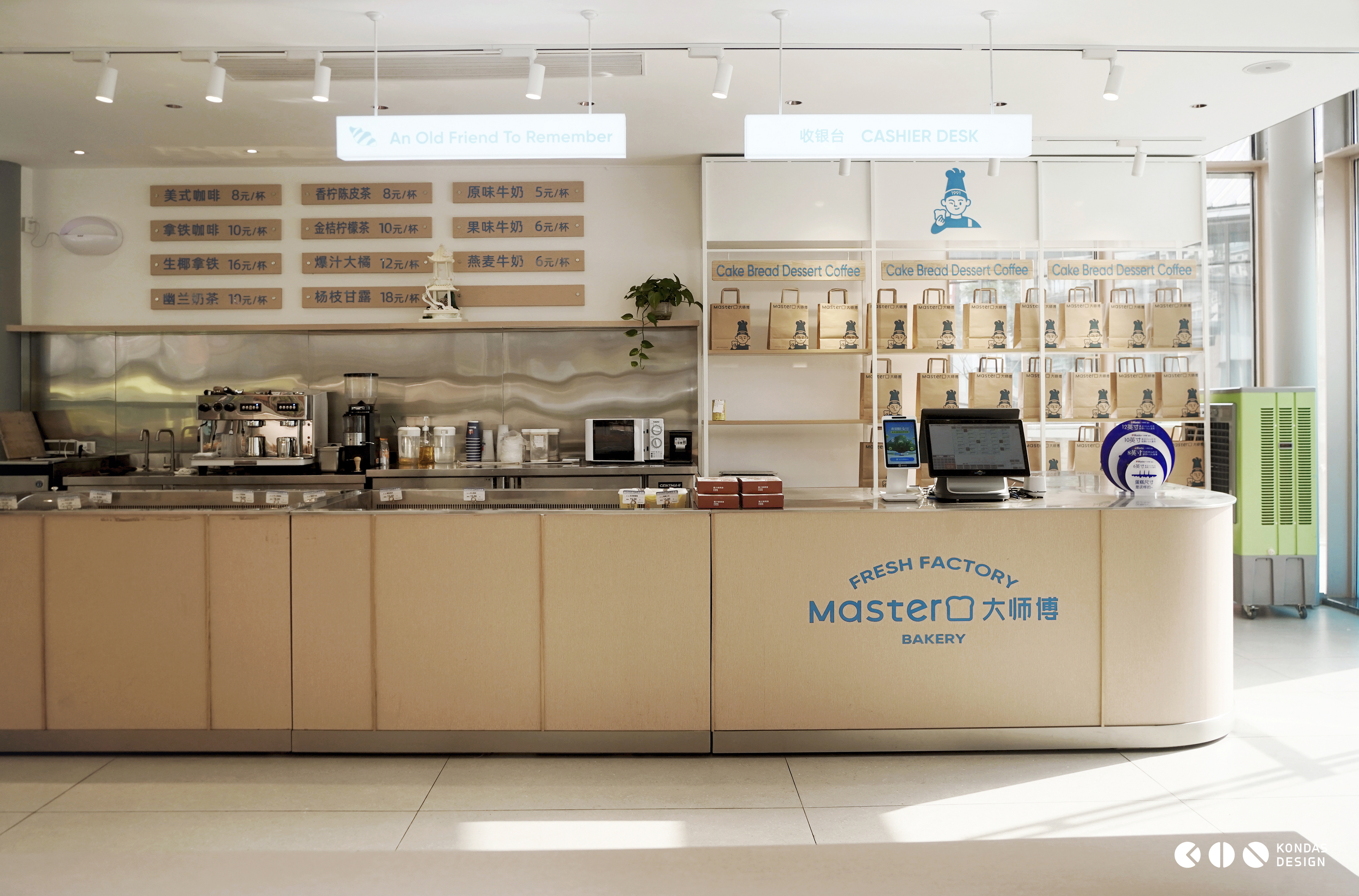


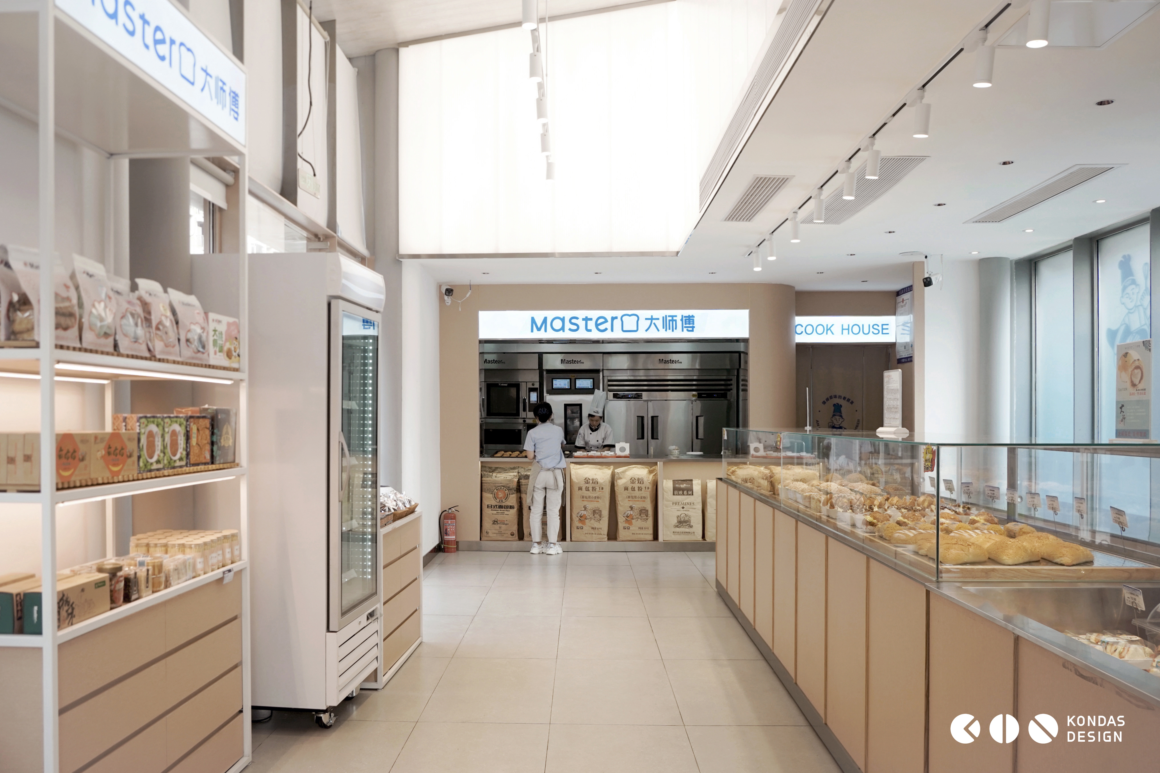
在空间陈列方面,通过借鉴卖场和便利店的陈列逻辑,内部硬装设计轻巧,专用陈列和成品道具营造出温馨的氛围,饮品区、烘焙区和休闲区等各功能区域也得到明确的提示,让顾客在快节奏的生活中能够迅速选择心仪的商品。
In terms of spatial display, by drawing on the display logic of stores and convenience stores, the internal hard decoration design is lightweight, with dedicated displays and finished props creating a warm atmosphere. Functional areas such as the beverage area, baking area, and leisure area are also clearly indicated, allowing customers to quickly choose their desired products in a fast-paced life.

这次大师傅品牌升级和空间设计的变革, 不仅仅是一次外在形象的更新, 更是对品牌文化的深度挖掘和再塑。 通过对标志、 店面外观和室内空间的重新塑造。
The upgrade of the Grand Master brand and the transformation of spatial design are not only an update of the external image, but also a deep exploration and reshaping of the brand culture. By reshaping the logo, storefront appearance, and interior space.