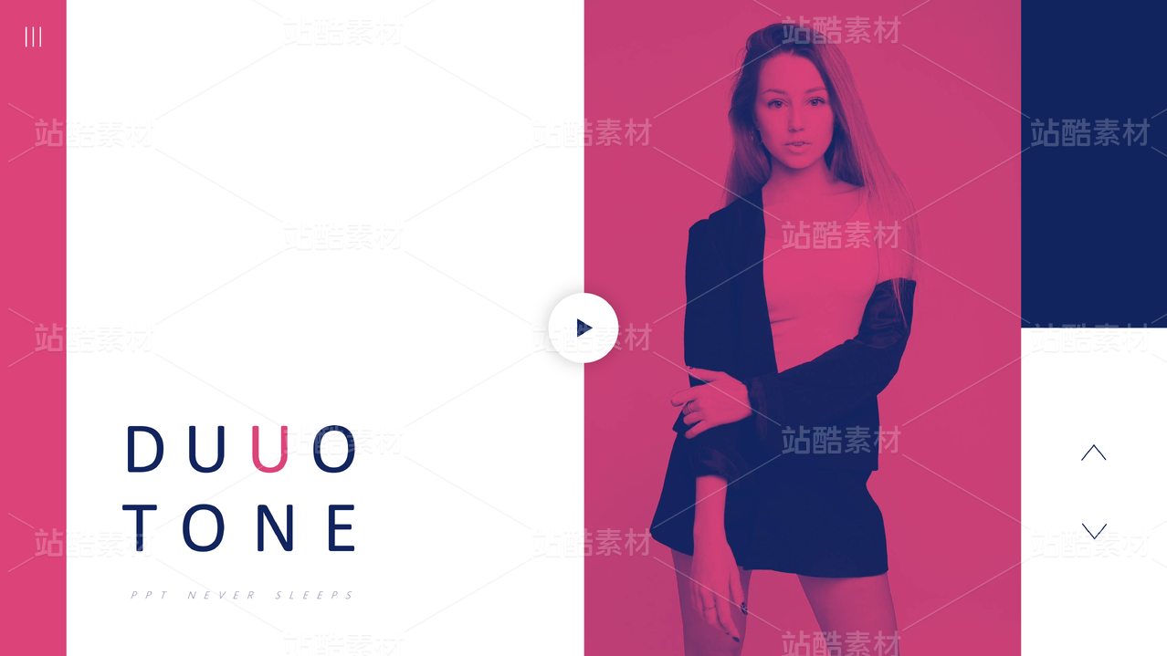
十肉|树立量贩寿喜锅品牌的年轻新风尚


上海/设计爱好者/4年前/43099浏览
版权
十肉|树立量贩寿喜锅品牌的年轻新风尚
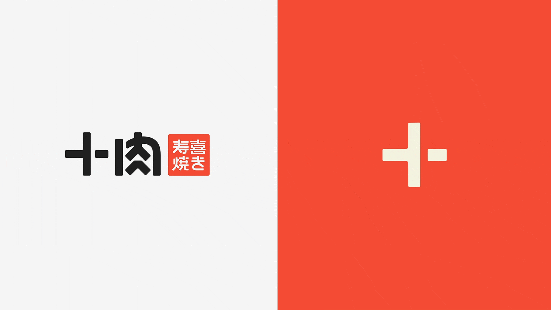
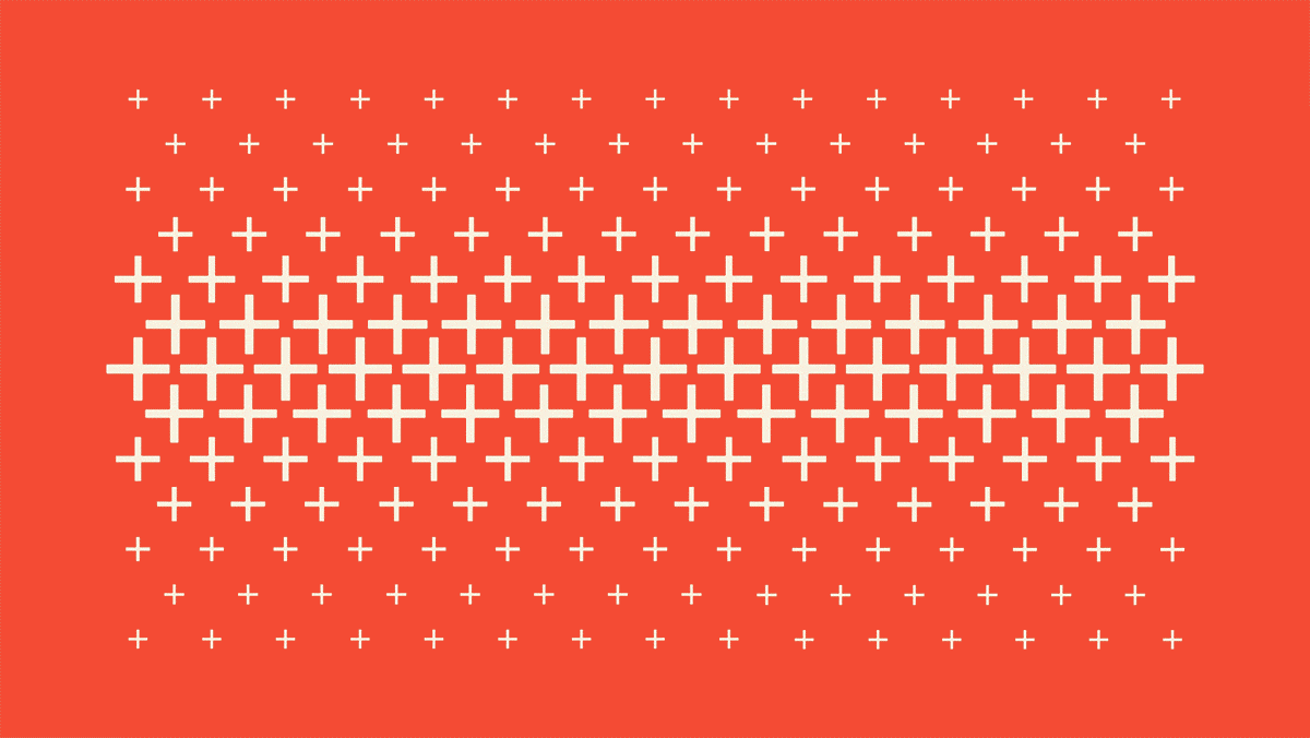
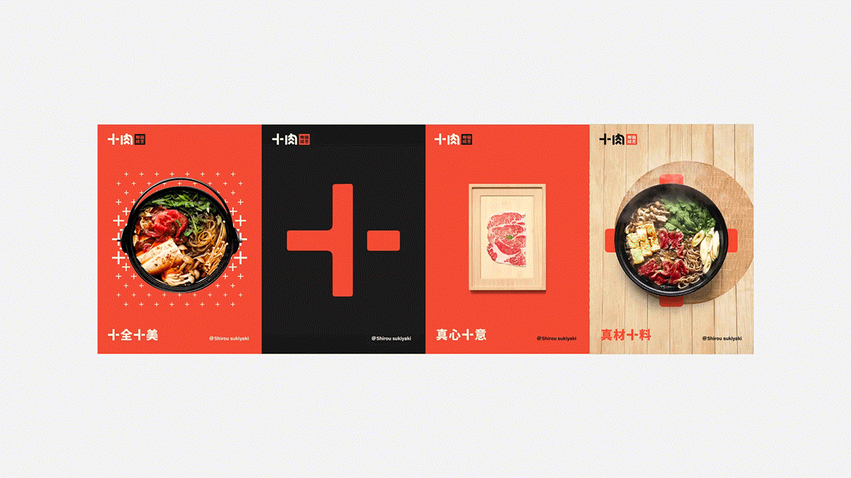
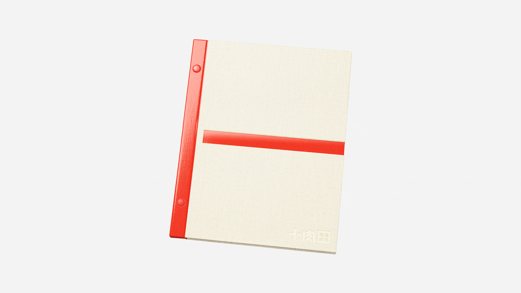
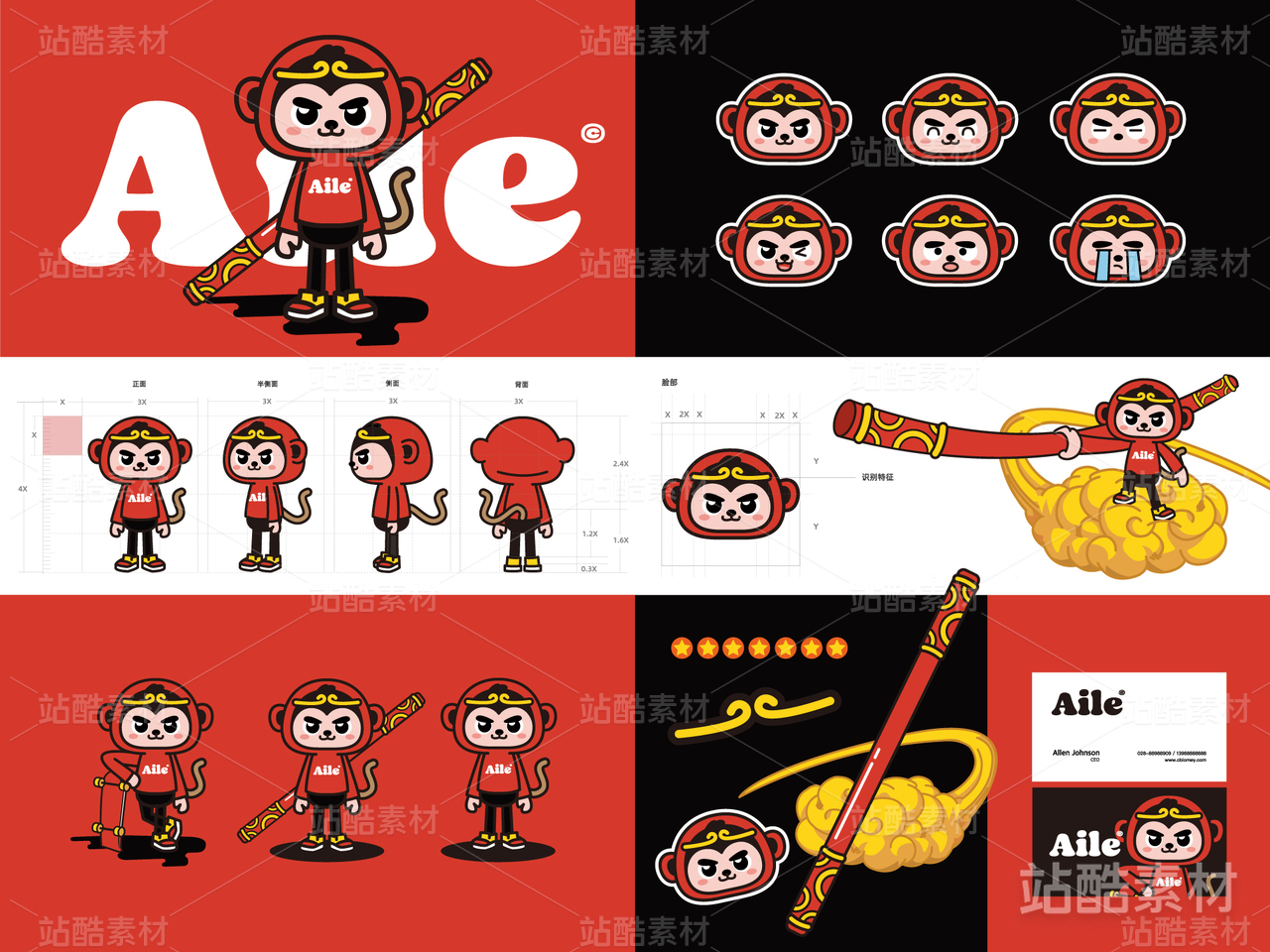
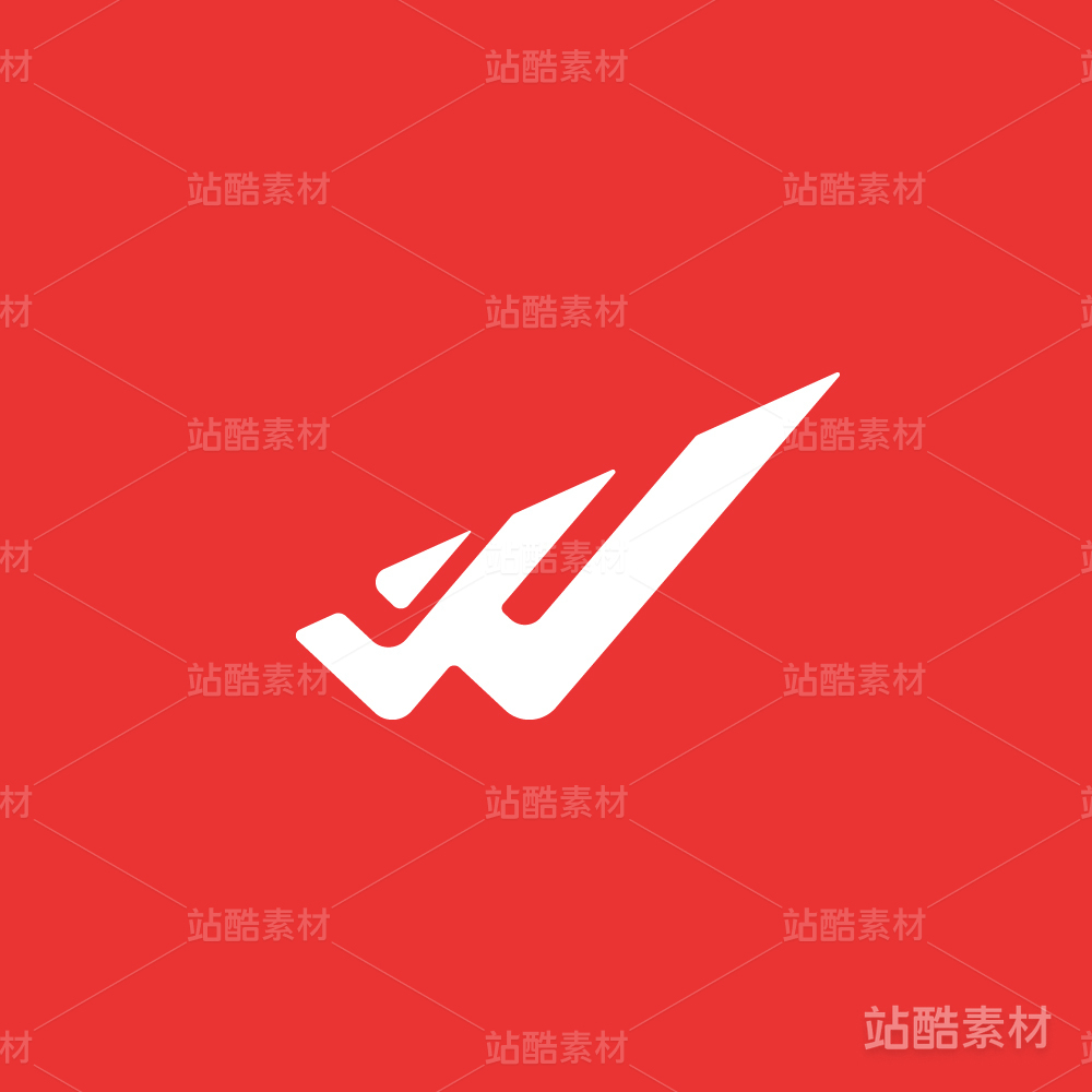
十肉是一家日式寿喜烧的量贩餐厅,十,即十全十美,十心十意,寄予的是品牌用心为客户提供的丰富且多元的品质食材,十,又食,表达的是品牌作为量贩式的餐厅,尽情满足客户饕餮美食的欲望的宗旨。整体品牌塑造希望区别于市场上普遍的寿喜烧品牌形象,即传统日式的单一风格,而选择更为年轻当代的视觉表达,一方面契合主力消费群体的爱好与审美,同时打破市场相近品类的同质化,另一方面寄予创新的塑造赋予更有活力更为年轻的品牌调性。整体品牌视觉将十字进行了符号化处理,融合了平面,立体,产品,空间等品牌多个媒介,全面的将品牌形象串联塑造成统一且多元,趣味且富有惊喜的独特体验。
Shirou is a Japanese style sukiyaki all-you-can-eat restaurant in Changsha, China. Shi is the number 10 in Chinese,and has the meaning of perfect and abundant. Shi also has the same pronunciation as eat in Chinese, and Rou is meat, so Shi and rou together not only showed the specialty of the restaurant but also presented a brand image with quality and abundant of the food selection.
Shirou is a Japanese style sukiyaki all-you-can-eat restaurant in Changsha, China. Shi is the number 10 in Chinese,and has the meaning of perfect and abundant. Shi also has the same pronunciation as eat in Chinese, and Rou is meat, so Shi and rou together not only showed the specialty of the restaurant but also presented a brand image with quality and abundant of the food selection.
The initial goal of the branding is to differentiate from the existing similar brand image,which are mostly traditional Japanese style. The style of Shirou’s brand visual appears to be more modern and vibrant because Shirou wants to not only provide the quality food with affordable price, but also to build brand culture with its target customers, who are mostly gen-z. The design emphasized the brand name Shi, which is the shape of a cross and adopted it in multiple medias, such as the interior design, graphic design and product design.


819
举报
声明
1178
分享
相关推荐


评论你的想法~
表情
喜欢TA的作品吗?喜欢就快来夸夸TA吧!
推荐素材


你可能喜欢


相关收藏夹


登录注册
99+登录即可同步推荐记录哦
99+登录即可加入我的收藏
评论登录即可评论想法
分享分享