春丽和金刚|打造小酒馆赛道的新势力


上海/设计爱好者/4年前/17644浏览
版权
春丽和金刚|打造小酒馆赛道的新势力
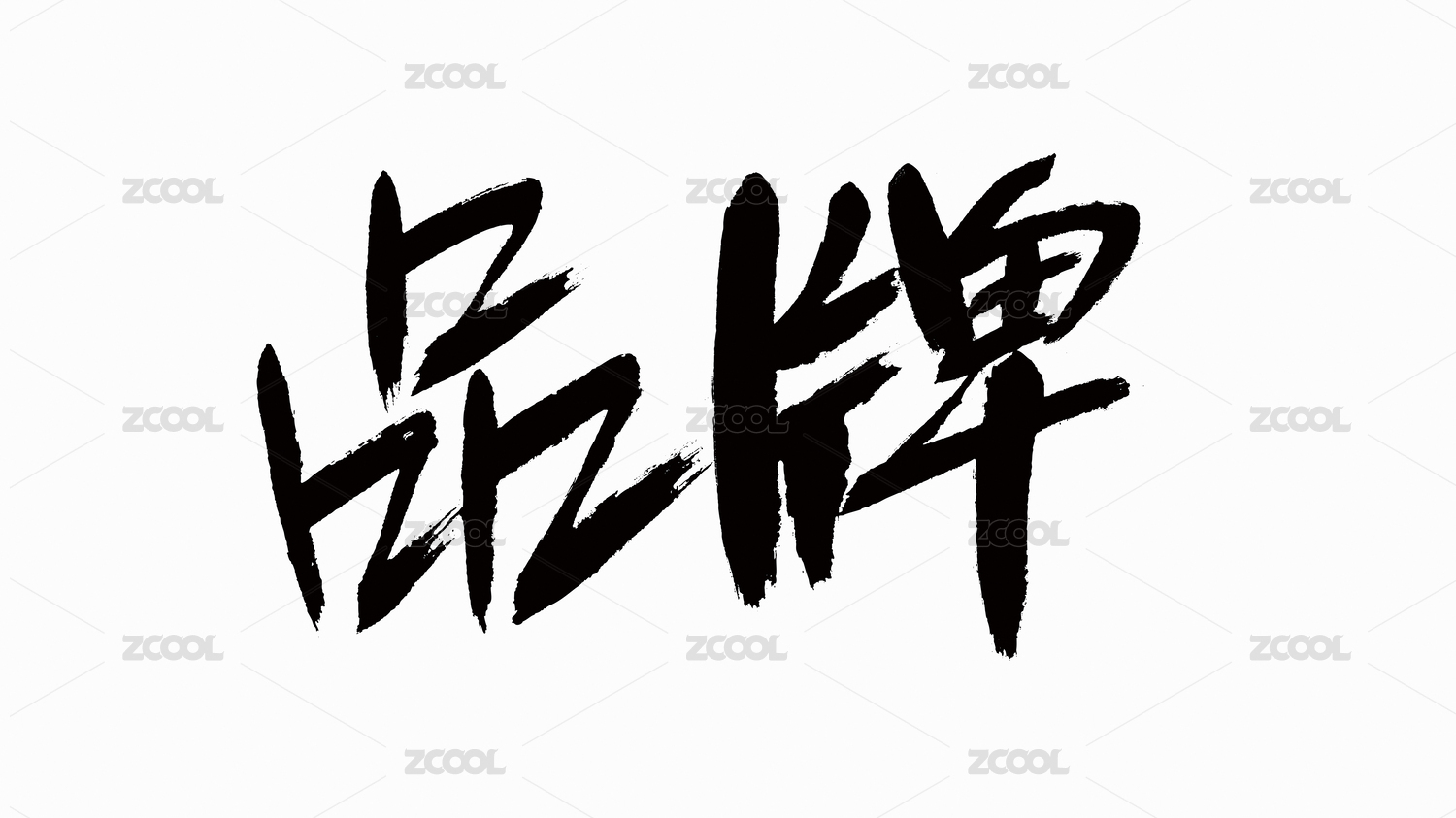
春丽和金刚是针对时下年轻潮流的小酒馆品牌。将有着荒诞趣味的两个⻆色合二为一,是希望营造出对比冲突的感受,冲突是时尚潮流的定义,更是z世代年轻生活的显现。春丽和金刚一方面传达的 是不同⻛格男女⻆色的维系,更是不同文化,不同生活方式的碰撞和融合。 品牌视觉的整体设计围绕冲突的概念展开,设计将春丽和金刚的文字形态提取了星星和闪电的视觉符号,并赋予了玫红和荧光⻩的对比配色,让冲突的演绎更为视觉化,并且有着丰富多变的延展力。在视觉传达上,设计将提取的闪电和星星融入了一系列当代潮流的符号元素,并将视觉画面沿用到了空间不同的媒介和产品上,使品牌具有明确统一识别的同时,彰显了当代年轻群体崇尚的潮流风尚。
Innovative brand design showcasing the brand’s explicit and unified identity, strengthens the fashionable visual image favored by the Generations Z.
Chunli and Kingkong is a pub brand catering to the current youth trends. The combination of the two absurd yet amusing characters, aims to create a sense of conflict for it is not only the source of fashion, but also the key word for the life of the young Generation Z. Chunli and Kingkong not only advocates the convergence of male and female roles of different styles, but also the integration of different cultures and lifestyles.
The overall design of brand vision centers on the concept of conflict. Symbols of star and lightning are extracted from the Chinese characters of Chunli and Kingkong, and the design is matched with colors of rose red and fluorescent yellow. The effort makes the representation of conflict more visualized and diversified, and endows it with extra changeable features, so that it is not limited to the characters and images of Chunli and Kingkong.
As for visual communication, the design integrates the extracted lightning and star into a series of trend symbols, and applies visual images to different media and products of the brand. This effort contributes to the brand’s explicit and unified identity, and strengthens the fashionable brand image favored by contemporary young generations.


499
举报
声明
499
分享
相关推荐


评论你的想法~
表情
喜欢TA的作品吗?喜欢就快来夸夸TA吧!
推荐素材


你可能喜欢


相关收藏夹


登录注册
99+登录即可同步推荐记录哦
99+登录即可加入我的收藏
评论登录即可评论想法
分享分享