云鲸 Narwal|重塑家用科技品牌的人文气质


上海/设计爱好者/4年前/20798浏览
版权
云鲸 Narwal|重塑家用科技品牌的人文气质
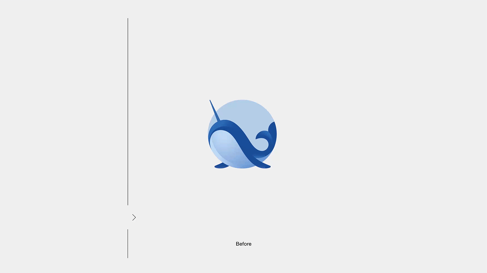
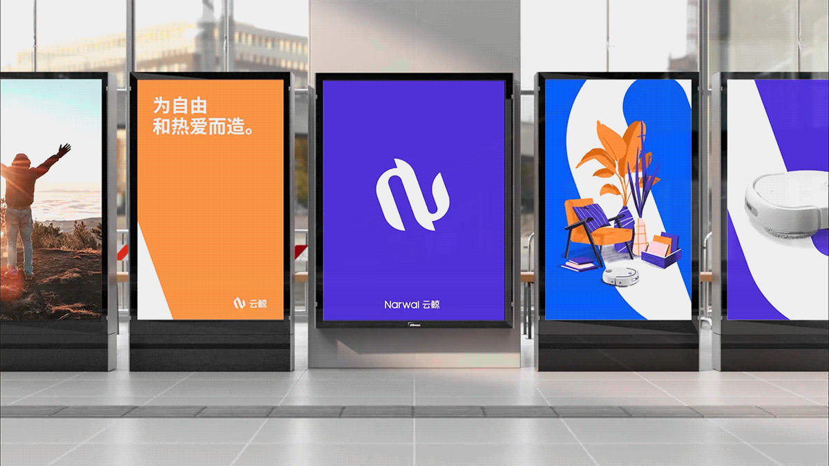
作为中国扫地机品类的头部品牌,云鲸一直被赋予“革新”“创造”的标签。在品牌成⻓的新的阶段, 云鲸同样希望通过创新来为品牌塑造更具价值的形象,能够跨越产品,讲诉品牌的精神内核,从而 强化与用户更深层次的维系。 首先,作为原先的品牌标识,图形偏向卡通具象的表达,显得传统且缺乏联想。同时,具象的图形 无法形成统一的应用语言,从而不能实现有效的品牌传达。设计的目标是希望通过更具符号化的图 形更有力的为品牌形成更直观的识别,设计将Narwal的首字母N与云鲸的造型结合,为品牌创造了 独一无二的视觉图腾,在品牌形象的整体塑造上,设计将图形符号演变成视觉语言,并通过不同媒 介的延展,构建了品牌统一而独特的视觉形象。建立了云鲸当代年轻同时拥有深刻价值内涵的品牌 新形象。 云鲸产品的开发目标是通过科技创新赋予人们身心的自由,从而可以投身于自我的热爱当中,自由 和热爱便成为了品牌的核心价值。作为云鲸的全新品牌配色-紫色和橙色,紫色蕴含了科技智慧的无 限的繁华可能,而橙色象征了拥有热爱的万丈热情。品牌色的呼应也正是品牌价值自由与热爱的直 观写照。
As one of the leading robot mob brands in China, Narwal had been granted with the tags of “innovation” and “creation”. Now at the new phase of the brand growth, Narwal hopes to keep the innovation of the branding to present a stronger image with meaningful values, which can go beyond its product, and communicate with consumers through deep inside, so that can build closer relationship with them.
As one of the leading robot mob brands in China, Narwal had been granted with the tags of “innovation” and “creation”. Now at the new phase of the brand growth, Narwal hopes to keep the innovation of the branding to present a stronger image with meaningful values, which can go beyond its product, and communicate with consumers through deep inside, so that can build closer relationship with them.
Firstly, as the existing graphic logo, which is more cartoonish and figurative, it is difficult to build a visual language with the logo to unify the brand image, so it lacks of a consistent visual identity.


548
举报
声明
448
分享
相关推荐


评论你的想法~
表情
喜欢TA的作品吗?喜欢就快来夸夸TA吧!
推荐素材


你可能喜欢


相关收藏夹


登录注册
99+登录即可同步推荐记录哦
99+登录即可加入我的收藏
评论登录即可评论想法
分享分享