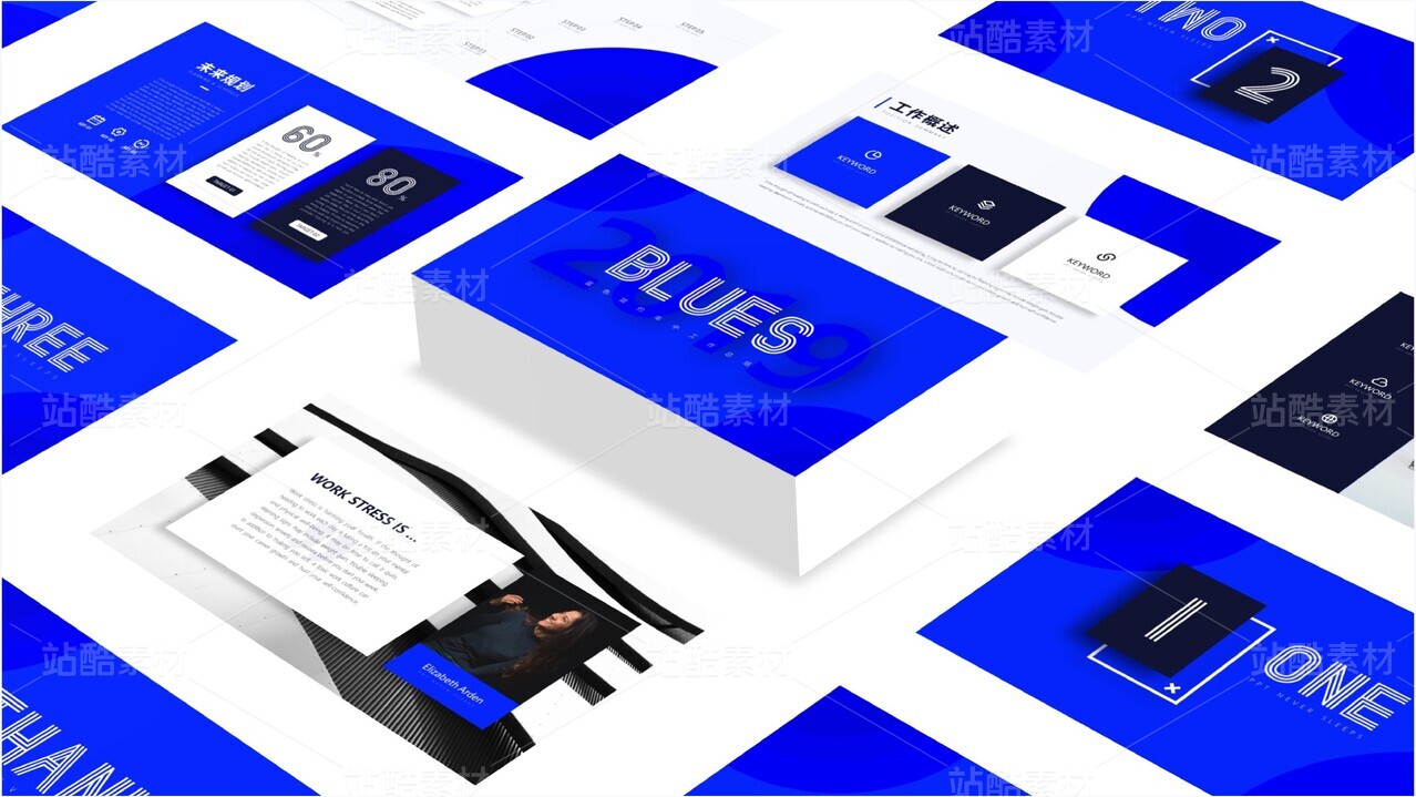
仓储店&便利店-子母双品牌结构-视觉VI设计


上海/平面设计师/4年前/75557浏览
版权
仓储店&便利店-子母双品牌结构-视觉VI设计
-PRICELOW & TOOCHEAP-
站酷首发·非请勿转
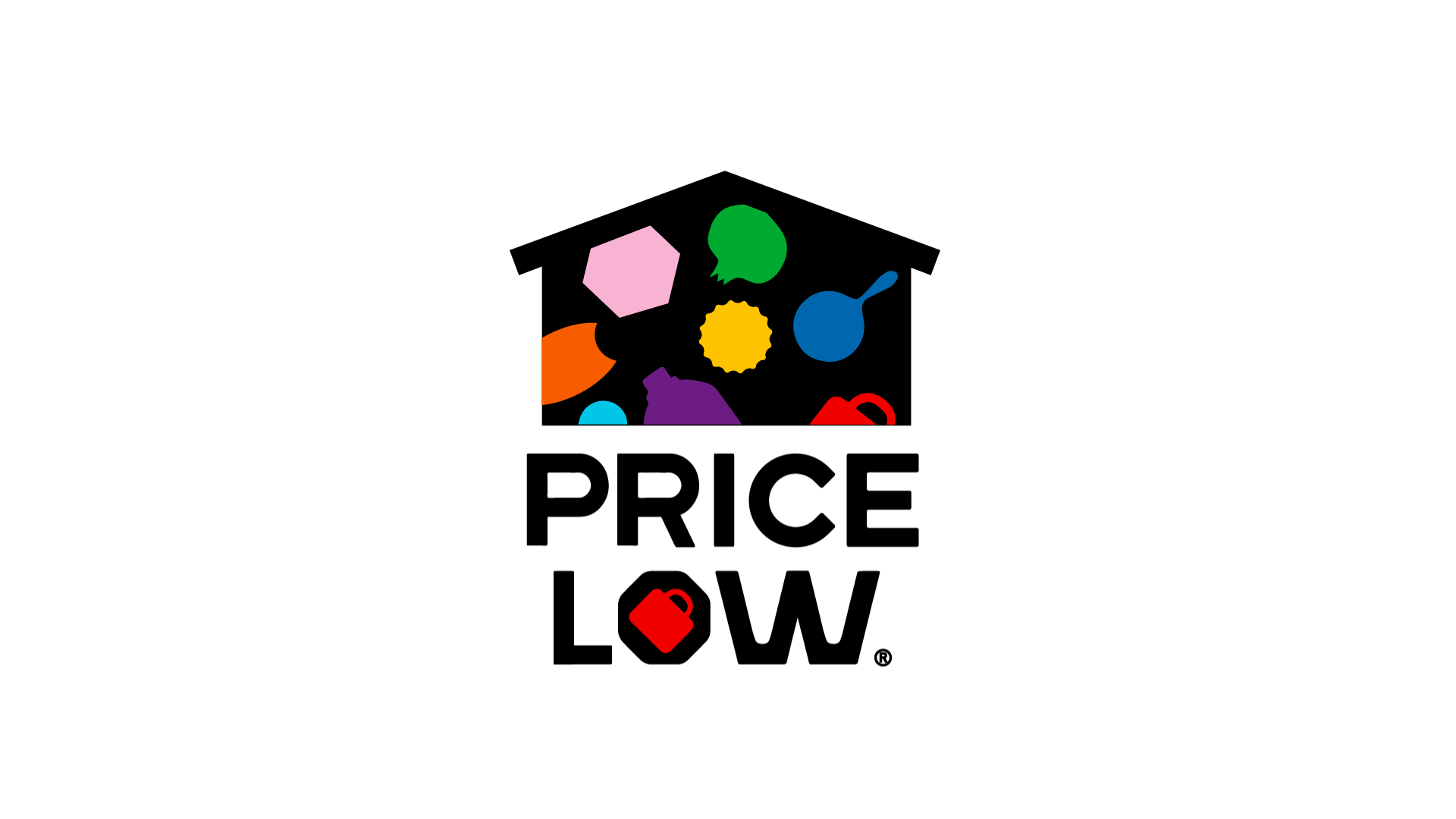
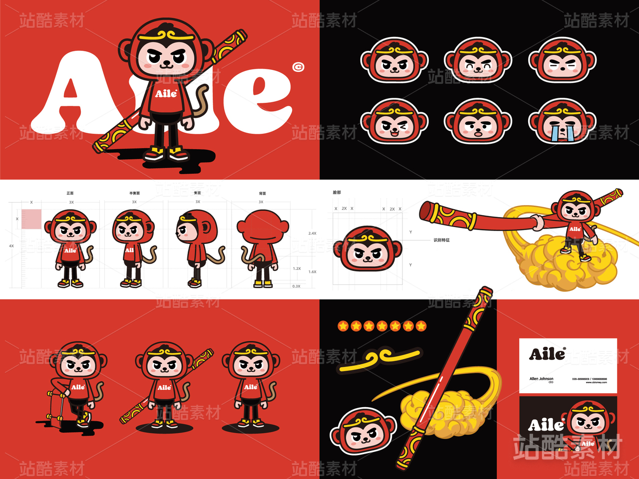
PRICELOW「简称品牌P」和TOOCHEAP「简称品牌T」,分别为仓储店品牌,和其旗下的便利店品牌。
品牌P作为母品牌,是大型仓储店;品牌T是小型商超便利店,为品牌P做终端分销。
这也是团队第一次接触并尝试设计双品牌结构的框架视觉体系。
在设计视觉体系时,优先考虑处理品牌P和品牌T的子母逻辑关系
参考google系家族品牌的处理方式,对品牌图标进行设计的同时,提炼品牌图标层面的基因
以「统一的图形排列」,「图形表达逻辑」和「统一的规范类字体」,为子母两个品牌设计LOGO本体图形
同时,为品牌后续延展其他业态(服装,手办等),做了较好的视觉逻辑预埋。
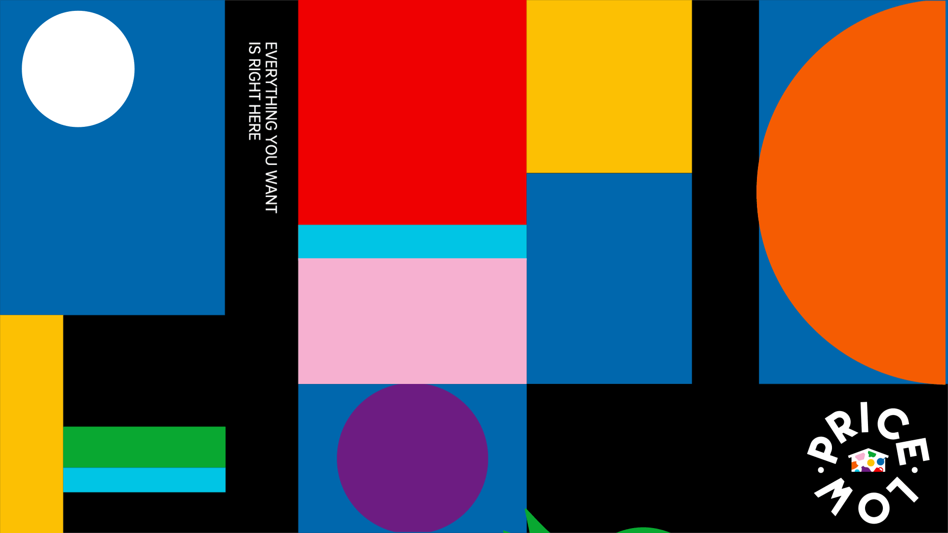
在保证品牌P和品牌T在图标识别上的视觉联系后,我们通过设计不同的色系搭配/辅助图形拓展/KV输出形态
来为两个品牌塑造「既在图标层面具有统一性」,又在「VI视觉框架层面各自具有各自特点」的不同品牌性。
品牌P作为母品牌,更多的是体现稳重性,以平面构成类笔触较硬朗的KV形式作为品牌视觉特征。
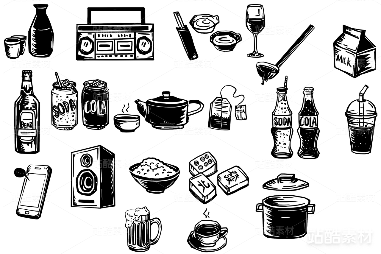
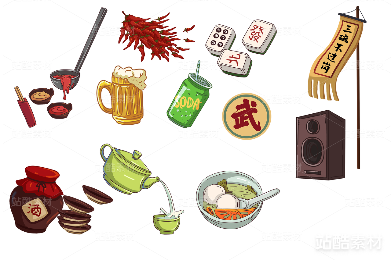
品牌T作为子品牌,同时比品牌P更具有to C的属性,所以更多的是体现活泼性,颜色艳丽,KV形式趣味性更高。
-
When designing the system, the logical relationship between brand P and brand T should be given priority
Referring to the processing method of Google family brand, the brand icon is designed and the gene of the brand icon is refined
With unified graphic arrangement, graphic expression logic and unified standard typeface, icon ontology is designed for both brands
At the same time, for the brand follow-up extension of other formats (clothing, handwork, etc.), do a good visual logic embedded.
After ensuring the visual connection between brand P and brand T in icon recognition, output forms through different color matching/auxiliary graphics expansion /KV
To achieve the unity of the two brands in the level of icon, but also in the level of VI framework with their own brand characteristics.
-
logo/icon design:hualun
layout design:xutian/yang jingsen
poster design:jing
Result-diagram design:Vasilis Pallas/Another Collective/Amr Elwan/Bitty/Stelios/Dustin/Abby
*提案中部分图片源自网络,仅做效果展示,未商用,侵删


559
举报
声明
1460
分享
相关推荐


评论你的想法~
表情
喜欢TA的作品吗?喜欢就快来夸夸TA吧!
推荐素材


你可能喜欢


相关收藏夹


登录注册
99+登录即可同步推荐记录哦
99+登录即可加入我的收藏
评论登录即可评论想法
分享分享