天府可乐

重庆/平面设计师/4年前/7637浏览
版权
天府可乐
一代名饮,复古新生
Back to the golden age, reborn with new attitude.
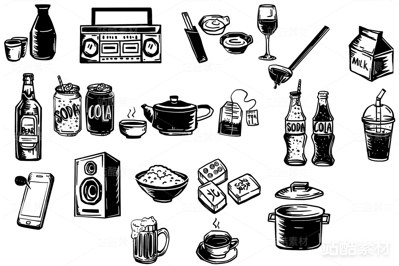
服务内容:品牌形象识别、品牌推广及传播、包装设计
客户信息:重庆天府可乐集团有限公司
—
天府可乐,1936年从华美汽水厂开始,根植川渝85年,这个曾被誉为中国八大饮料之首,唯一被冠以“中国”字号的饮料企业,一度风靡全国乃至世界。1984年首登国宴餐桌并于次年被定为国宴和外事活动饮料,在1988年国际第27届“世界食品评选”中获得金奖,这是中国饮料类仅有的一项国际金奖,天府可乐从此被冠以“一代名饮”的美誉,辉煌时期下属灌装厂达108个,在中国可乐市场占有率更是高达75%。
伴随着辉煌的历史,这个承载了一代人记忆的民族品牌却在九十年代末与国际饮料巨头合资的十多年间被打压和雪藏,天府可乐逐渐在市场上消失…经过天府人数年的努力,终于胜诉,一举追回了配方、工艺及商标,于2016年正式复出。2021年,借助国货自强,民族复兴之势,天府可乐再次出发。
ANNND共和在巩固和延续品牌经典元素的同时打破常规,为天府可乐打造了全新的品牌和产品体系。在创作中我们沿用了品牌红色系与书法字体的基调,保留并升级了复古的双横线规整排列,用全新的设计语言诠释经典;在视觉锤的提炼中,我们更是大胆提出了“文化自信”的主张,取消了原本西化的英文字体“COLA”,取而代之的是可乐的中文拼音“KELE”,借此我们打造出属于天府可乐独一无二的超级符号,助力民族品牌重返辉煌。
In 2021, Tianfu Kele set out again with the help of domestic products and the trend of national rejuvenation. While consolidating and continuing the classic elements of the brand, ANNND breaks the rules and creates a new brand and product system for Tianfu Kele. In the creation, we continue to use the brand red department and the basic tone of calligraphy font, retain and upgrade the retro double horizontal line arrangement, with a new design language to interpret the classic; In the visual hammer of the distillation, we are bold to put forward the "cultural confidence", cancelled the original Westernization of the English font "COLA", replaced by the Chinese pinyin "KELE" of coke, so that we create a unique super symbol belonging to Tianfu Kele, help national brands return to public.


64
举报
声明
117
分享
相关推荐


评论你的想法~
表情
喜欢TA的作品吗?喜欢就快来夸夸TA吧!
推荐素材


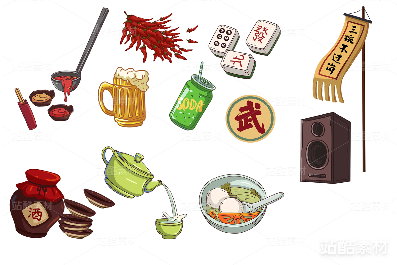

你可能喜欢


相关收藏夹


登录注册
64登录即可同步推荐记录哦
99+登录即可加入我的收藏
评论登录即可评论想法
分享分享