C咖品牌重塑—双舱精华霜


武汉/平面设计师/1年前/6953浏览
版权
C咖品牌重塑—双舱精华霜
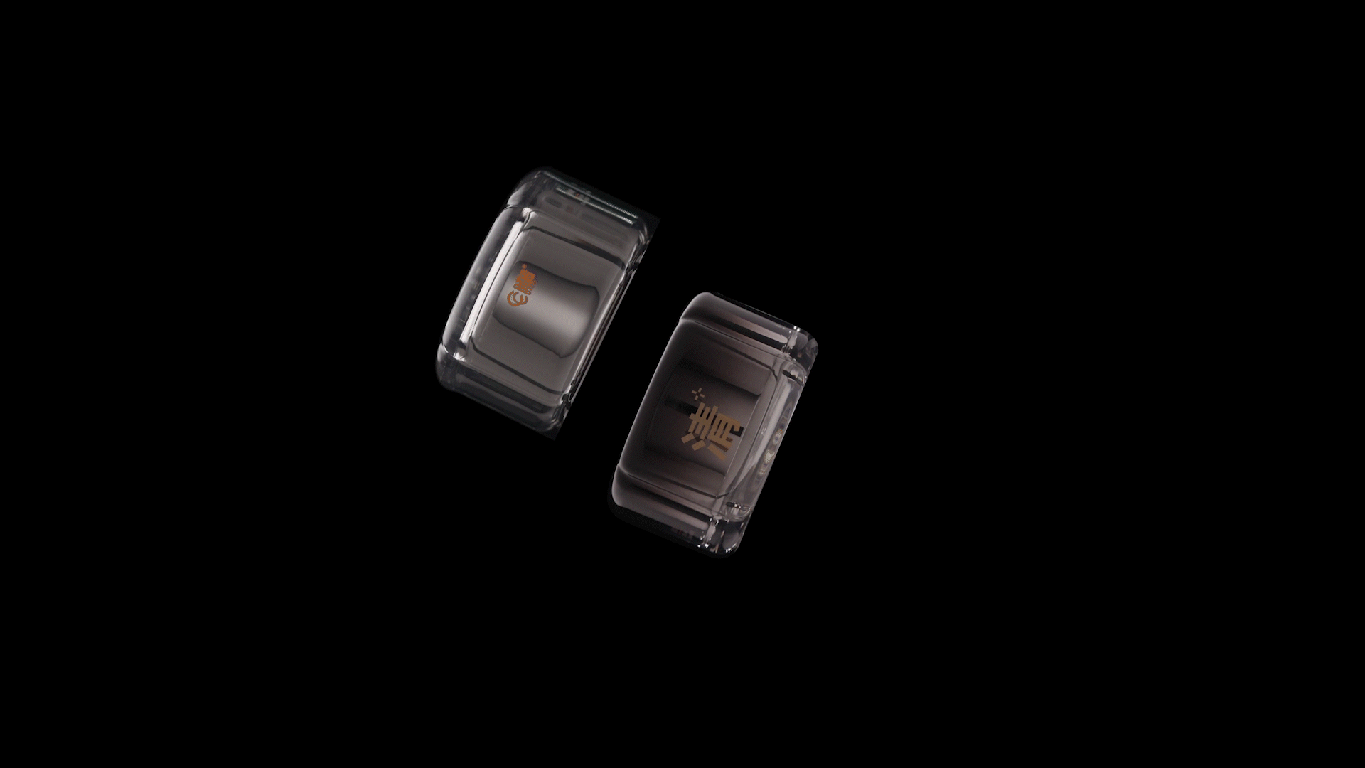
RAD为C+打造的「双舱精华霜」,以品牌核心理念“精准”为出发点,通过视觉符号的提炼与造型语言的革新,全面重塑了品牌形象,实现了视觉与产品体验的双重升级。
RAD collaborated with C+ to create the innovative product design for the Dual-Chamber Essence Cream, drawing from the brand’s core philosophy of precision. By extracting and translating this value into a unique visual symbol, we redefined the brand identity and achieved a dual innovation in both visual language and user experience.
产品外观设计围绕“高效与精准”展开,采用创新双舱真空结构,精准隔离双重活性成分,避免互扰,同时确保每次按压都能精准释放,带来稳定、高效的护肤体验。该结构不仅体现了产品的科技感,也传递出品牌对科学护肤的坚持与探索。
The product’s form centers around the concept of efficiency and precision, featuring a custom-engineered dual-chamber vacuum structure. This design ensures the effective separation of two active ingredients, preventing interference while delivering a precise dose with each pump—offering a stable and efficient skincare routine. The structure reinforces the product’s scientific and technological character, echoing the brand’s commitment to precision skincare.
设计中的中央十字结构贯穿整体造型,作为“精准定位、精准呵护”的视觉符号核心,象征C+对肌肤问题精准解决的品牌承诺。
At the heart of the design lies the central cross structure, a visual metaphor that embodies "targeted care and accurate delivery." This geometric symbol reflects C+’s dedication to addressing skin concerns with scientific precision.
C+以「双舱精华霜」为起点,构建一个以“精准”为信仰的品牌美学体系,通过统一的形态与视觉语言,持续推动品牌体验的现代化与系统化升级。
With the Dual-Chamber Essence Cream as the starting point, C+ is building a precision-driven design system, where product form and visual identity work in unison to elevate the brand’s presence and deepen its emotional connection with users.


170
Report
声明
140
Share
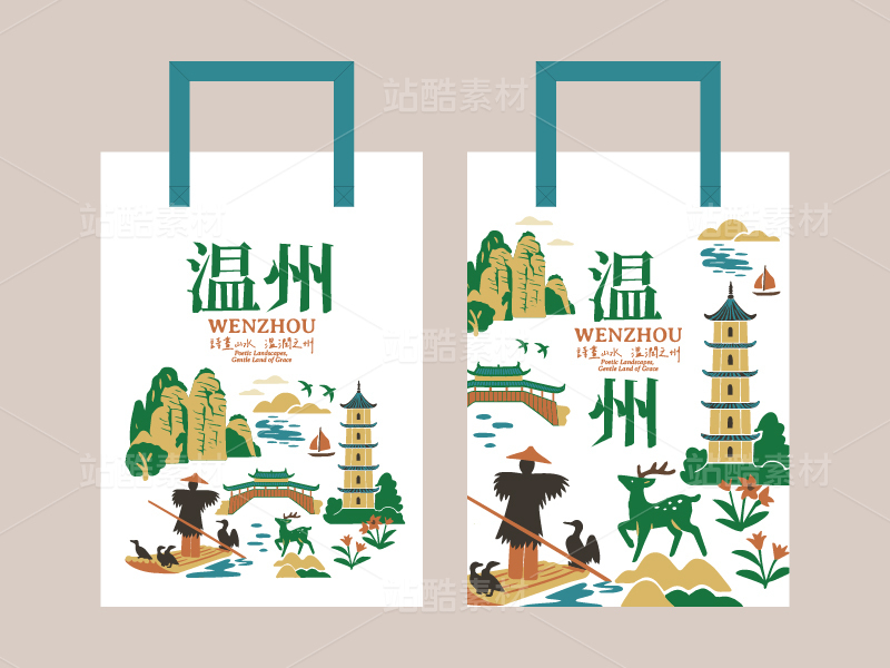
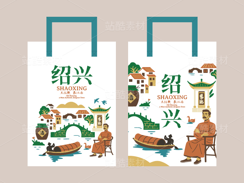
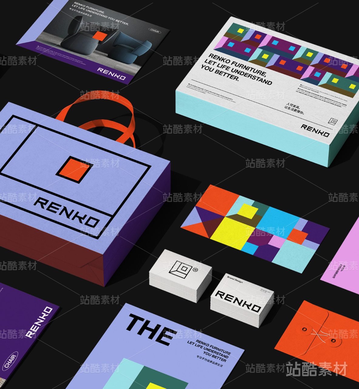
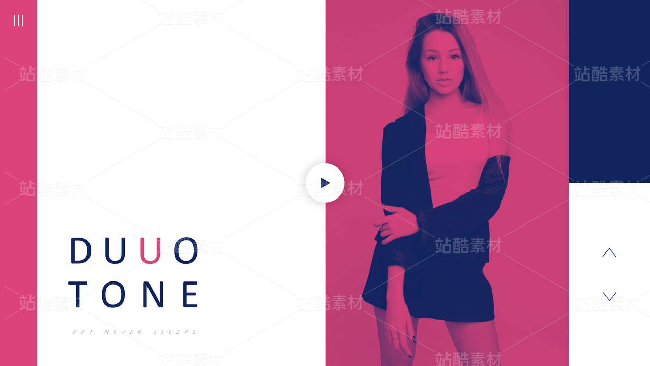
相关推荐


in to comment
Add emoji
喜欢TA的作品吗?喜欢就快来夸夸TA吧!
推荐素材


You may like


相关收藏夹


Log in
99+Log in and synchronize recommended records
99+Log in and add to My Favorites
评论Log in and comment your thoughts
分享Share