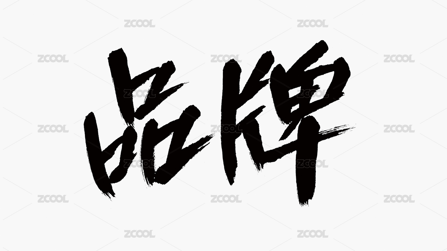
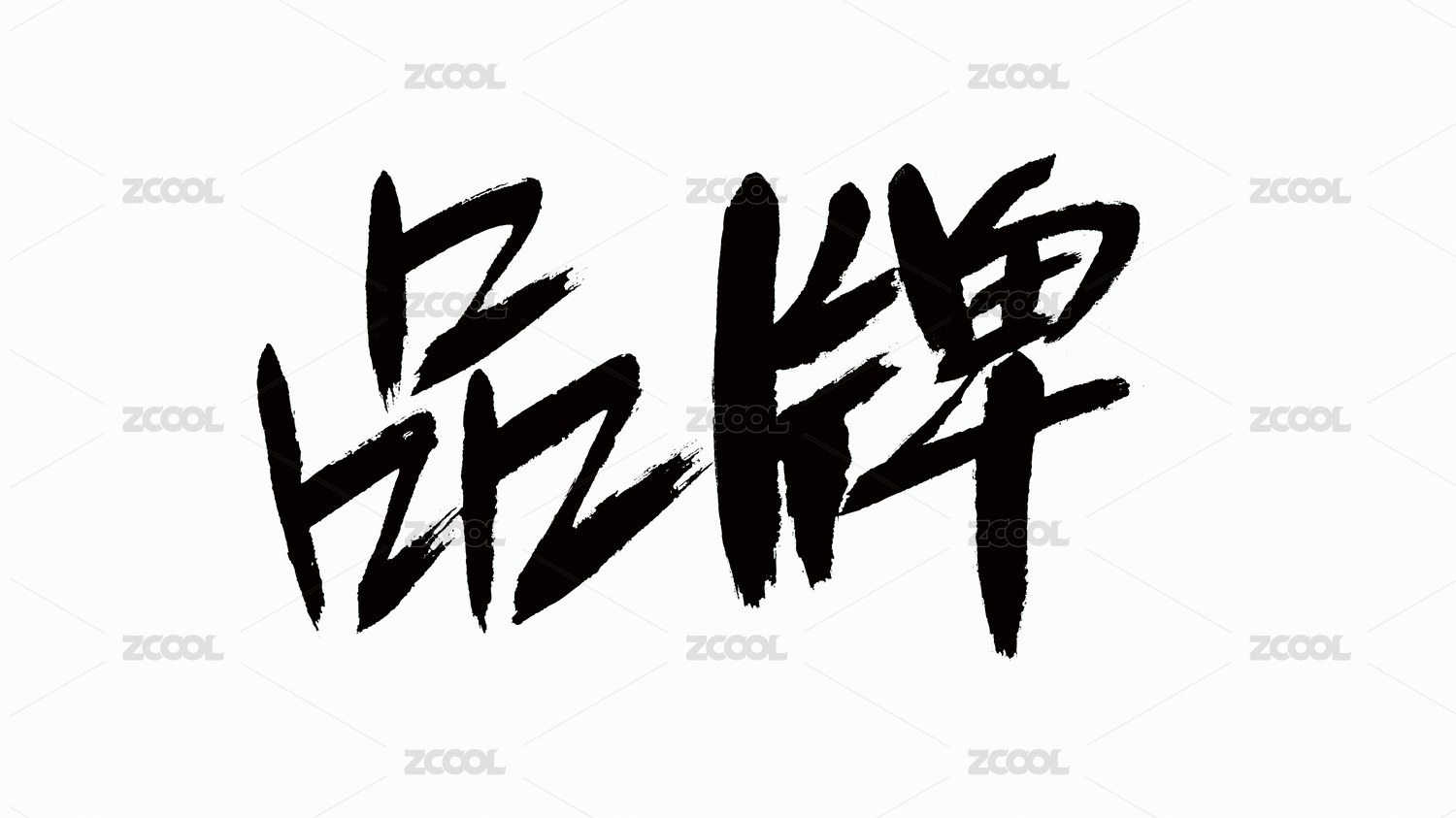
高夫品牌升级


武汉/平面设计师/279天前/5371浏览
版权
高夫品牌升级
高夫创立于1992年,是中国最早的男士护肤品牌之一。三十三年来,品牌始终陪伴中国男性成长,并在时代更迭中保持鲜活影响力。此次焕新,以“守护每一面名场面”为核心命题,探索更具当代感的视觉体系。 设计中引入“网格”作为视觉母题,每一格象征一个“面”,隐喻男性在职场、社交、运动等多元场景中的角色切换。色彩体系以蓝色谱系为核心:深蓝传递专业与活力,藏蓝强调力量与权威,浅蓝营造清新亲和,亮蓝赋予年轻与科技感。 通过网格的秩序与蓝色的层次递进,高夫构建出简洁而多义的视觉语言,让“守护每一面”的品牌主张直观呈现,并为品牌注入更自信从容的能量。
Founded in 1992, GF is one of the earliest men’s skincare brands in China. For 33 years, the brand has accompanied Chinese men through their growth, maintaining a dynamic influence across changing times.
In this brand refresh, the core proposition “Guarding Every Defining Moment” shapes a more contemporary visual system. The design introduces the “grid” as a central motif, with each square symbolizing a “facet,” metaphorically representing the multiple roles men take on in work, social, and sports settings.
The color system centers on shades of blue: deep blue conveys professionalism and vitality, navy emphasizes strength and authority, light blue creates freshness and approachability, while bright blue embodies youth and a sense of technology.
Through the order of the grid and the layered progression of blues, GF establishes a visual language that is both simple and multi-dimensional, making the brand statement “Guarding Every Facet” tangible, and infusing the brand with greater confidence and composure.


56
举报
声明
43
分享
相关推荐


评论你的想法~
表情
喜欢TA的作品吗?喜欢就快来夸夸TA吧!
推荐素材


你可能喜欢


相关收藏夹


登录注册
56登录即可同步推荐记录哦
43登录即可加入我的收藏
评论登录即可评论想法
分享分享