三只松鼠 × 研一 | 满月为形祈祥美


其他/平面设计师/1年前/3584浏览
版权
三只松鼠 × 研一 | 满月为形祈祥美
中秋节承载着深厚的文化底蕴和丰富的情感寄托,而月饼作为这一节日的标志性食品,不仅满足了人们的味蕾享受,更成为了传递亲情、友情和祝福的重要载体。在本案中,我们这份情感与祝福具象化,通过独特的插画构图和精致的图形元素,展现出中秋团圆的美好愿景。
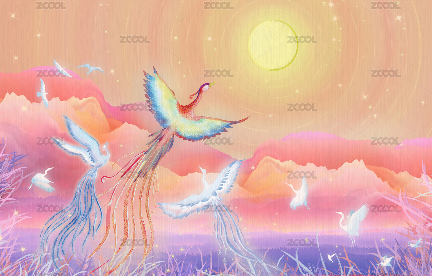
满月为形,向心聚焦
提取满月形态作为插画构图的核心,寓意着团圆和美满。图形元素围绕中心聚集,形成强烈的视觉焦点,引导视线,增强主体的表现力。同时,整体图形巧妙延伸至包装左右两侧,不仅提升了包装的视觉层次感,更在陈列时能够拼出完整的图案,增添趣味性。
融合创作,营造氛围
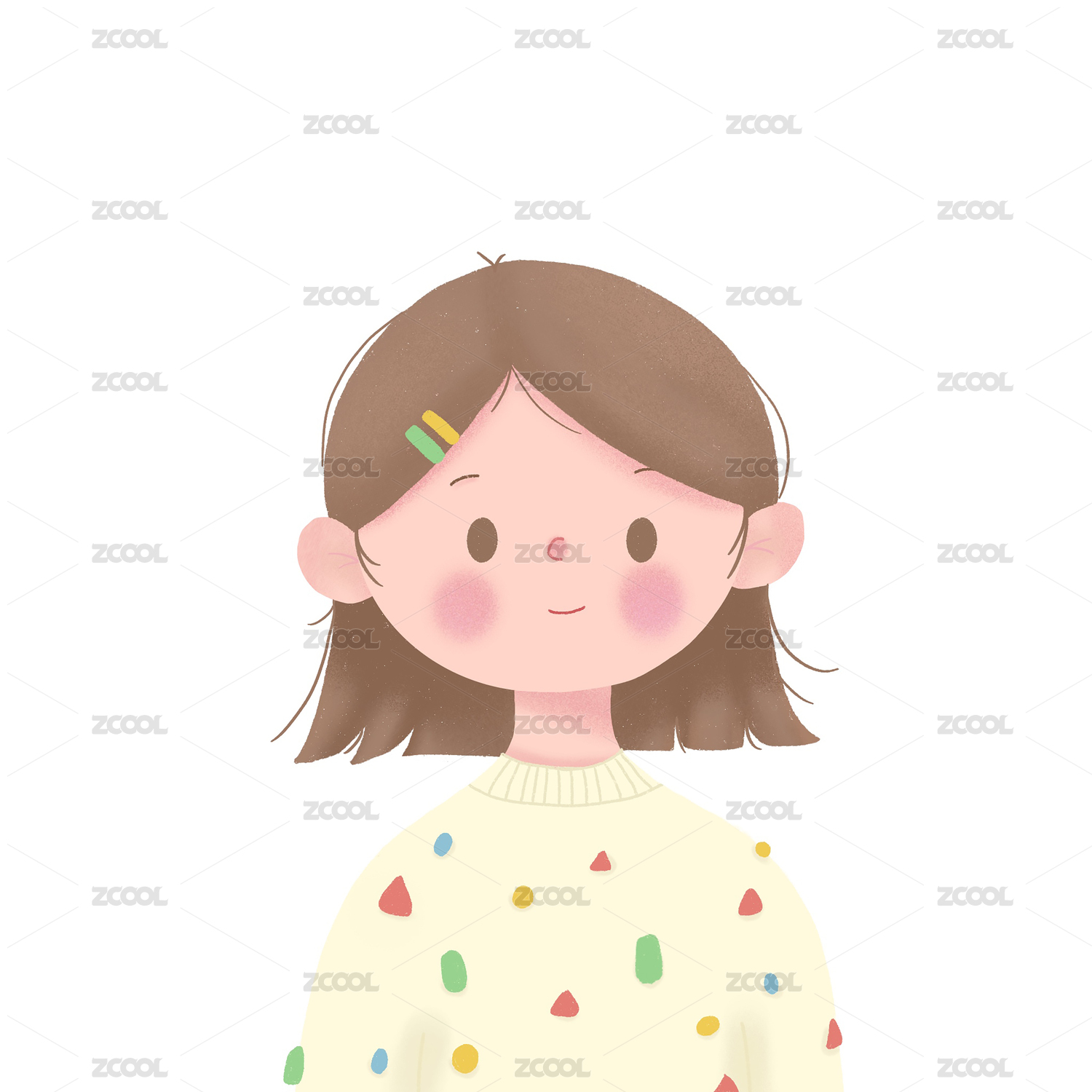
在设计元素上,我们从中秋习俗中汲取灵感,将月亮、灯笼、桂花等传统元素融入插画之中,既体现了节日特色,又传递了浓厚的文化氛围。祥云、画眉鸟、烁烁星辰及连绵山岳等细节的点缀,营造出一种吉祥、美好的节日氛围,寓意深远。此外,我们又对三只松鼠的IP形象进行了再创作,使其以捣月饼馅料、抱桂花酒、放花灯等姿态融入插画之中,不仅增强了品牌与产品的关联性,还赋予了插画更强的故事性和趣味性。
层级清晰,阅读连贯
品牌名称、系列名称及单品名称三者有序组合置于包装视觉中心位置,突出品牌与产品信息,也确保阅读的连贯性和便捷性,使消费者在第一时间就能捕捉到关键信息。
The Mid-Autumn Festival carries a profound cultural heritage and rich emotional sustenance. Mooncakes, as the iconic food of this festival, not only satisfy people's taste buds, but also become an important carrier for conveying family affection, friendship and blessings. In this case, we concretize this emotion and blessing, and show the beautiful vision of Mid-Autumn Festival reunion through unique illustration composition and exquisite graphic elements.
Full moon as shape, centripetal focus
The full moon shape is extracted as the core of the illustration composition, implying reunion and happiness. The graphic elements gather around the center to form a strong visual focus, guide the line of sight, and enhance the expressiveness of the subject. At the same time, the overall graphic cleverly extends to the left and right sides of the packaging, which not only enhances the visual layering of the packaging, but also can spell out a complete pattern when displayed, adding fun.
Fusion creation, creating an atmosphere
In terms of design elements, we draw inspiration from the Mid-Autumn customs and integrate traditional elements such as the moon, lanterns, and osmanthus into the illustrations, which not only reflects the characteristics of the festival, but also conveys a strong cultural atmosphere. The embellishment of details such as auspicious clouds, thrush, twinkling stars and continuous mountains creates an auspicious and beautiful festival atmosphere with profound meaning. In addition, we recreated the IP image of Three Squirrels, integrating it into the illustrations in the form of pounding mooncake fillings, holding osmanthus wine, and setting off lanterns, which not only enhanced the relevance between the brand and the product, but also gave the illustrations stronger storytelling and fun.
Clear hierarchy and coherent reading
The orderly combination of the brand name, series name and single product name is placed in the visual center of the packaging, highlighting the brand and product information, and ensuring the coherence and convenience of reading, so that consumers can capture key information at the first time.
-
客户 Client | 三只松鼠股份有限公司
品牌 Brand | 三只松鼠
项目 Project | 山河揽月礼盒包装设计


124
举报
声明
58
分享
相关推荐


评论你的想法~
表情
喜欢TA的作品吗?喜欢就快来夸夸TA吧!
推荐素材


你可能喜欢


相关收藏夹


登录注册
99+登录即可同步推荐记录哦
58登录即可加入我的收藏
评论登录即可评论想法
分享分享