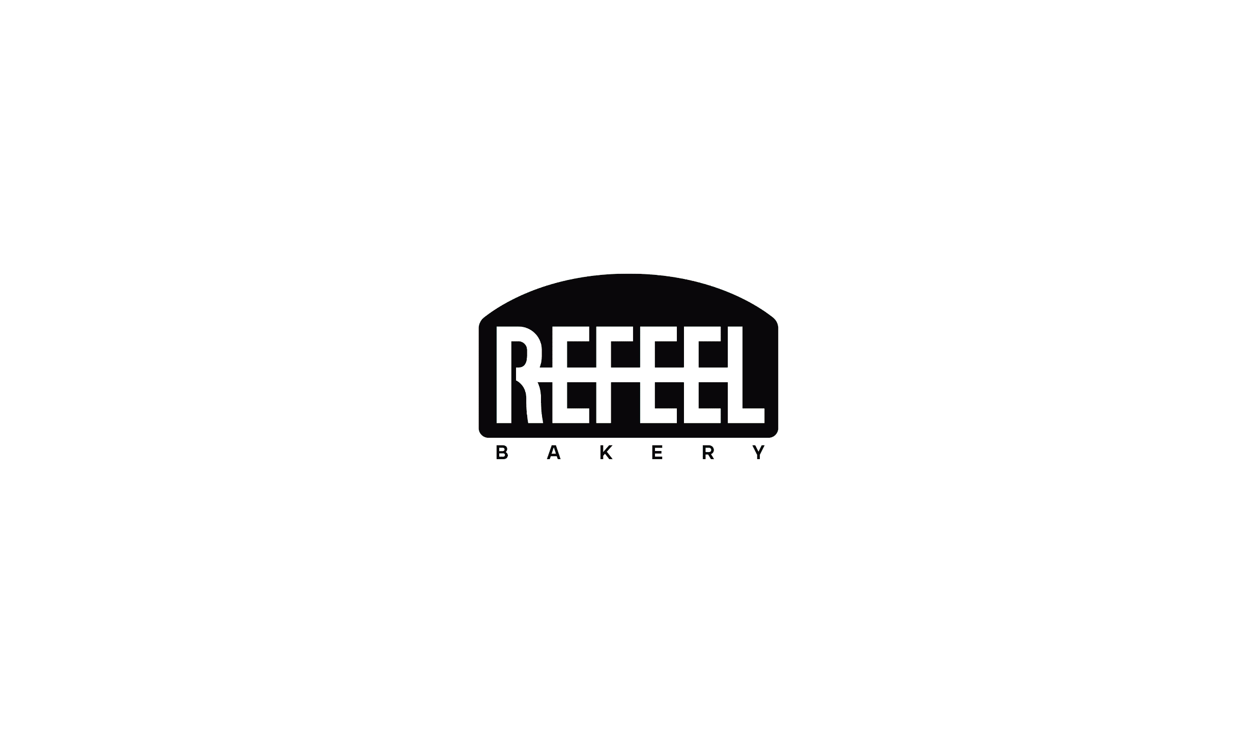
REFEEL社区潮流烘焙咖啡品牌设计


长沙/平面设计师/2年前/18465浏览
版权
REFEEL社区潮流烘焙咖啡品牌设计

Refeel是一家社区潮流面包店,以崇尚和创造高品质的潮流文化为核心理念。我们将烘焙和咖啡提升为时尚单品的潮流宠儿,将品质生活与潮流趋势相结合。品牌的主旨在于追求生活品质、拥有独特态度和品位,同时营造轻松松弛的环境,Refeel致力于在产品、品牌和空间设计上带来令人惊喜的体验。
Refeel的主要产品包括精心制作的甜甜圈、可颂面包、丰富口感的酸奶奶昔以及清新的气泡水/咖啡。我们以专业的烘焙技艺和精选的原材料,为顾客提供口感独特、品质上乘的美食体验。在设计理念中,我们用行业和产品的特征衍生出符号视觉锤,用符号视觉锤贯穿触点应用和物料包装,符号图形不断传输让受众对品牌产生印象。
Refeel is a community trend bakery with the core concept of advocating and creating high-quality trend culture. We promote baking and coffee to the trend of fashion items, combining quality life with trend trends. The purpose of the brand is to pursue the quality of life, have a unique attitude and taste, and create a relaxed and relaxing environment. Refeel is committed to bringing surprising experiences in product, brand and space design.Refeel's main products include carefully made donuts, croissants, rich yogurt shakes and refreshing sparkling water/coffee. With professional baking skills and selected raw materials, we provide customers with a unique taste and high-quality food experience. In the design concept, we use the characteristics of the industry and products to derive the symbol visual hammer, and use the symbol visual hammer to run through the contact application and material packaging. The symbol graphics are continuously transmitted to make the audience have an impression of the brand.


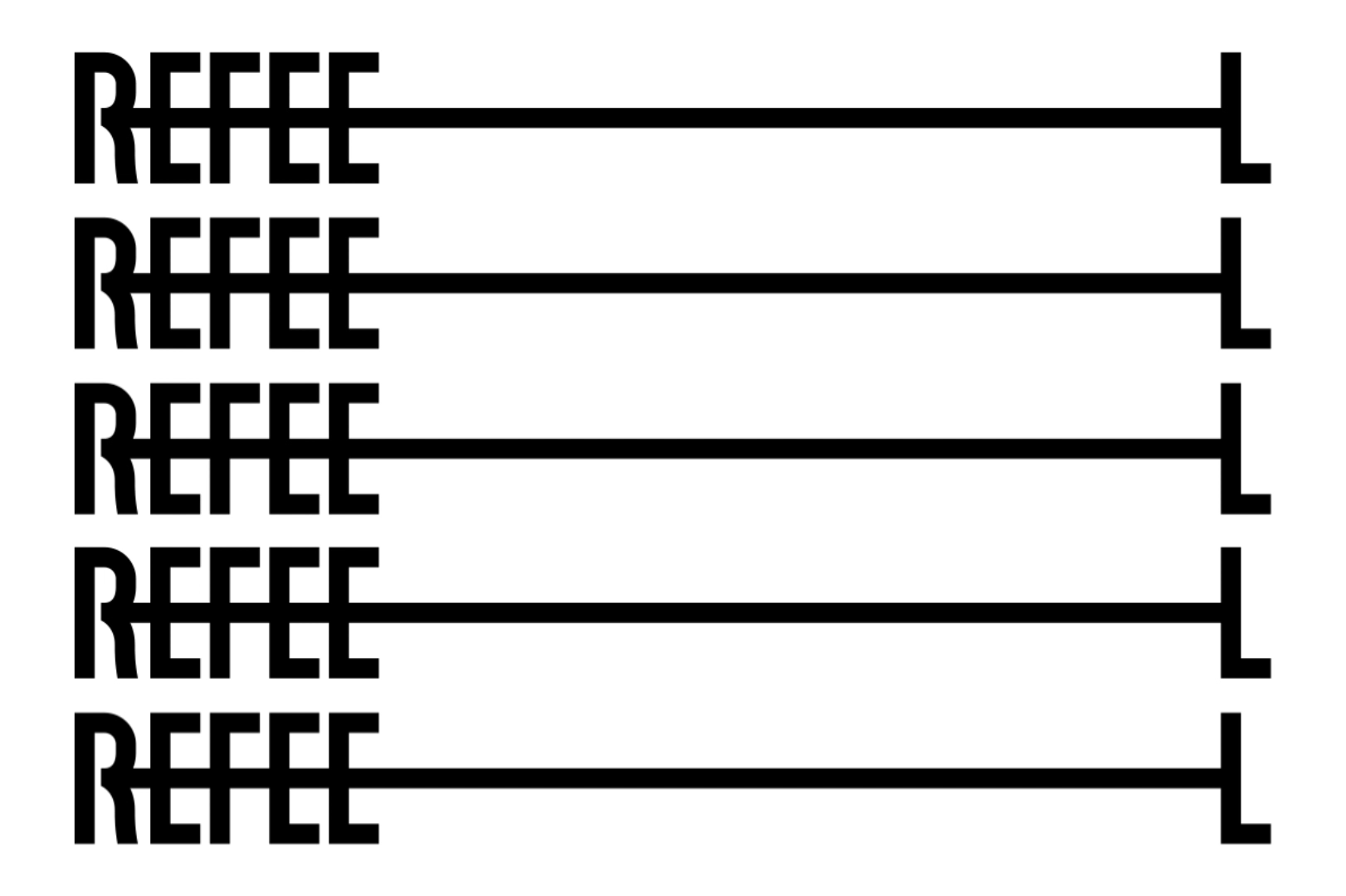


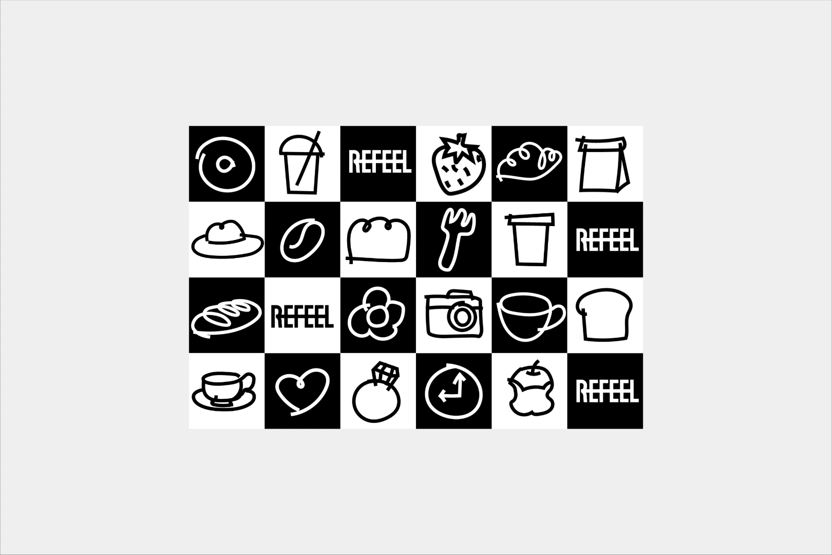


用行业和产品的特征延伸出图形面包符号的视觉锤,用符号视觉锤贯穿触点应用和物料包装,符号图形不断出现在不同媒介传输让受众对品牌产生印象。
REFEEL的字体设计根据字母的特征和优势,我们进行了结合串联的创意形式表达,几何化和增加记忆点的同时,也是代表品牌与消费者的关系和出发点是共同的角度和共同发展以及相互成就的,品牌文化和消费者认知在互相影响着。
The visual hammer of the graphic bread symbol is extended by the characteristics of the industry and products. The visual hammer of the symbol runs through the contact point application and material packaging. The symbol graphics continue to appear in different media transmissions to make the audience have an impression of the brand. The font design of REFEEL is based on the characteristics and advantages of the letters. We have combined the creative form of expression in series. While geometricization and increasing the memory point, it also represents the relationship and starting point between the brand and the consumer. The brand culture and consumer cognition are influencing each other.


-
时间|2024.04
项目地点|广东佛山 Foshan, Guangdong, China
服务内容|品牌设计、VIS建设、物料包装
Brand Identity、VI identification、Material packaging
团队|阿祖不收手设计工作室 Non Stop Studio
商务对接|单一晨 Shanyichen
品牌规划|阿祖 Azu
品牌与动效设计|阿祖 Azu、大舟 Dazhou
三维设计|00苏 00Su
工艺对接|怼怼 Duidui
PS:未经允许,不允许转载盗用至小红书/ 抖音/淘宝等其他媒体平台,著作权均属品牌方!
470
创作信息
举报
声明
782
分享
相关推荐


评论你的想法~
表情
喜欢TA的作品吗?喜欢就快来夸夸TA吧!
推荐素材


你可能喜欢


相关收藏夹


登录注册
99+登录即可同步推荐记录哦
99+登录即可加入我的收藏
评论登录即可评论想法
分享分享