ICON LAB I 酒店品牌升级 DBLUE品牌设计

深圳/平面设计师/4年前/2460浏览
版权
ICON LAB I 酒店品牌升级 DBLUE品牌设计
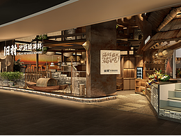
ICON LAB艾垦酒店是艾垦酒店集团旗下的轻奢酒店品牌,集团总部位于深圳,目前在营门店四家。
ICON LAB系列的每一家都主打艺术和设计风格,将小众与美学放大到极致。从2011年起发展至今,用户群体的需求升级也同时改变了用户对于品牌的认知。目前已有的品牌设计不够聚焦和品质感,明显跟不上年轻群体对于品牌的诉求。DBLUE.团队受邀为其探索全新的品牌形象升级,目的是传承现有品牌资产的前提下进行设计上的探索,经由视觉语言传达ICON更佳年轻、活泼符合年轻人的品味的品牌主张。此次DBLUE.在为期2个月的时间内,为ICON提供了图形设计、色彩更新、导视更新、辅助图形的延展设计等设计服务。
在标志设计当中,我们运用艺术化的表现形式,将ICON这四个字母以构成的形式重组,并融入“窗户”“日月交替”“好奇之眼”的概念。不仅代表着品牌独有的艺术理念,也完美的把酒店行业的属性得到了完美全是,即表现了品牌“包容”的特点。也体现品牌简约的设计感觉,现代感,艺术感。
ICON LAB is a Boutique hotel brand under the Icon Group.
The group is headquartered in Shenzhen and currently has four stores.
Each of the ICON LAB series focuses on art and design style, magnifying the niche and aesthetics to the extreme. Since its development in 2011, the upgrading of user needs has also changed the user's perception of the brand. The existing brand designs are not focused enough and have a sense of quality, and obviously can't keep up with the demands of young people for brands. The DBLUE. team was invited to explore a new brand image upgrade for it. The purpose is to carry out design explorations on the premise of inheriting the existing brand assets, and to convey through visual language ICON's brand proposition that is more youthful and lively in line with the tastes of young people. This time, DBLUE. provided ICON with design services such as graphic design, color update, guide update, and extended design of auxiliary graphics for ICON.


16
创作信息
举报
声明
72
分享
相关推荐


评论你的想法~
表情
喜欢TA的作品吗?喜欢就快来夸夸TA吧!
推荐素材


你可能喜欢


相关收藏夹


登录注册
16登录即可同步推荐记录哦
72登录即可加入我的收藏
评论登录即可评论想法
分享分享