QISIKE BRAND DESIGN


北京/艺术工作者/9年前/52242浏览
版权
QISIKE BRAND DESIGN
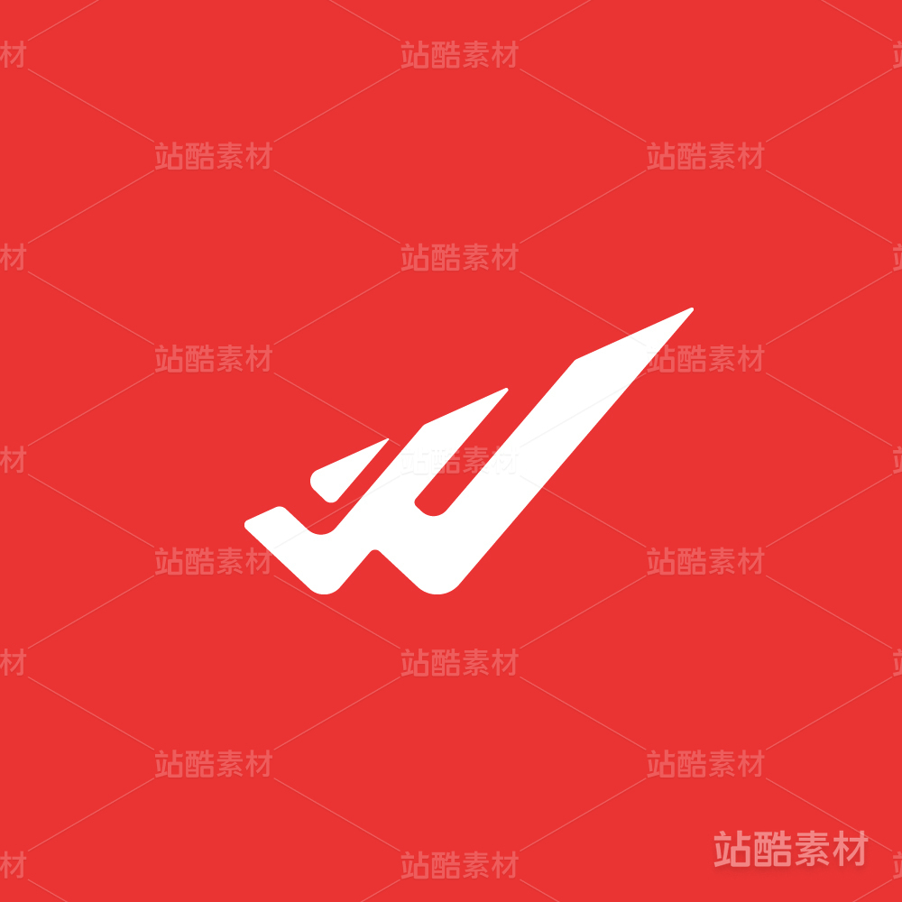
标识以”QISIKE”首字母“Q”为基础,结合蜂窝的六边形分子结构,三个”Q”旋转连接在一起,形成一个正三角形,体现科技网络公司的行业属性。
顶部的尖角,代表山峰,寓意我们是一群以创新,追求极致,拥有全球化视野的人,也体现了“科技与艺术从山麓分手,后来又在山顶回合”的观点,就像一枚硬币的两面,连接它们的是创造力,这也是“奇思客”的灵魂,我们开拓的行动力。
The logo uses the shape of Q from Qisike and the structure of hexagon to form a regular triangle by the connection and rotation of three Qs, to indicate the Technology and Internet nature of the company.
The sharp angle on top represents mountain peak to show the company’s pursuit of innovation, perfection and a global vision. It also shows the conversion and contradiction between art and technology, like two sides of a coin; it is innovation that connects them together, it is also the soul and the passion of Qisike.


1602
创作信息
举报
声明
1268
分享
相关推荐


评论你的想法~
表情
喜欢TA的作品吗?喜欢就快来夸夸TA吧!
推荐素材


你可能喜欢


相关收藏夹


登录注册
99+登录即可同步推荐记录哦
99+登录即可加入我的收藏
评论登录即可评论想法
分享分享