并行致远×华阳新兴科技集团有限公司 | 品牌标志升级

天津/平面设计师/73天前/398浏览
版权
并行致远×华阳新兴科技集团有限公司 | 品牌标志升级
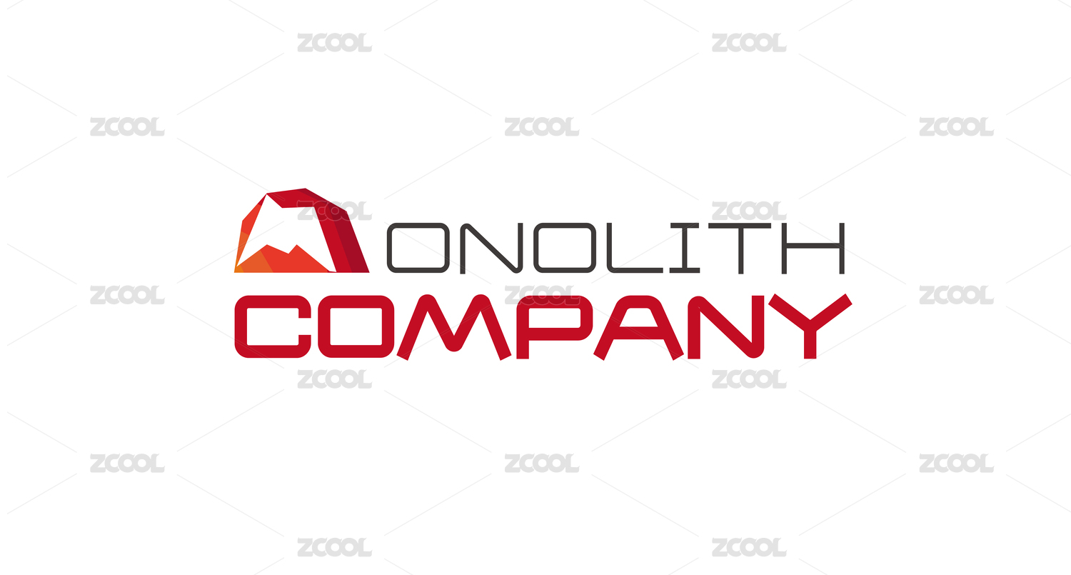
作品名称|华阳新兴 品牌标志升级
品牌定位丨科技、创新
文化背景丨津门启航,科技兴华
创意构想丨華陽新興标志升级焕新,蕴含深刻内涵。新标志中,字母 Y 与 H 的空隙拉大,造型宛如更像参天大树,挺拔向上,象征着企業蓬勃的生命力与不断向上生长、追求卓越的进取精神;亦似燃烧的火炬,寓意着企業如火炬般照亮前行道路,传递光明与希望,引领行业发展。色彩上,更浓郁的工业科技色调,彰显出企業聚焦工业科技领域,秉持严谨态度,专注于前沿科技探索与创新,以专业、可靠的形象,展现出在工业科技赛道上不断突破、引领变革的决心与实力。新标志不仅在视觉形态和色彩上实现跃升,更规范了标志中各元素的比例粗细关系。这种精确规范,如同螺母和扳手为企業发展筑牢根基,体现出对细节的极致把控与对品质的执着追求。标志的每一处比例、每一道粗细,都经过精心考量,确保在各类应用场景中都能保持统一且精准的视觉呈现,展现出企業严谨、规范、专业的管理理念与行事风格,助力企業以更加稳健、自信的姿态迈向未来。
Project Name: Huayang Xinxing Brand Logo UpgradeBrand Positioning: Technology, InnovationCultural Background: Setting Sail from Tianjin, Thriving Through TechnologyCreative Concept:
The revitalized logo of Huayang Xinxing carries profound meaning. In the new design, the spacing between the letters "Y" and "H" is widened, creating a visual form reminiscent of a towering tree—sturdy and upward-growing. This symbolizes the Company's vibrant vitality and its enterprising spirit of continuous growth and pursuit of excellence. The form also resembles a blazing torch, signifying that the Company lights the way forward like a beacon, conveying hope and illumination while leading the development of the industry.
In terms of color, a deeper industrial-tech palette has been adopted, underscoring the Company's focus on the industrial technology sector. It reflects a rigorous approach dedicated to exploring and innovating at the forefront of technology. With a professional and reliable image, it demonstrates the Company's determination and capability to continuously break new ground and drive change in the industrial technology.


0
举报
声明
收藏
分享
相关推荐


评论你的想法~
表情
喜欢TA的作品吗?喜欢就快来夸夸TA吧!
推荐素材


你可能喜欢


相关收藏夹


登录注册
推荐登录即可同步推荐记录哦
收藏登录即可加入我的收藏
评论登录即可评论想法
分享分享