并行致远×海河稻 | 品牌包装设计

天津/平面设计师/88天前/405浏览
版权
并行致远×海河稻 | 品牌包装设计
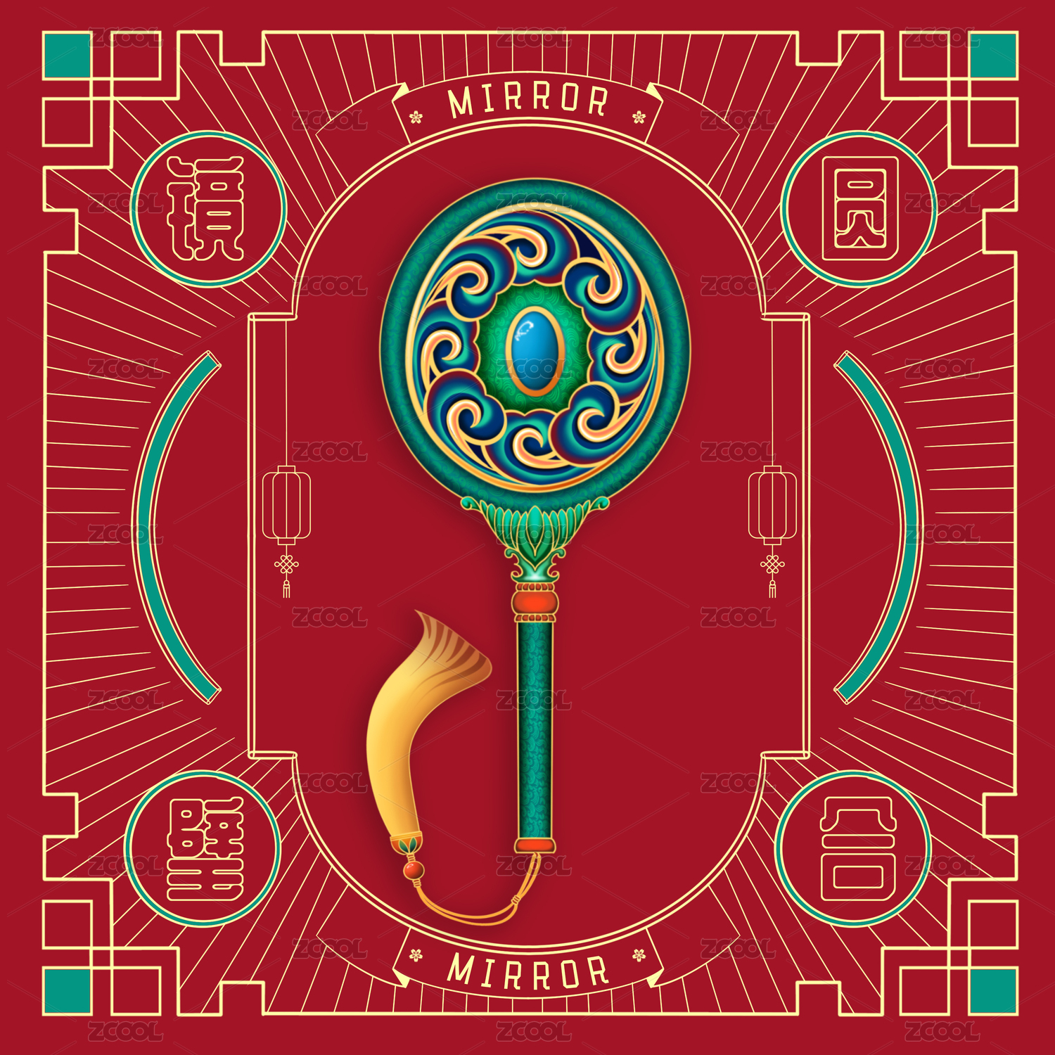
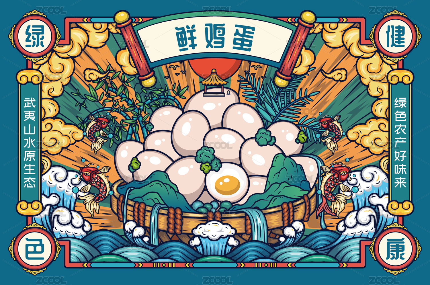
作品名称|海河稻 品牌包装设计
品牌定位丨有机、绿色
文化背景丨源起宋辽 御膳贡米
创意构想丨本设计以小站稻的产地风土为核心意象,将天津独特的自然与人文符号融入包装。画面以金黄稻田、蜿蜒河流、解放桥与浮云构成一幅宁静悠远的田园长卷,展现从沃野到餐桌的美好旅程。上方云朵采用透明材质,消费者可直接窥见内里颗粒饱满的大米,巧妙将“云看稻香”的诗意想象与产品实景观感结合,形成视觉互动。整体设计既回溯了小站稻“白里透青、粘香适口”的百年风味,也通过解放桥这一地标元素,传递出扎根津沽、面向更广阔天地的品牌愿景。
Project Title: Brand Packaging Design for Haihe Dao (Haihe Rice)
Brand Positioning: Organic·Green
Cultural Context: Originating in the Song and Liao Dynasties; Tribute Rice for the Imperial Palace
Creative Concept:The design takes the terroir of Xiaozhan Rice as its core imagery, weaving the distinctive natural and cultural symbols of Tianjin into the packaging. The visuals—golden paddy fields, meandering rivers, the Liberation Bridge, and drifting clouds—form a serene, idyllic panorama, depicting a poetic journey from fertile soil to the dining table.At the top, clouds rendered in a transparent material offer consumers a direct glimpse of the plump rice grains within. This technique artfully merges the poetic vision of "gazing at rice fragrance through clouds" with a tangible view of the product, creating an engaging visual interplay.The overall design not only evokes the century-old flavor of Xiaozhan Rice—"translucent with a hint of green, sticky, fragrant, and palatable"—but also, through the iconic element of the Liberation Bridge, conveys the brand's vision of being deeply rooted in Tianjin (Jin’gu) while reaching out to a broader world.


0
举报
声明
收藏
分享
相关推荐


评论你的想法~
表情
喜欢TA的作品吗?喜欢就快来夸夸TA吧!
推荐素材


你可能喜欢


相关收藏夹


登录注册
推荐登录即可同步推荐记录哦
收藏登录即可加入我的收藏
评论登录即可评论想法
分享分享