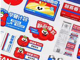
FEI COFFEE 品牌视觉设计
杭州/平面设计师/175天前/95浏览
版权
FEI COFFEE 品牌视觉设计
FEI COFFEE 以复古潮流与都市节奏之间的美学对话为灵感,探索传统与现代共融的可能性,开创现代咖啡文化的新风尚。品牌巧妙融合复古情怀与当代风味,将情感记忆与都市生活节奏相结合,为消费者营造出一种既熟悉又新鲜的咖啡体验。我们致力于打造一个轻松、愉悦、富有仪式感的日常生活场景,让每一杯咖啡都成为唤醒灵感的时刻。视觉体系以高饱和橙色传达温暖与活力,配合极简白色呈现清新与现代,营造出明快有力、富有能量的品牌氛围。标志字体在复古美学的基础上融入几何理性,塑造出极具辨识度的视觉形象,全面传递品牌“唤醒每天的灵感”这一核心理念。
FEI COFFEE draws inspiration from the aesthetic dialogue between retro trends and urban rhythms, exploring the possibilities of harmonizing tradition and modernity to redefine contemporary coffee culture. The brand seamlessly blends nostalgic sentiments with modern flavors, combining emotional memory with the pulse of city life to create a coffee experience that feels both familiar and refreshing. We are committed to crafting a relaxed, joyful, and ritualistic everyday atmosphere, where each cup of coffee becomes a moment of awakened inspiration. The visual identity features a vibrant, high-saturation orange paired with minimal white, conveying warmth, energy, and clarity. This dynamic color palette helps shape a bright, powerful, and energetic brand atmosphere. The logotype merges retro aesthetics with geometric rationality, resulting in a highly distinctive visual mark that reflects both structure and style. Together, these elements fully express the brand’s core message: “Awaken the inspiration of every day.”
7
Report
声明
收藏
Share
相关推荐
in to comment
Add emoji
喜欢TA的作品吗?喜欢就快来夸夸TA吧!
You may like
相关收藏夹
Log in
7Log in and synchronize recommended records
收藏Log in and add to My Favorites
评论Log in and comment your thoughts
分享Share


