慕安美容养生坊 Muan Beauty Studio

深圳/平面设计师/253天前/232浏览
版权
慕安美容养生坊 Muan Beauty Studio
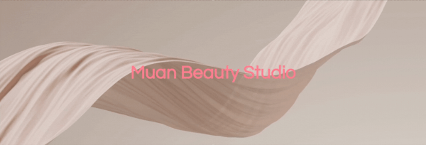
Muan Beauty Studio 慕安美容养生坊品牌设计
慕安美容养生坊,一家专注于美妆与护肤的美学机构。我们的任务是为其打造一套全新的品牌视觉系统,以视觉语言精准传递其对于美的理解与追求。
基于品牌年轻化的定位,我们最终选用糖果色系作为基调,并融入复古与轻奢的设计细节,构建出一个既甜美梦幻又不失优雅格调的视觉世界。
标识设计暗藏巧思:我们将品牌首字母“M”巧妙变形,一侧勾勒出女孩俏丽的马尾辫,另一侧则融入象征幸运的三叶草花瓣。二者合一,既点明行业的女性属性,亦寄托一份美好的寓意。
此次项目的成果令人欣喜,我们由衷感谢客户在此过程中给予的充分信任,让创意得以自由生长。
New branding for Muan Beauty Studio. Our clients are purveyors of beauty and fashion, focusing on youthful trends, makeup and skincare. So in order to transform their philosophy visually, we designed the whole identity with a candy colour and vintage, light luxury style.
The logo was designed with the first letter of their name, including a girl's ponytail and a clover petal, representing their industrial element, girls and luck.
The outcome of this project was satisfying, and we are very grateful to our clients for showing such confidence in our work.
—
设计 Designer:Jessie Wong
客户 Client:Muan Beauty Studio
时间 Date:2017年7月


标识的设计根植于统一的美学法则。我们严格遵循一致的角度与等比的圆角处理,以此构筑出一种精妙的平衡,最终从本质上提升了其整体的美学高度。
The logo was created on an aesthetic basis; The Same angles, equal proportion chamfers and a perfect balance effectually enhanced its aesthetics.


0
举报
声明
5
分享
相关推荐


评论你的想法~
表情
喜欢TA的作品吗?喜欢就快来夸夸TA吧!
推荐素材


你可能喜欢


相关收藏夹


登录注册
推荐登录即可同步推荐记录哦
5登录即可加入我的收藏
评论登录即可评论想法
分享分享