FIGO设计 | 轻十八 鲜食

成都/平面设计师/358天前/476浏览
版权
FIGO设计 | 轻十八 鲜食

轻十八是一个专注于新鲜饮食&健康生活方式的品牌,在行业深耕10余年。品牌不仅提供高品质的新鲜健康食品,还致力于将品牌美学与生活方式结合,为消费者带来更加纯粹、自然的体验。
品牌视觉设计围绕“新鲜、年轻、清爽”展开,并结合简约的美学感知,以符合当下的审美需求。以简约的符号、干净的配色,传递品牌的轻松感和高品质属性。
Light Eighteen is a brand that focuses on fresh food and healthy lifestyle, with over 10 years of experience in the industry. The brand not only provides high-quality fresh and healthy food, but also strives to combine brand aesthetics with lifestyle, bringing consumers a purer and more natural experience.
The brand visual design revolves around "freshness, youthfulness, and freshness", combined with a minimalist aesthetic perception to meet current aesthetic needs. Using simple symbols and clean color schemes, convey the brand's purity and high-quality attributes.


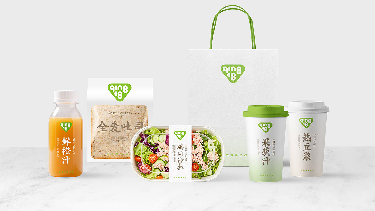
品牌标志以极简的三角形图案呈现,代表品牌的核心产品“三明治”的基本形态,使得品牌不仅在外观上具有辨识度,更传达出一种文化传承与创新融合的情感,文字呼应“QING 18”的品牌名称。简洁有力的图形语言,使品牌形象在各种应用场景下都能保持高度的识别度。
The brand logo is presented in a minimalist triangular pattern, representing the basic form of the brand's core product "sandwich", which not only gives the brand recognition in appearance, but also conveys an emotional fusion of cultural heritage and innovation. The text echoes the brand name "QING 18". The concise and powerful graphic language enables the brand image to maintain a high degree of recognition in various application scenarios.


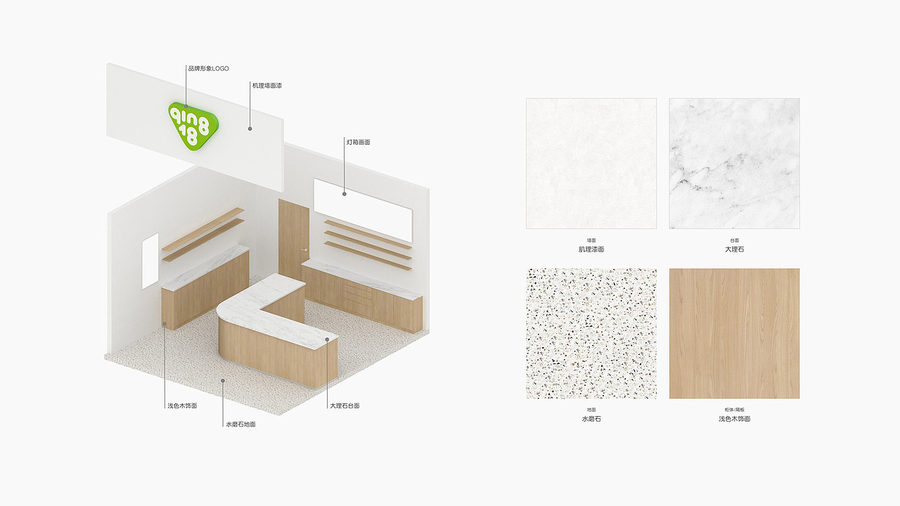
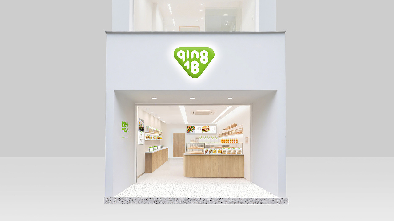
品牌形象店面与品牌视觉语言一致,在设计上保持极度克制,在图形、字体、配色上不断做减法,目的是为了消费者把更多的注意力聚焦在“产品”本身,去设计化本身也是一个很大的挑战,不断在取舍中权衡。
简洁的视觉语言,便于品牌快速有效的传播,视觉应用上也能保持品牌形象的统一性和完整性,能最大限度的兼容不同面积大小的店面,快速复制。
The brand's image storefront is consistent with the brand's visual language, and extreme restraint is maintained in design. Subtractions are made in graphics, fonts, and color schemes in order to focus more attention on the "product" itself for consumers. Designing itself is also a great challenge, constantly balancing choices.
A concise visual language facilitates the rapid and effective dissemination of the brand, while also maintaining the unity and integrity of the brand image in visual applications. It can be maximally compatible with storefronts of different sizes and can be quickly replicated.


绽放鲜美生活
Qing 18 Light Food
6
Report
声明
13
Share
相关推荐


in to comment
Add emoji
喜欢TA的作品吗?喜欢就快来夸夸TA吧!
推荐素材


You may like


相关收藏夹


Log in
6Log in and synchronize recommended records
13Log in and add to My Favorites
评论Log in and comment your thoughts
分享Share