SONGAD WORKS|作品精选

北京/设计爱好者/1年前/349浏览
版权
SONGAD WORKS|作品精选
01 弦上茶 Teaphonic
为弦上茶品牌进行品牌升级,对原有图形进行优化调整,更改文字与图形之间的关系,在新形象的设计中,更加突出品牌的图形属性,并针对包装进行了重点系统化调整与升级。以奢侈品的调性对茶品牌进行品牌塑造,突出高订属性,新图形配合新包装系统的应用,让图形在品牌的成长中更具传播性和记忆点。
For the brand upgrade of Xianshang Tea, the original graphics were optimized and adjusted, and the relationship between text and graphics was changed. In the design of the new image, the graphic attributes of the brand were more highlighted, and key systematic adjustments were made to the packaging. upgrade. The tea brand is branded with the tone of luxury goods, highlighting the high-end attributes. The new graphics are combined with the application of the new packaging system to make the graphics more communicable and memorable in the growth of the brand.


02 陈萨 专辑设计
以古典乐传统的手写乐谱为设计理念,用烫印叠加印刷的形式,试图重现老乐谱的历史质感,让文化所代表的人文属性与古典乐的历史属性相结合。
Taking the traditional handwritten music scores of classical music as the design concept, the team attempts to reproduce the historical texture of the old music scores by using hot stamping and overlay printing, so as to combine the humanistic attributes represented by culture with the historical attributes of classical music.


03 POSTWAVE BREWING
包装摒弃传统啤酒的设计思维,提出“约等号”的超级符号与浪相结合,作为品牌的视觉主导,恰当的将厚浪与约等于的概念相融合,表达出“厚浪,约等于......”的品牌逻辑。并在包装的整体上尽可能的干净,贯彻出约等的纯粹性。
The packaging abandons the traditional design thinking of beer and proposes the combination of the supersymbol of "about equal sign" and the wave as the visual dominant of the brand. It appropriately integrates the concepts of thick waves and about equal, expressing the brand logic of "thick waves, about equal to...". And as clean as possible in the overall packaging, embodying the purity of equality.


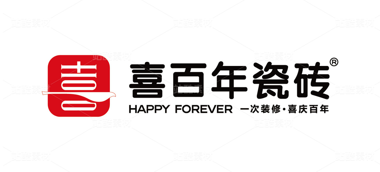
04 HESHENG
标志以一条绿色渐变线段贯穿始末,四条黑色线段与绿色线段的交织,以穿插的形式表现首字母“H”,与编织的相交概念,将禾生的四个主题以抽象的形式予以贯穿、交融,同时绿色线段不仅作用于图形部分,亦延伸至字母图形中,一抹绿色也将作为品牌核心色贯穿整个品牌形象构建。
The logo is characterized by a green gradient line running through the entire logo. The interweaving of four black and green lines expresses the initial letter "H" in an interlaced form, and the concept of weaving intersections, which runs through and blends the four themes of Hesheng in an abstract form. At the same time, the green line not only acts on the graphic part, but also extends to the letter graphics. A touch of green will also serve as the brand's core color throughout the entire brand image.


05 天物-甲辰生龍
为天物艺术中心龙年展览所创作的龙形装置,与其视觉海报,其龙形装置皆以圆形构成,以达到呼应天物主标志的作用,也是作为天数艺术中心开馆的装置之一。
The dragon-shaped installation created for the TIANWU Year of the Dragon exhibition and its visual poster are both circular in shape to echo the TIANWU main logo and is also one of the installations for the opening of TIANWU.


06 TIANWU COFFEE
天物咖啡作为天物 的子品牌而又非独立品牌,需要在不脱离天物原有风格的前提下进行品类相关创意,在品牌形式上选用纯文字标的方式,让其与天物产生最直接的关联,其风格仍继承天物品牌字的竖窄结构,突出两个品牌的关联性,其创意部分融入传统水墨的晕染效果,让整体在硬朗的结构下凸显出水性的神韵。
As Tianwu Coffee is a sub-brand of Tianwu but not an independent brand, it needs to carry out category-related creativity without departing from the original style of Tianwu. It uses a pure text logo in the brand form to make it most directly related to Tianwu. The style still inherits the vertical and narrow structure of Tianwu brand characters, highlighting the correlation between the two brands. Its creative part incorporates the smudge effect of traditional ink, allowing the whole to highlight the water-based charm under the tough structure.


07 YAWNING COBRA
品牌位于纽约的一家“暗门酒吧”,为贴合其行业属性,与品牌名所寓意的“打瞌睡的蛇!”,故以“贪吃蛇”为创意点,以马赛克的手法设计出一条追逐酒杯的蛇的形象,将蛇固有的锋利感、邪恶感转换为一种诙谐、风趣,又有些怀念的憨酷形象,反映出暗门酒吧特有的独特、年轻与吸引力。
The brand is located in a "secret door bar" in New York. In order to fit its industry attributes and the "sleeping snake!" implied by the brand name, it takes "snake greedy" as the creative point and designs a chasing bar with mosaic techniques. The image of the snake in the wine glass transforms the snake's inherent sense of sharpness and evil into a humorous, funny, and nostalgic cool image, reflecting the uniqueness, youth and attractiveness of the secret door bar.


08 THREE CLOUDS
三朵云,小众茶品牌,顾名思义一朵三瓣的云,主张回归自然,提倡本真,热水泡生茶,茶上一缕白,如天边一抹云。
Three clouds, a minority tea brand, as the name implies, a three-petal cloud, advocating the return to nature, to advocate the true, hot bubbles of tea, tea on a wisp of white, such as a cloud on the horizon.


09 YARDCOM
标志创作将院半“半山、半水、半生活”的理念以隐性的手法巧妙的融入图形中,将自然界最原始的设计元素“河石”,作为标志的主体元素,将流水的从容与河石的圆润包容相结合,通过设计将汉字“山”作为骨架,将水、石、山三种自然依存元素进行结合,从而引出院半自然东方的美学属性,图形采用国际化简约设计,去繁留简回归本源,同时又是“半”字的上半部分,将半字作为隐性元素结合在图形中。
The logo creation cleverly integrates the concept of "half mountain, half water, half life" of YARDCOM into the graphic in an implicit way, and uses the most primitive design element in nature, "river stone", as the main element of the logo, combining the calmness of flowing water with the roundness and tolerance of river stone. Through the design, the Chinese character "山" is used as the skeleton, and the three naturally dependent elements of water, stone and mountain are combined, thus bringing out the natural oriental aesthetic attributes of YARDCOM. The graphic adopts an international minimalist design, removing complexity and returning to the origin. At the same time, it is the upper part of the word "半", and the word "半" is combined into the graphic as a hidden element.


10 MENGDU
标志将极具安徽代表的迎客松元素进行几何化,以抽象干练的元素替代迎客松的复杂线条,以年轻化、扁平化的形式来适应时代的快速变化,品牌标准字用轻松流畅的笔触形式对字体进行风格改造,让整体透露出一种生活气息,配合图形让整体更加轻松、松弛。
The logo geometricizes the welcoming pine elements that are very representative of Anhui, replacing the complex lines of the welcoming pine with abstract and capable elements, and adapts to the rapid changes of the times with a younger and flat form. The brand standard characters are relaxed and smooth. The style of the font is modified in the form of strokes to give the whole a sense of life, and the graphics make the whole more relaxed and relaxed.


11 梦都会 MENGDUHUI
标志舍弃了原有的图形元素,从更具传播认知的文字着手,摒弃了原先的设计字体,回归传统,从经典着手,选用隶书的框架,从传统汉碑中提取,并保留残破的效果,任其保留历时的痕迹,并具有承载更多人文气息的条件,让品牌具有传承感的同时更加符合品牌新阶段的发展。
The logo abandoned the original graphic elements and started with words that are more communicative. It abandoned the original design font and returned to tradition. It started from the classics and chose the framework of official script, which was extracted from traditional Han steles and retained the broken effect. , allowing it to retain the traces of time and have the conditions to carry more humanistic atmosphere, giving the brand a sense of heritage and being more in line with the new stage of brand development.


12 久逢 JIUFENG
久逢陈酿,久别与重逢,遂图形创意以仙鹤为出发点,期许友谊的长久延年,又赋予其杯中酒的极简现代手法为呈现,文字参考古时楷书神韵,让现代的图形带入传统的公式中,两者相辅,不过于形式又不过于传统的新时代中式白酒品牌。
After a long time of aging, long separation and reunion, the graphic design takes the crane as the starting point, expects the long-lasting friendship, and gives the wine in the cup a minimalist and modern way of presentation. The text refers to the charm of ancient regular script, and brings modern graphics into the In the traditional formula, the two complement each other, a new era Chinese liquor brand that is neither too formal nor too traditional.


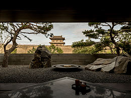
13 朴居 PUJU TEA SPACE
品牌位于杭州,“杭州最高的茶空间!”,在繁华的现代都市中的一所古朴茶空间,“三人成行,以茶会友!”,以朴素、笨拙的手法设计出一个神似房屋的图形,打造繁华忙碌下的庇护所,以与茶最无关的元素,来设计最朴素的茶空间。
The brand is located in Hangzhou, "the highest tea space in Hangzhou!", a simple tea space in the bustling modern city, "three people go together, meet friends with tea!", design a graphic that looks like a house in a simple and clumsy way , to create a shelter under the bustling and busy, and design the simplest tea space with the most irrelevant elements of tea.


14 XIANGNAN558
品牌位于上海,襄阳南路的一家顶级私宅,标志由抽象化的襄南两字组合而成,由横竖线分散排列组成,襄南两字的呈现,犹如建筑与水的倒影,整体结构突出建筑的解构与对称,体现标志与建筑的稳定性。
The brand is located in Shanghai, a top-level private residence on Xiangyang South Road. The logo is composed of the abstract two characters Xiangnan, which are composed of scattered horizontal and vertical lines. The presentation of the two characters is like the reflection of buildings and water. Deconstruction and symmetry reflect the stability of signs and buildings


15 WILLIAM NUVOL
意大利家具具有丰厚的历史根源,罗马作为意大利的首都,是世界著名的历史文化名城。该标志巧妙地运用威廉云尚的英文中的两个首字母“w”和“n”组合成为罗马时代的拱形门造型,是一种致敬,也形成了一个家族符号,体现出皇家贵族的古典气息,整体厚重有力又不失细节装饰,同时具备奢侈品图案的张力。配合柔而不圆的标准字,照映体现出品牌自然柔和的品牌属性。
Italian furniture has rich historical roots. As the capital of Italy, Rome is a world-famous historical and cultural city. The logo cleverly combines the two initials "w" and "n" in English by William Yunshang to form an arched door in the Roman era. Classical atmosphere, the whole is thick and powerful without losing the detailed decoration, and at the same time, it has the tension of luxury patterns. With the soft but not round standard characters, it reflects the natural and soft brand attributes of the brand.


文字翻译来源于谷歌翻译
Text translation comes from Google Translate
4
Report
声明
4
Share
相关推荐


in to comment
Add emoji
喜欢TA的作品吗?喜欢就快来夸夸TA吧!
推荐素材


You may like


相关收藏夹


Log in
4Log in and synchronize recommended records
4Log in and add to My Favorites
评论Log in and comment your thoughts
分享Share