
武汉/UX设计师/1年前/202浏览
版权
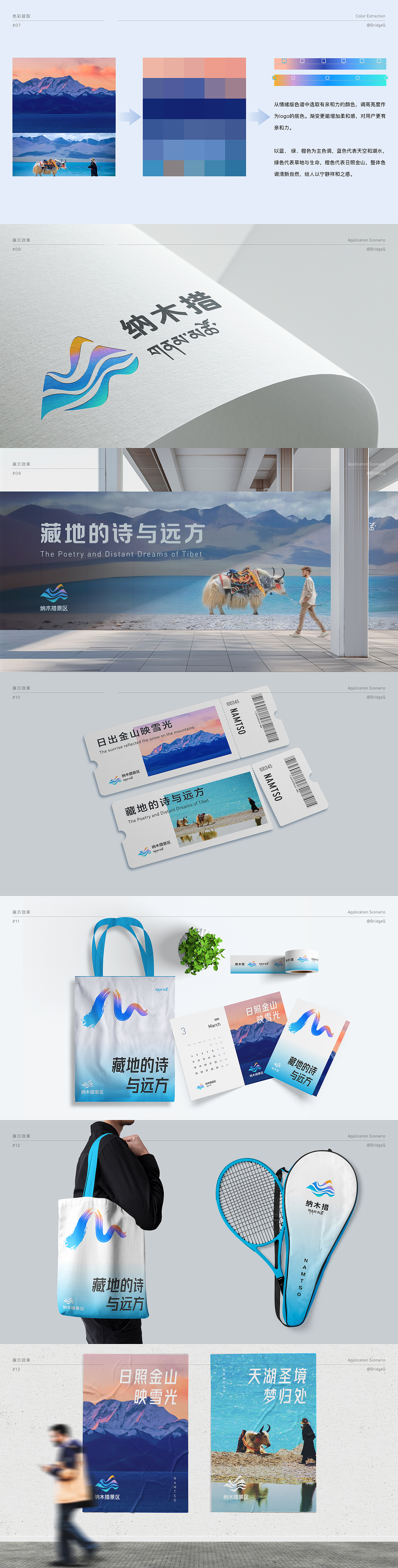
设计理念:
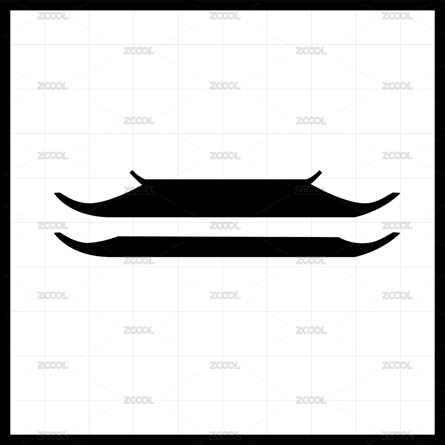
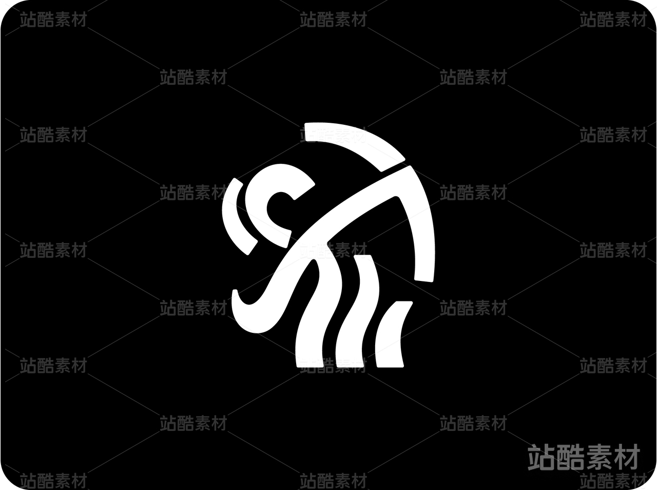
Logo本身采用灵动的波纹状构成念青唐古拉山与纳木措湖山水一色,交相辉映,山涧的风,浮动着的图案,在游览者心中泛起丝丝涟漪,不只是风景,更是心境,人与自然,天人合一。
整体构图:
采用灵动流畅的波纹线条,勾勒出念青唐古拉山雄伟壮丽的轮廓,山峰连绵起伏,与下方纳木措湖的碧波荡漾相映成趣,形成山水一体的和谐画面。
波纹线条由近及远,逐渐扩散,象征着山涧清风拂过湖面,泛起层层涟漪,营造出一种宁静悠远、心旷神怡的意境。
细节设计:
- 山峰:线条粗细变化,突出山体的层次感和立体感,部分线条可融入藏式纹样元素,体现地域文化特色。
- 湖水:采用渐变色彩,从浅蓝到深蓝,模拟湖水在不同光线下的色彩变化,增添动感。
- 涟漪:以同心圆的形式向外扩散,线条逐渐变细,最终融入背景,象征着人与自然和谐共生的理念,以及游览者内心的感悟与升华。
色彩搭配:
以蓝、 绿、橙色为主色调,蓝色代表天空和湖水,绿色代表草地与生命,橙色代表日照金山,整体色调清新自然,给人以宁静祥和之感。
设计寓意:
- Logo :以念青唐古拉山和纳木措湖为设计元素,展现了西藏壮丽的自然风光和独特的文化魅力。类似笔触的行云流水,灵动自由的波纹线条运用,不仅象征着山水的灵动之美,更寓意着人与自然和谐共生的理念,以及游览者内心的感悟与升华。
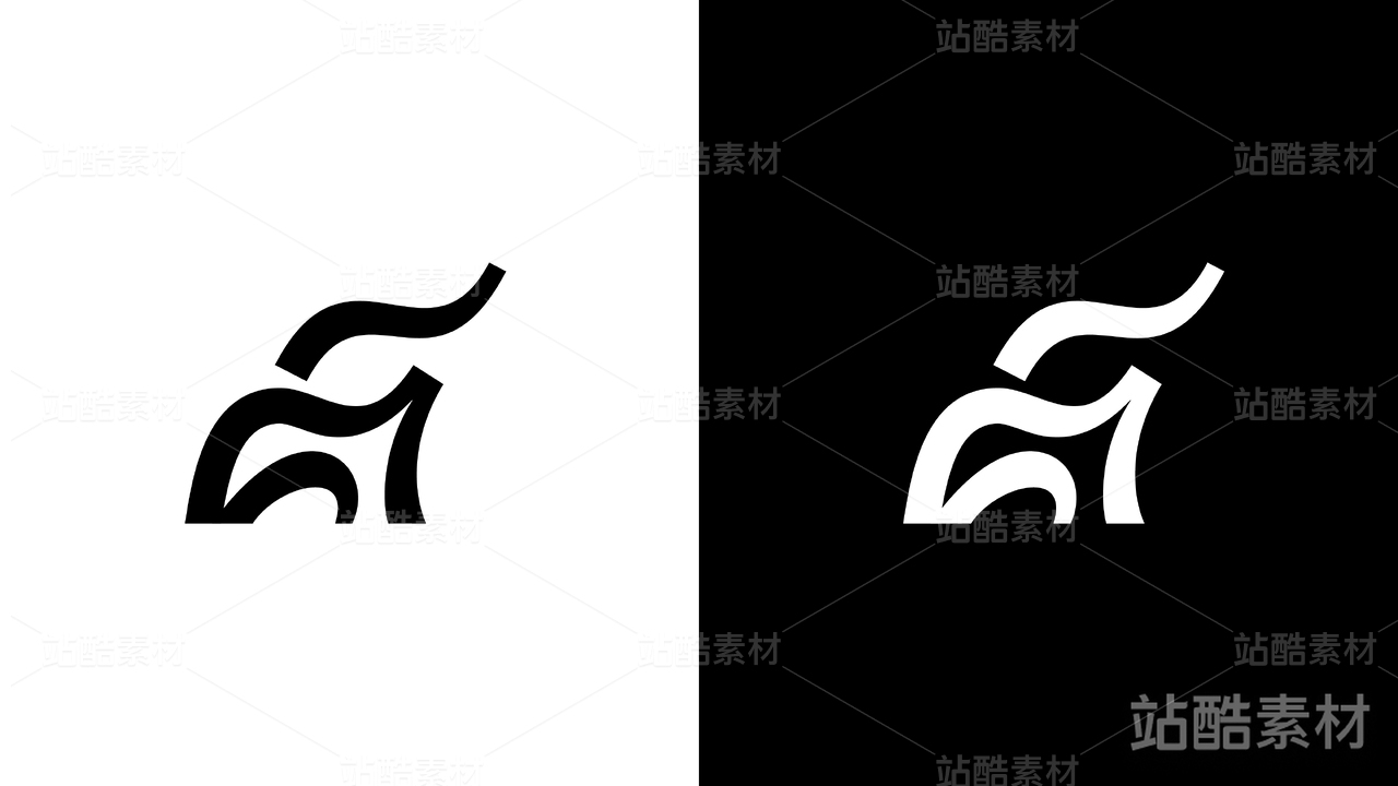
- 辅助图形:流动的山脉图案形似纳木措的英文名称首字母“N”,Logo 整体设计简洁大气,寓意深刻,易于识别和传播,能够很好地代表纳木措旅游形象。
Design Guidelines:
The logo itself adopts a dynamic, wavy pattern to depict the seamless integration of the Nyenchen Tanglha Mountains and Namtso Lake, where the mountains and waters reflect each other in harmony. The mountain breeze and the floating patterns create ripples in the hearts of visitors, evoking not just a scenic view but also a state of mind—a unity of humanity and nature, heaven and earth.
Overall Composition:
The design employs fluid and graceful wavy lines to outline the majestic contours of the Nyenchen Tanglha Mountains. The undulating peaks complement the shimmering waves of Namtso Lake below, forming a harmonious landscape where mountains and waters are united.
The wavy lines spread from near to far, symbolizing the mountain breeze gently brushing the lake's surface, creating layers of ripples. This evokes a sense of tranquility, vastness, and mental relaxation.
Detailed Design:
- Mountains: The varying thickness of the lines highlights the layered and three-dimensional quality of the mountain range. Some lines incorporate Tibetan patterns, reflecting the regional cultural identity.
- Lake: A gradient color scheme, transitioning from light to dark blue, simulates the changing hues of the lake under different lighting conditions, adding a sense of dynamism.
- Ripples: Concentric circles radiate outward, with lines gradually thinning and blending into the background. This symbolizes the harmony between humans and nature, as well as the visitors' inner reflections and spiritual elevation.
Color Palette:
The primary colors are blue, green, and orange. Blue represents the sky and lake, green symbolizes grasslands and life, and orange depicts the golden sunlight on the mountains. The overall palette is fresh and natural, conveying a sense of peace and serenity.
Design Symbolism:
The logo, featuring the Nyenchen Tanglha Mountains and Namtso Lake, showcases the magnificent natural scenery and unique cultural charm of Tibet. The flowing, brushstroke-like wavy lines not only represent the beauty of the landscape but also symbolize the harmony between humans and nature, as well as the visitors' inner reflections and spiritual growth.
Auxiliary Graphics:
The flowing mountain patterns resemble the letter "N," the first letter of "Namtso" in English. The overall logo design is simple yet profound, easy to recognize and disseminate, making it an excellent representation of Namtso's tourism image.


3
举报
声明
2
分享
相关推荐


评论你的想法~
表情
喜欢TA的作品吗?喜欢就快来夸夸TA吧!
推荐素材


你可能喜欢


相关收藏夹


登录注册
3登录即可同步推荐记录哦
2登录即可加入我的收藏
评论登录即可评论想法
分享分享