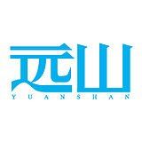
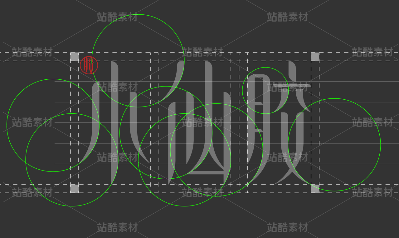
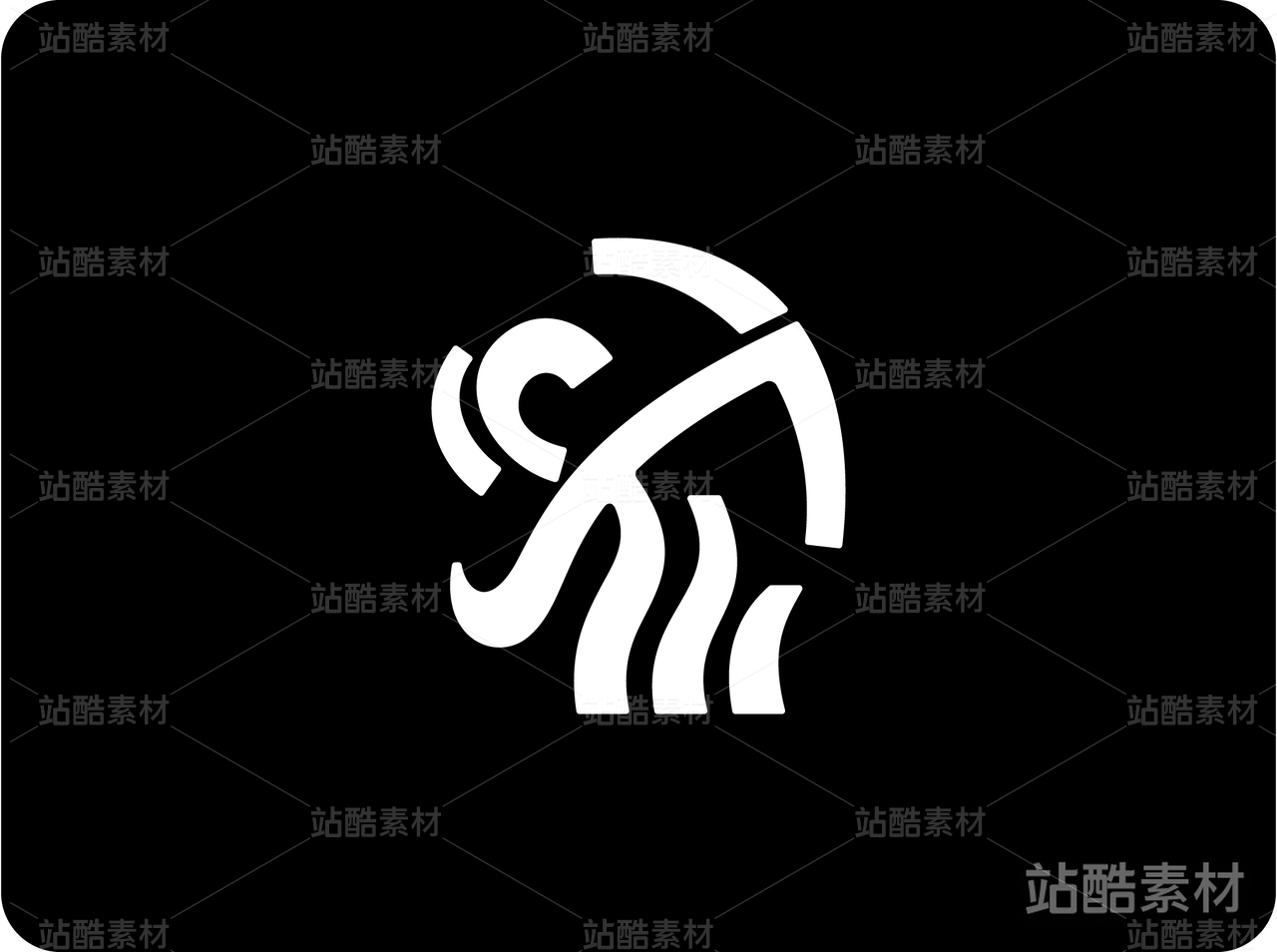
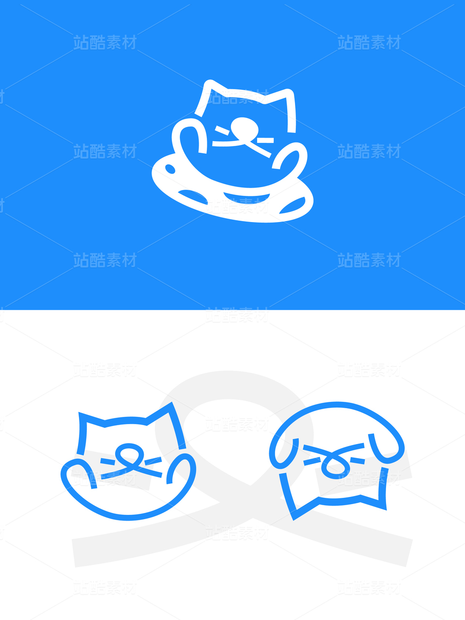
都家客水站logo设计

深圳/平面设计师/2年前/890浏览
版权
都家客水站logo设计
作者:设计师二哈
ERHA Design
项目简介:
一个有想法年轻化的水站品牌标志
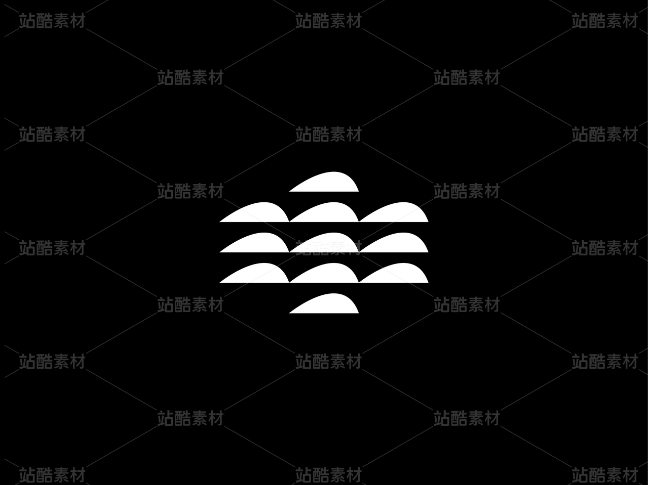
此次的水站Logo以水泡的形状为设计灵感,象征着清新、活力和纯净。它的圆润和流畅描绘出水的柔和和包容,不仅呈现了水站的行业特征,也体现了我们的品牌理念。
颜色上,我们选择了象征水的纯净蓝色,既表达了我们对水质清洁度的严格要求,又具有强烈的视觉冲击力,有效地凸显出我们与竞争对手的差异。
这个Logo不仅是我们品牌的象征,更是我们对提供高质量、健康水源的承诺的具体体现。我们的目标是创造一个既年轻化又充满活力的水站品牌形象,让每一滴水都充满活力。
A brand logo for a water station with a youthful idea
The logo of the water station is inspired by the shape of a water bubble, which symbolizes freshness, vitality and purity. Its roundness and smoothness depict the softness and inclusiveness of the water, which not only presents the industry characteristics of the water station, but also reflects our brand philosophy.
In terms of color, we chose pure blue, which symbolizes water, which not only expresses our strict requirements for water cleanliness, but also has a strong visual impact, effectively highlighting the difference between us and our competitors.
This logo is not only a symbol of our brand, but also a concrete embodiment of our commitment to providing high-quality, healthy water. Our goal is to create a brand image of a water station that is both young and vibrant, so that every drop of water is full of vitality.


17
举报
声明
11
分享
相关推荐


评论你的想法~
表情
喜欢TA的作品吗?喜欢就快来夸夸TA吧!
推荐素材


你可能喜欢


相关收藏夹


登录注册
17登录即可同步推荐记录哦
11登录即可加入我的收藏
评论登录即可评论想法
分享分享