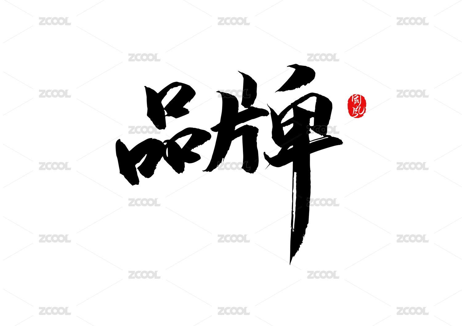
《無虑酒吧》|品牌设计

大连/艺术工作者/3年前/715浏览
版权
《無虑酒吧》|品牌设计
《無虑酒吧》|品牌设计
作者:范翘儿 金子琪 纪程棋
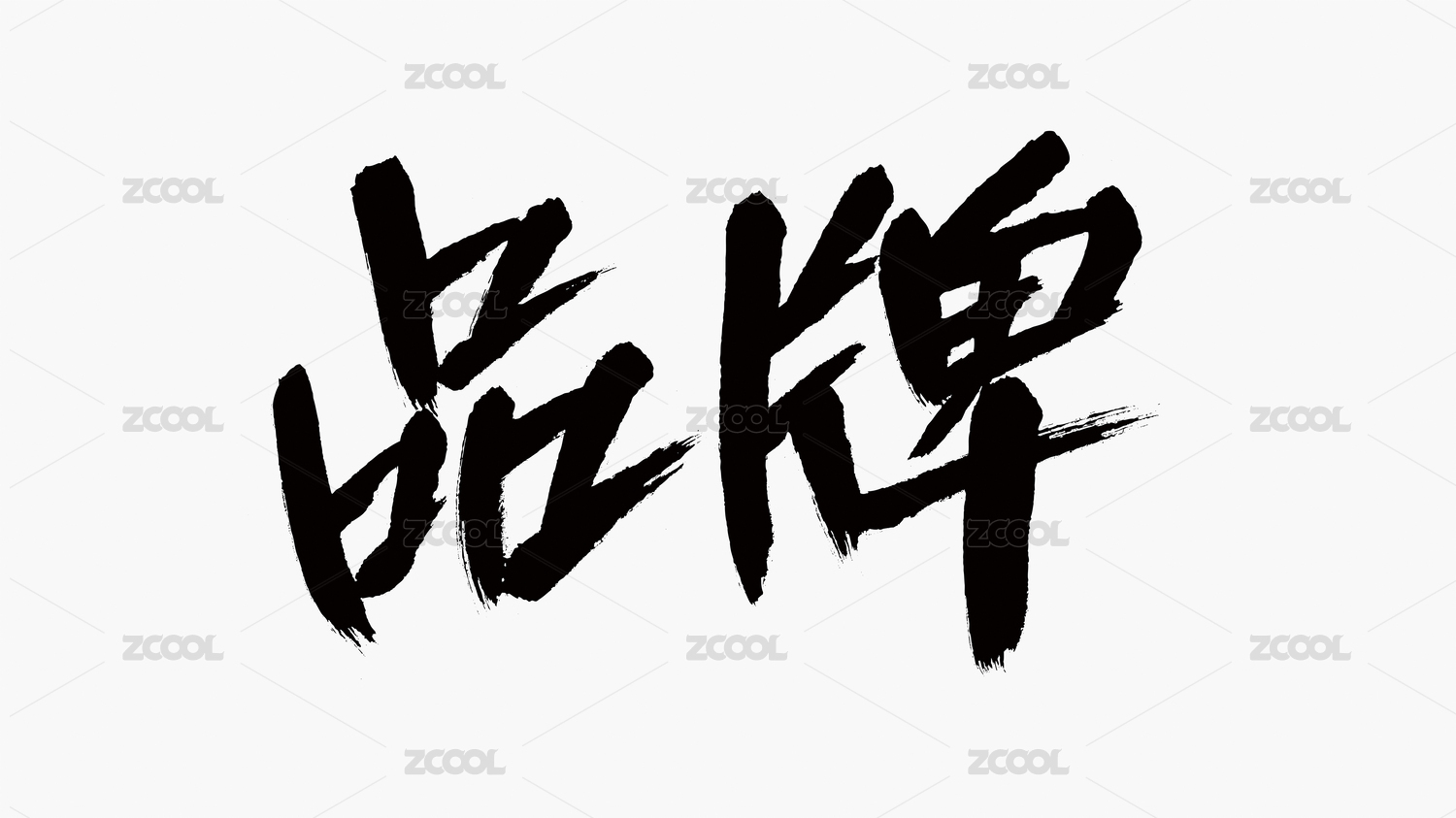
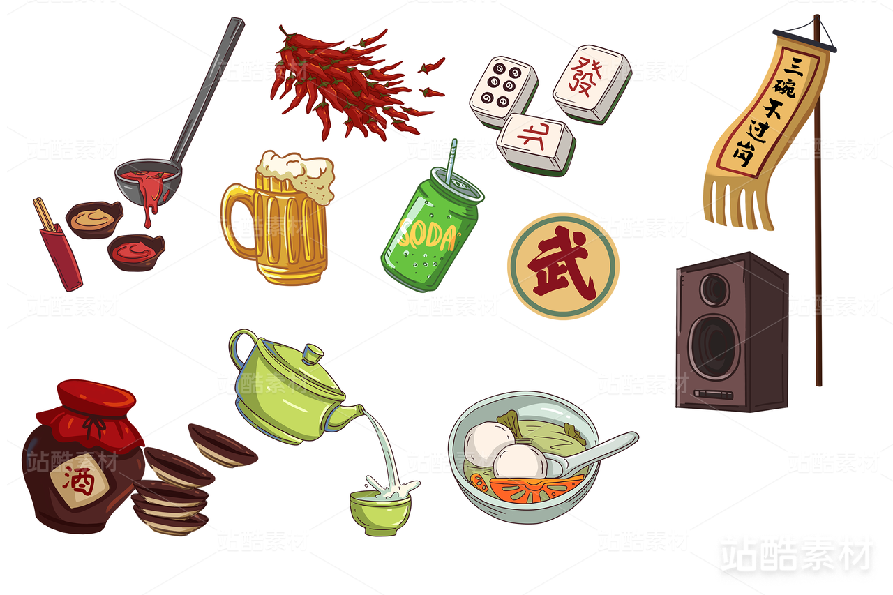
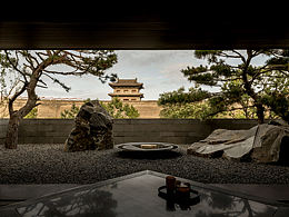
设计理念:此套品牌设计,是采用医巫闾山满族剪纸的传说和元素,与酒吧品牌相交融的,形象采用传说中的嬷嬷人形象,以剪纸的风格搭配夜店风的造型,突出酒吧的整体形象,生动活泼,具有感染力。其中为其酒吧的营销设计了宣传海报、酒瓶包装、灯牌、工作牌、手环、纸巾、扑克牌和整体的现场布置装置等。颜色采用黑、红的配色,红色是剪纸的代表色,搭配黑色,神秘炫酷,医巫闾山满族剪纸自古传达着无虑、美好的寓意,无虑酒吧的主旨更是带给大家快乐,能够在这感受到无忧无虑的精神世界,忘掉烦恼,甩掉包袱,做更加轻松的自我。
指导教师:刘亚璇
禁止盗用、商用、二改
《Carefree Bar》|Brand Design
Author:Qiaoer Fan、Ziqi Jin、Chengqi Ji
Design concept:This set of brand design is based on the legend and elements of the Manchu paper-cut in LVshan, integrating with the bar brand. The image uses the image of the Mammy in the legend, and the style of paper-cut is matched with the style of the nightclub, highlighting the overall image of the bar, which is lively and contagious. For its bar marketing design of publicity posters, bottle packaging, lights, work cards, bracelets, paper towels, playing cards and the overall site layout device. The color is black and red. Red is the representative color of paper cutting, which is mysterious and cool when paired with black. Since ancient times, the Manchurian paper-cutting conveys a careless and beautiful meaning in our country.
Instructor: Yaxuan Liu
Prohibit misappropriation, commercial use, and secondary modification


6
Report
声明
15
Share
相关推荐


in to comment
Add emoji
喜欢TA的作品吗?喜欢就快来夸夸TA吧!
推荐素材


You may like


相关收藏夹


Log in
6Log in and synchronize recommended records
15Log in and add to My Favorites
评论Log in and comment your thoughts
分享Share