OLIGO - 洋槐蜂蜜包装

杭州/平面设计师/3年前/11041浏览
版权
OLIGO - 洋槐蜂蜜包装
OLIGO希望消费者在享受产品的同时能够感受到的不仅是甜蜜的滋味,更能体会到品牌主张的一种融入了健康与自然的生活方式。
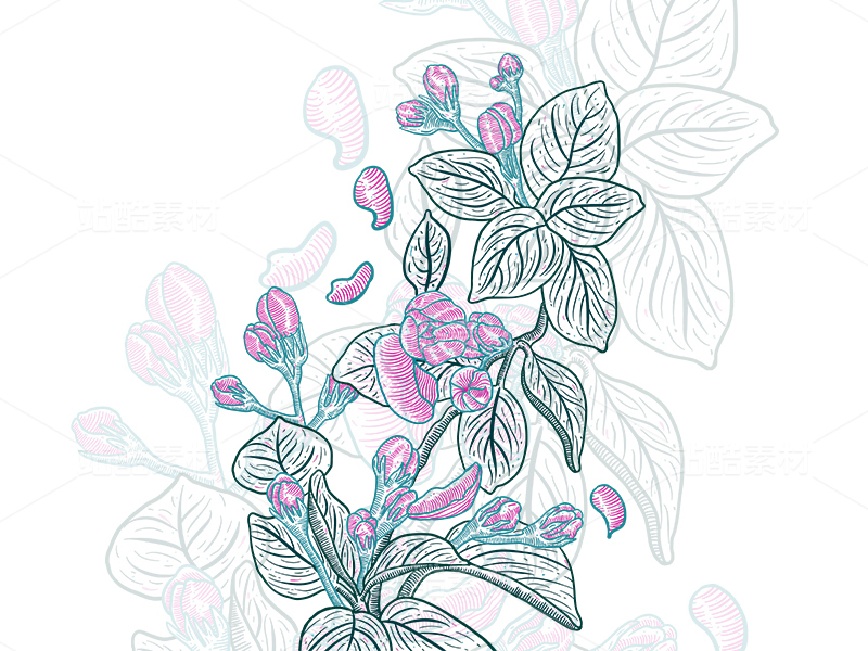
整体视觉设计遵循简约与高识别性为首要原则,我们将品牌的首要成分信息转化为简明清晰的卖点,呈现品牌的干净与专业性。图形设计中我们摒弃了多余的装饰语言,以一个简化提炼出的蜂巢图形作为OLIGO的品牌图形符号,在简约的品牌形象上增添一丝生动与形象。
Oligo hopes that when consumers enjoy the products, they can not only feel the sweet taste, but also realize that the brand brings a way of companionship that integrates health and nature.
The brangding visual design follows the main principles of simplicity and high identification. We transform the primary ingredient information of the brand into a concise and clear selling point, presenting the brand clean and professional. In the graphic design, we abandon the redundant decorative language, and use a simplified and extracted honeycomb figure as the brand graphic symbol of Oligo, which adds a bit of vividity and image to the simple brand image.
DESIGNER: Xu Ye
YEAR: 2022.10
© TWOPTWODESIGN, INC.


95
举报
声明
389
分享
相关推荐


评论你的想法~
表情
喜欢TA的作品吗?喜欢就快来夸夸TA吧!
推荐素材


你可能喜欢


相关收藏夹


登录注册
95登录即可同步推荐记录哦
99+登录即可加入我的收藏
评论登录即可评论想法
分享分享