CULTUREA I 文韵社

广州/平面设计师/100天前/692浏览
版权
CULTUREA I 文韵社
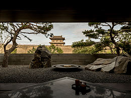
“CULTUREA 文韵社”这个名字本身就极具张力,是中西、古今的融合。LOGO的视觉是“形”,而品牌文案就是“神”。我们要追求的“境界”,应该是 “于方寸之间,见天地古今” 的从容与深厚。
The name "CULTUREA Wenyun Society" itself is highly dynamic, a fusion of Chinese and Western cultures, ancient and modern. The visual aspect of a logo is' form ', while brand copy is' spirit'. The 'realm' we should pursue should be the calmness and profundity of 'seeing the past and present of heaven and earth in every inch'.


25
Report
声明
12
Share
相关推荐


![[A CORNER] 高端艺术创作画室 - 品牌识别&包装设计](https://img.zcool.cn/community/69e1a1d55896afsnv65il96480.png?x-oss-process=image/resize,m_fill,w_520,h_390,limit_1/auto-orient,1/sharpen,100/quality,q_80)


in to comment
Add emoji
喜欢TA的作品吗?喜欢就快来夸夸TA吧!
推荐素材


You may like


相关收藏夹


Log in
25Log in and synchronize recommended records
12Log in and add to My Favorites
评论Log in and comment your thoughts
分享Share