湾区国际短片展VI

深圳/设计爱好者/279天前/52浏览
版权
湾区国际短片展VI

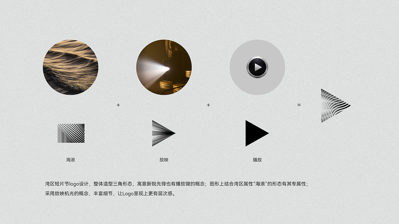
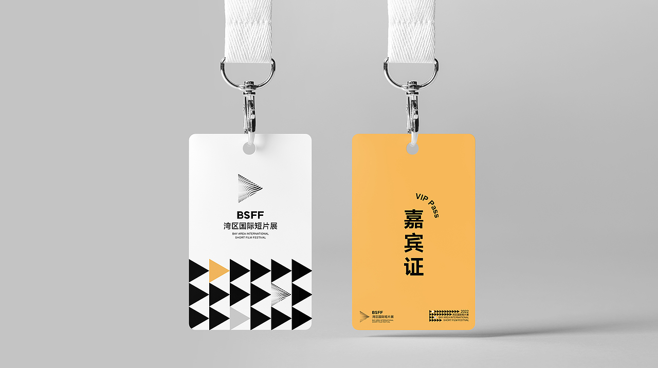
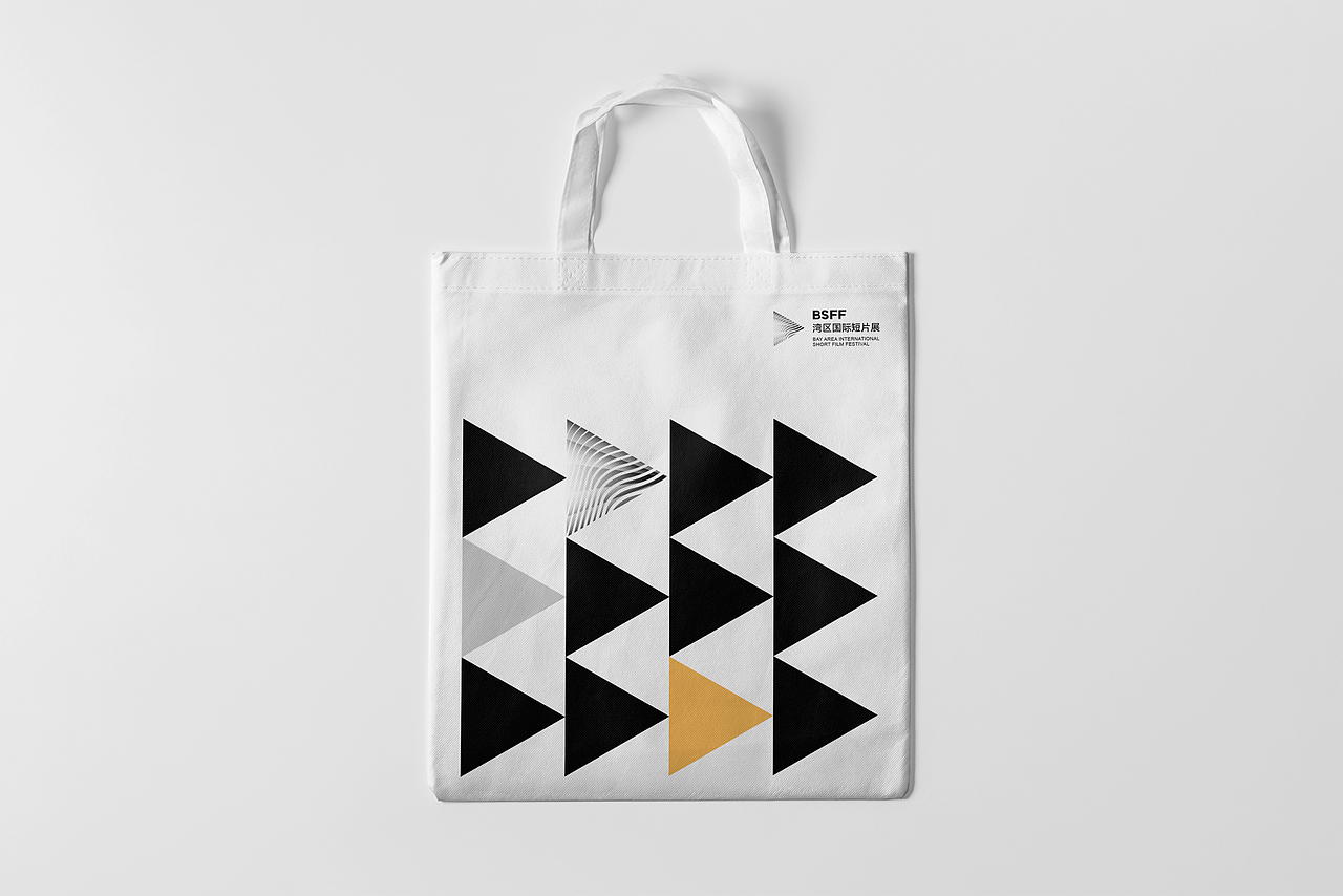
品牌设计的创意点来源于三角形播放按钮,既包含短片艺术在湾区启动之意,又如箭头般指向短片展和影视产业的无限未来。黑色三角形提取海浪的核心元素,由流动的曲线组成,在流形的视觉效果下创造“浪潮”的形态,寓意短片展“再造一个新浪潮”。醒目的黄色加强了色彩的对比,与流动的三角形相互结合成快进播放按钮,以视觉的融合传达短片展对于湾区和时代的核心定位及价值。
The brand design takes inspiration from a triangle-shaped play button, meaning the kickoff of this event and the infinite future of the short film festival and the film industry. The black triangle with flowing curves extracts the core element of the wave, creating a visual wave effect and signifying that a new trend will be created by this short film show. The flowing triangle with a tone of striking yellow resembles a fast forward play button, showing the core position and value of the short film festival to the Greater Bay Area and the era.


0
Report
声明
收藏
Share
相关推荐


in to comment
Add emoji
喜欢TA的作品吗?喜欢就快来夸夸TA吧!
推荐素材


You may like


相关收藏夹


Log in
推荐Log in and synchronize recommended records
收藏Log in and add to My Favorites
评论Log in and comment your thoughts
分享Share