BIRU BIRU/BRAND VISUAl DESIGN

成都/平面设计师/318天前/6615浏览
版权
BIRU BIRU/BRAND VISUAl DESIGN
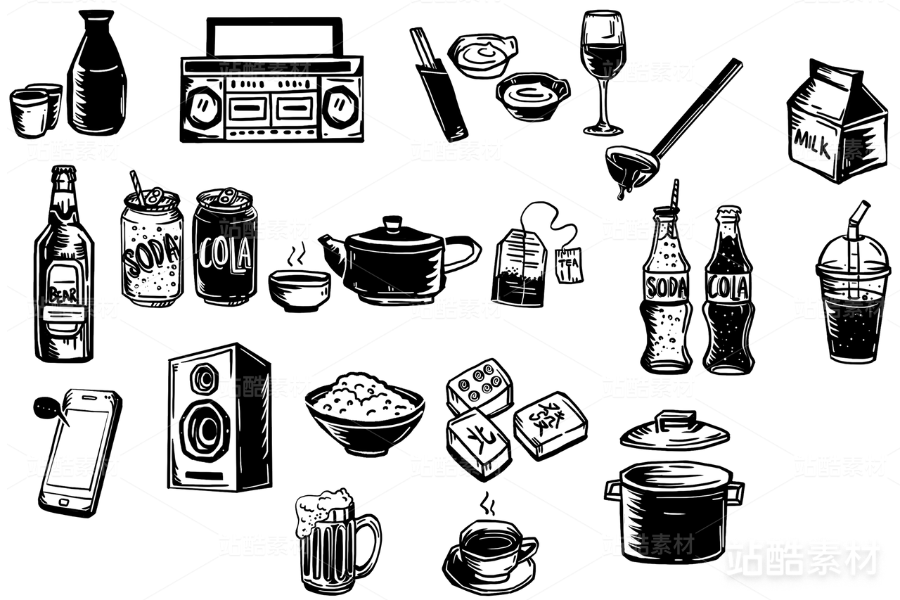
Biru Biru 的设计起于日语“ビール(啤酒)”的发音,将拉丁字母与假名「び」巧妙重组,使“ī”和“u”成为跨语言的视觉符号。几何字体的理性被抽象手绘的随性线条搅动,密密麻麻的文字幻化为跳跃的趣味纹理,就像啤酒里冒出的气泡般生动活泼,Biru Biru 带来一口轻松好玩的愉悦。 The design of Biru Biru is inspired by the Japanese pronunciation “ビール” (beer), cleverly combining Latin letters with the kana character 「び」, turning “ī” and “u” into cross-lingual visual symbols. The structured geometric type is playfully stirred by abstract hand-drawn lines, transforming dense text into lively, playful textures—like bubbles rising in a glass of beer. Biru Biru delivers a sip of lighthearted, joyful fun.


90
举报
声明
96
分享
相关推荐


评论你的想法~
表情
喜欢TA的作品吗?喜欢就快来夸夸TA吧!
推荐素材


你可能喜欢


相关收藏夹


登录注册
90登录即可同步推荐记录哦
96登录即可加入我的收藏
评论登录即可评论想法
分享分享