CHAIKU/BRAND VISUAl DESIGN

成都/平面设计师/1年前/7232浏览
版权
CHAIKU/BRAND VISUAl DESIGN
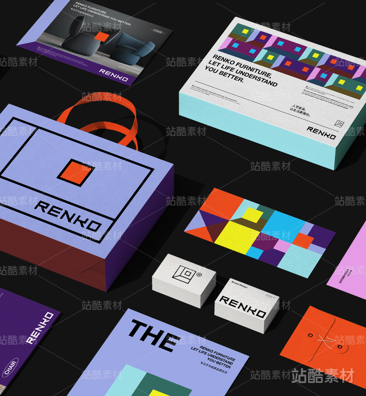
两个色块构成一套泰式奶茶品牌设计CHAIKU
CHAIKU 用最简单的几何色块,玩出了最有意思的品牌风格。两个色块碰撞在一起,就像泰国街头的热闹与奶茶的香气混合,每一块颜色都像是味蕾上的小惊喜。从包装到菜单,处处都是巧思。极简不仅纯粹,还让品牌更大胆,每一杯茶都更有个性、更有趣。 CHAIKU uses the simplest geometric color blocks to create a uniquely playful brand style. The two colors collide, blending the vibrant energy of Thai streets with the rich aroma of milk tea—each block feels like a little surprise for the taste buds. From packaging to menus, every detail is thoughtfully designed. Minimalism is not just about purity; it also makes the brand bolder, giving every cup of tea more personality and fun.


192
举报
声明
210
分享
相关推荐


评论你的想法~
表情
喜欢TA的作品吗?喜欢就快来夸夸TA吧!
推荐素材


你可能喜欢


相关收藏夹


登录注册
99+登录即可同步推荐记录哦
99+登录即可加入我的收藏
评论登录即可评论想法
分享分享