rong

上海/设计爱好者/207天前/30浏览
版权
rong

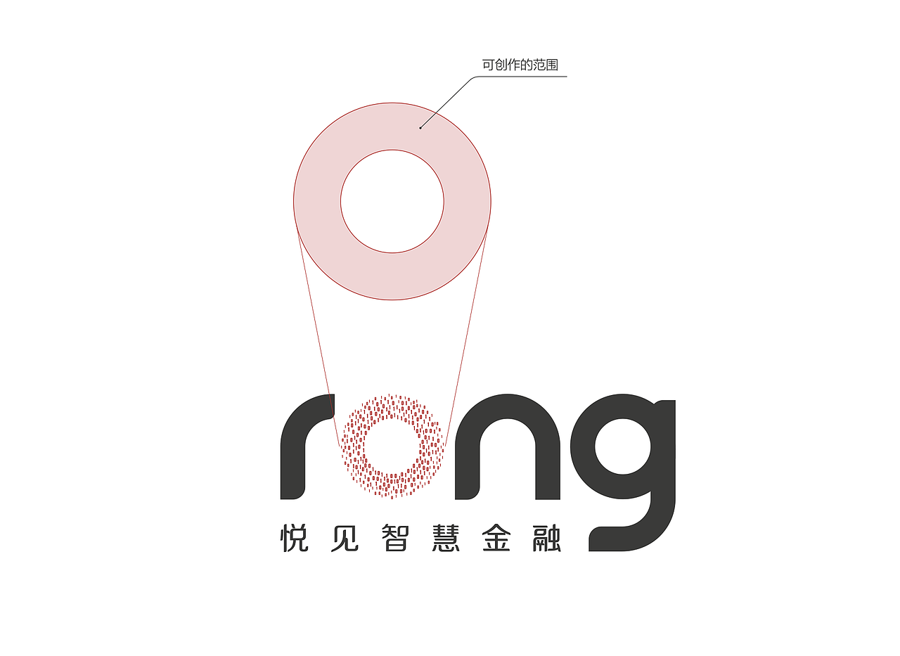
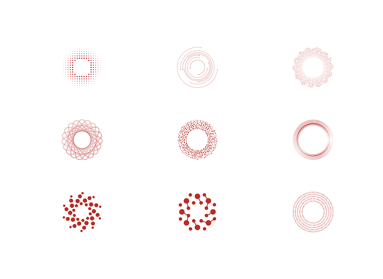
RONG品牌的打造利用圆这个概念,并且连超级符号的演绎,动态语言等方面都极其相似。LOGO rong的设计从科技与金融的关系出发,提出全新理念:“Ecosphere(生态圈),突出强调字母“o”,它与生态圈的理念不谋而合;所有的字母都圆角的呈现方式,与东方证券辅助图形的圆角呼应。
The creation of the RONG brand utilizes the concept of circles, and even the interpretation of super symbols, dynamic language, and other aspects are extremely similar. The design of LOGO Rong starts from the relationship between technology and finance, proposing a new concept: "Ecosphere", highlighting the letter "o", which coincides with the concept of Ecosphere; The presentation of all letters with rounded corners echoes the rounded corners of the auxiliary graphics of Oriental Securities.


2
Report
声明
收藏
Share
相关推荐


in to comment
Add emoji
喜欢TA的作品吗?喜欢就快来夸夸TA吧!
推荐素材


You may like


相关收藏夹


Log in
2Log in and synchronize recommended records
收藏Log in and add to My Favorites
评论Log in and comment your thoughts
分享Share