gulugulu椰子水 品牌视觉升级
北京/设计爱好者/1年前/2109浏览
版权
gulugulu椰子水 品牌视觉升级
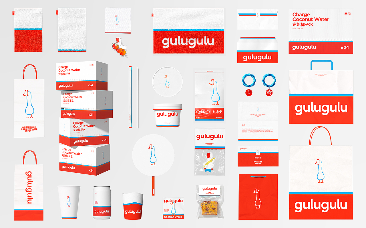
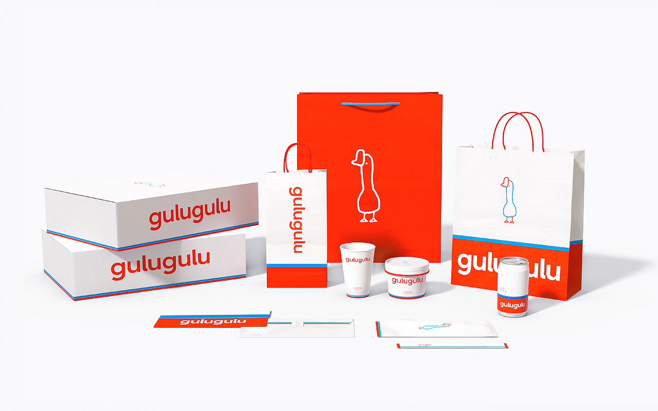
在于gulugulu合作中我们试图从品牌过往的沉淀资产中寻找专属品牌本身的视觉语言,ICON BRANDING 是我们首个联想到的方法论。将品牌最重要的资产“红蓝线条鹅”与椰子水的消费者触点结合,“清爽可口的椰子水咕噜咕噜的大口饮用”是我们对这个赛道品类的美好幻想。我们提取品牌资产的色彩比例,避免过于童稚化的品牌形象创造了条状的色块系统迎合“线条鹅”的用户记忆,并且在应对新消费茶饮行业,频繁的联名、活动物料上该视觉ICON也能够被无限的延伸铺开,形成系列感强烈、品牌ICON、统一且精彩的“清爽演绎”。
In our collaboration with Gulugulu, we endeavored to discover the exclusive visual language inherent to the brand from its accumulated assets. ICON BRANDING was the first methodology that came to mind. By merging the brand's paramount asset, the "red and blue lined goose," with consumer touchpoints related to coconut water, we envisioned a delightful fantasy for this category: "Refreshing and delicious gulping down of coconut water." We extracted the color proportions from the brand assets, avoiding an overly childish brand image, and created a block-like color system that caters to the memory of the "lined goose" for users. Moreover, in addressing the emerging tea beverage industry and frequent collaborations and event materials, this visual ICON can be endlessly extended, forming a strongly cohesive, brand ICON, unified, and captivating "refreshing interpretation."
46
Report
声明
91
Share
相关推荐
in to comment
Add emoji
喜欢TA的作品吗?喜欢就快来夸夸TA吧!
You may like
相关收藏夹
Log in
46Log in and synchronize recommended records
91Log in and add to My Favorites
评论Log in and comment your thoughts
分享Share


