
重庆/平面设计师/2年前/155浏览
版权
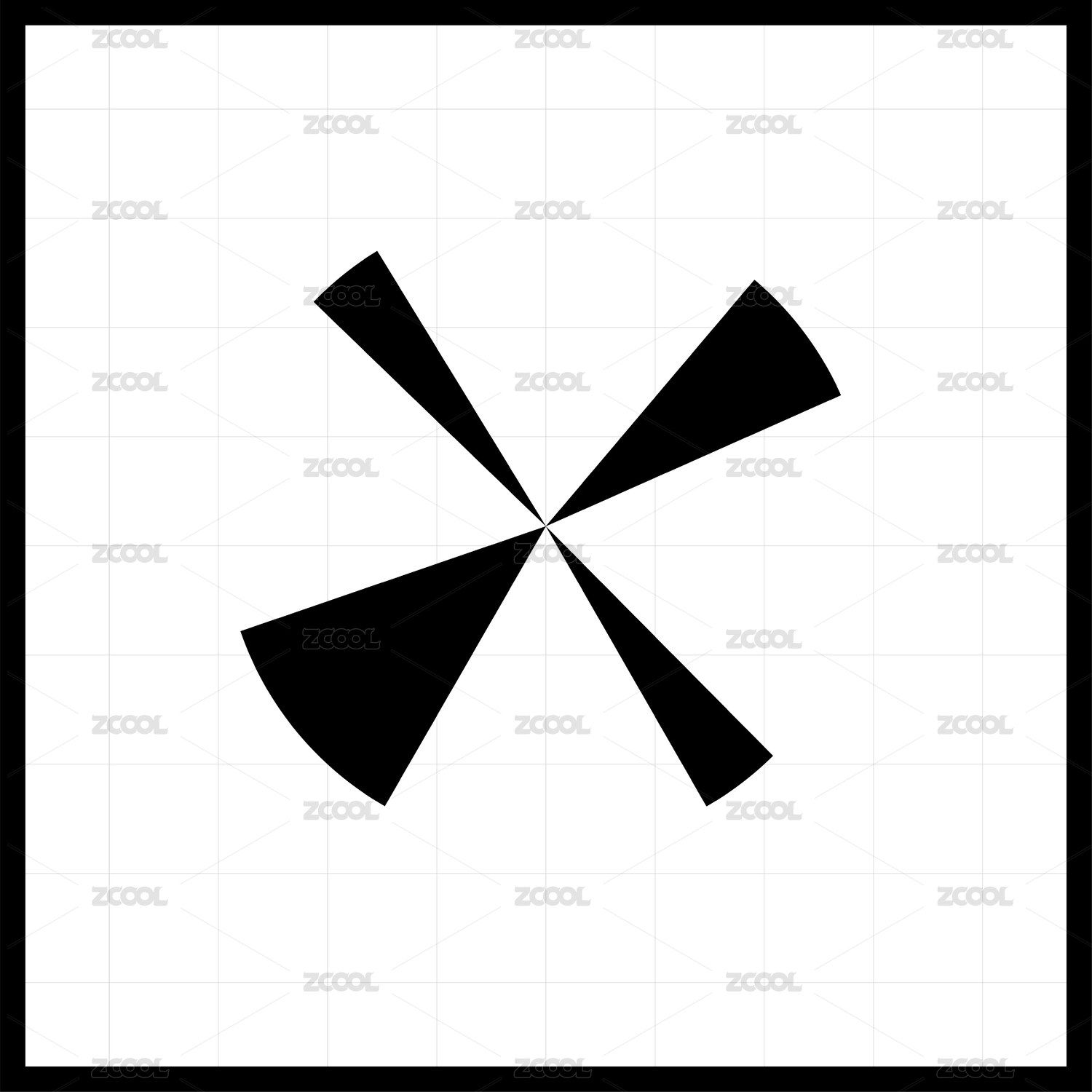
*何享健科学基金LOGO采用趣味性的视觉效果方式呈现。
*以何享健先生的何字首字母和几何体为基础进行抽像设计手法上的演变,组合而成的LOGO内意味着科研发展道路会一路盛放,结出为人类有益的科研成果。
*标志主色采用了蓝色,也象征着蓝色的科技感,充满无限的想象力。
————
The LOGO of Heung Kin Science Foundation is presented in an interesting visual way.
The evolution of abstract design techniques based on HE Xianjian's initials and geometries means that the path of scientificdevelopment will blossom all the way to the fruits of scientific research beneficial to mankind.
The main color of the logo is blue, which also symbolizes the scientific sense of blue and is full of infinite imagination.


0
举报
声明
1
分享
相关推荐


评论你的想法~
表情
喜欢TA的作品吗?喜欢就快来夸夸TA吧!
推荐素材


你可能喜欢


相关收藏夹


登录注册
推荐登录即可同步推荐记录哦
1登录即可加入我的收藏
评论登录即可评论想法
分享分享