包装设计|羽衣甘蓝粉系列

成都/设计爱好者/2年前/5952浏览
版权
包装设计|羽衣甘蓝粉系列
Package Design©
-
创作灵感|Inspiration
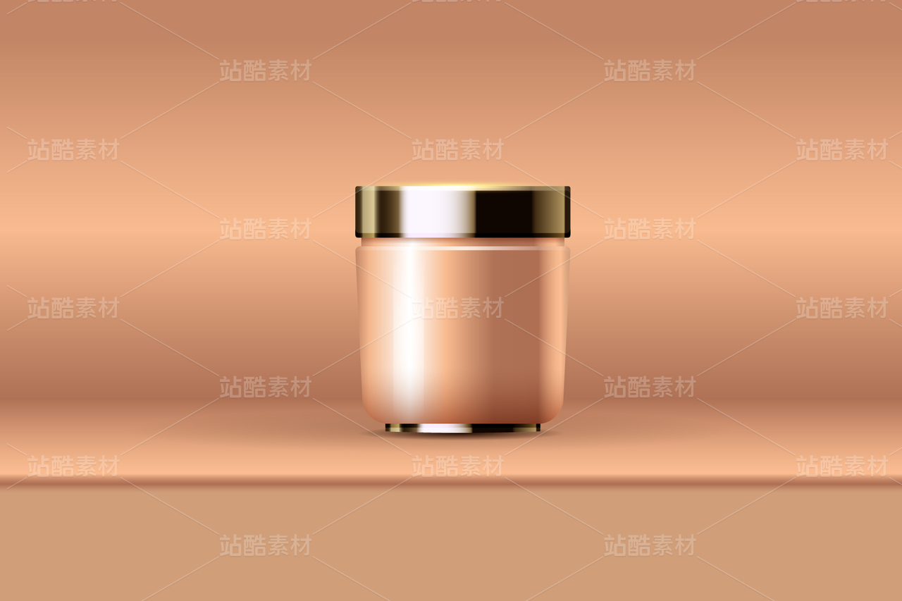
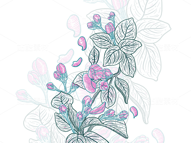
希望通过此次包装设计,将自然之美展现出来,让消费者在每一次使用羽衣甘蓝粉时都能感受到大自然的呵护和馈赠。因此,选择了清新的绿色作为主色调,以突出产品的来源和特点。同时,在包装设计中加入了绿叶图案和纹理,让整个包装呈现出生机勃勃的感觉。
除了绿色元素,还注重包装的简约和现代感。现代消费者更倾向于简约清爽的包装设计,因此避免了过多的繁复元素,追求简洁大方。同时,也添加了一些现代感的设计元素,让包装更具吸引力。
本次从三个方向入手,设计了3款包装,以下仅做展示
I hope to showcase the beauty of nature through this packaging design, so that consumers can feel the care and gift of nature every time they use kale powder. Therefore, fresh green was chosen as the main color tone to highlight the source and characteristics of the product.


62
举报
声明
223
分享
相关推荐


评论你的想法~
表情
喜欢TA的作品吗?喜欢就快来夸夸TA吧!
推荐素材


你可能喜欢


相关收藏夹


登录注册
62登录即可同步推荐记录哦
99+登录即可加入我的收藏
评论登录即可评论想法
分享分享