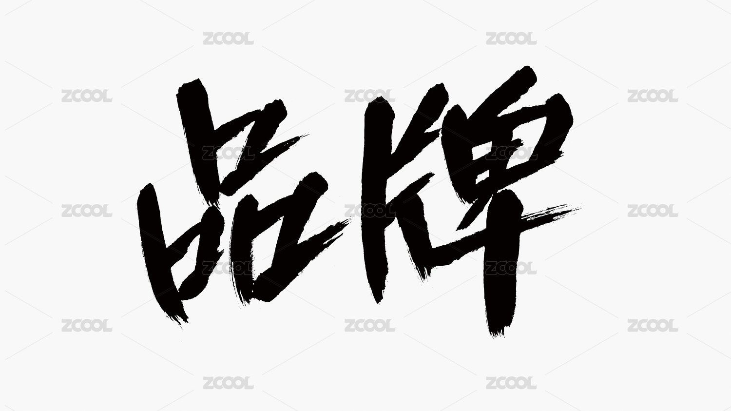
徐来 LIKE THE WIND 品牌设计

济南/平面设计师/2年前/110浏览
版权
徐来 LIKE THE WIND 品牌设计
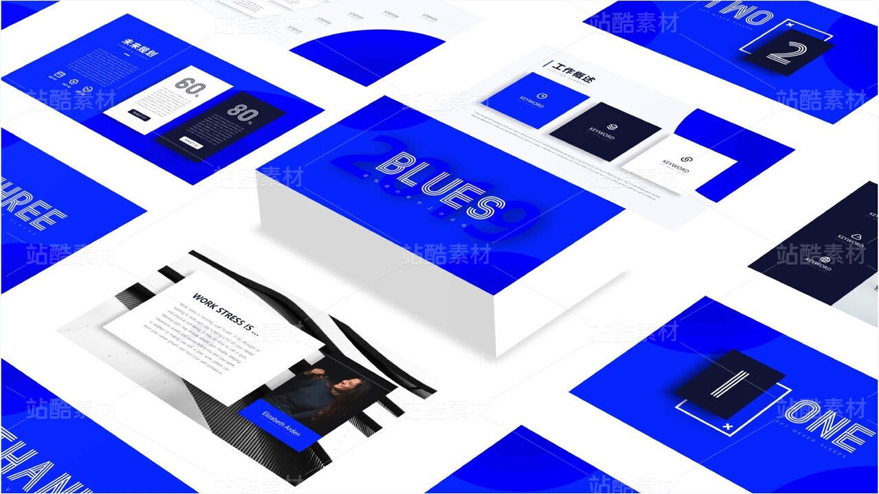
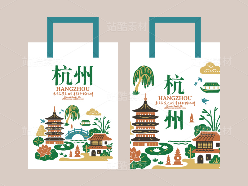
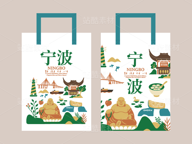
徐来品牌面包的包装设计简约而不失特色,注重突出产品的特点与品质。包装简约让消费者可直接感受产品。品牌标志采用简洁字体和代表性图案,突出产品特色。宣传使用高质量图片配以简洁文字,展示产品特色和优势。通过精心设计,徐来品牌面包将以独特形象和高品质产品吸引消费者关注,激发购买欲望。
The packaging design of Xu Lai brand bread is simple yet distinctive, focusing on highlighting the characteristics and quality of the product. The simple packaging allows consumers to directly experience the product. The brand logo uses simple fonts and representative patterns to highlight the product features. The promotion uses high-quality images with concise text to showcase the product's characteristics and advantages. Through careful design, Xu Lai brand bread will attract consumers' attention with a unique image and high-quality products, stimulating their purchasing desire.


1
Report
声明
1
Share
相关推荐


in to comment
Add emoji
喜欢TA的作品吗?喜欢就快来夸夸TA吧!
推荐素材


You may like


相关收藏夹


Log in
1Log in and synchronize recommended records
1Log in and add to My Favorites
评论Log in and comment your thoughts
分享Share