
贵阳/平面设计师/2年前/128浏览
版权
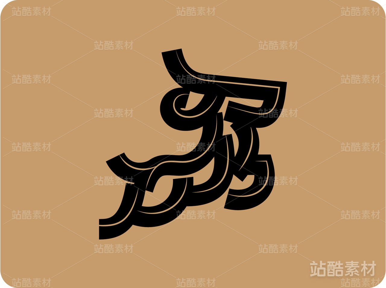
标志创意从英文People首字母“P”出发,以螺旋曲线的形式通过32.5度旋转而来。People to people,不同地域、不同肤色、不同文化、不同信仰的人,2024,我们相聚于此。人与人的交流,心与心的碰撞,共同促进发展。其中,十一条弧线代表美丽的中国和东盟十国,象征不同国家的人们手搭手,凝聚向心,共筑繁荣。而十一种颜色的汇聚代表着各国多元文化的交融,文化大团结。
The logo idea starts from the initial letter "P" in English, in the form of a spiral curve through 32.5 degrees of rotation. People to people, people of different regions, different colors, different cultures and different beliefs, 2024, we are here together. People-to-people exchanges, heart-to-heart collisions, and joint efforts to promote development. Among them, 11 arcs represent the beautiful China and the ten ASEAN countries, symbolizing that people of different countries join hands, unite toward the heart, and build prosperity together. The convergence of 11 colors represents the integration of diverse cultures and cultural unity of various countries.


1
Report
声明
2
Share
相关推荐


in to comment
Add emoji
喜欢TA的作品吗?喜欢就快来夸夸TA吧!
推荐素材

You may like


相关收藏夹


Log in
1Log in and synchronize recommended records
2Log in and add to My Favorites
评论Log in and comment your thoughts
分享Share