BUTCHER | 咖啡品牌设计

杭州/平面设计师/2年前/153浏览
版权
BUTCHER | 咖啡品牌设计
BUTCHER | 咖啡品牌设计
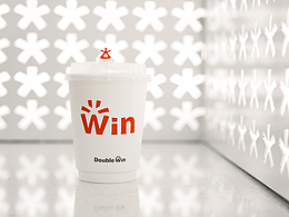
Butcher意为屠夫或刽子手,所以在品牌设计中,我们提炼了关于「冷峻」「冷艳」的元素,选用了深灰色与暖白色作为主色调,图案造型上也选用了相对锐利的处理方式 同时我们注意到了咖啡与酒精自带的社交属性以及咖啡厅与酒吧作为社交空间的存在,在辅助图形上增加了膨胀圆润的效果,同时选用亮色表现人与人的链接关系,分解重构后碰撞出新的奇妙效果。
Butcher it means butch-er or executioner, so in brand design, we have refined the concept of 'coldness'The element of 'cold and gorgeous' is chosen with dark gray and warm white as the main colors, and the pattern design is also relatively sharp We also noticed the social attributes inherent in coffee and alcohol, as well as the interaction between coffee shops and bars To enhance the presence of social spaces, an expansive and rounded effect has been added to auxiliary graphics, while bright colors are used to represent people and The link relationship of people, after decomposition and reconstruction, collides to create new and wonderful effects。
「 已商用 」


1
Report
声明
2
Share
相关推荐


in to comment
Add emoji
喜欢TA的作品吗?喜欢就快来夸夸TA吧!
推荐素材


You may like


相关收藏夹


Log in
1Log in and synchronize recommended records
2Log in and add to My Favorites
评论Log in and comment your thoughts
分享Share