品牌|Black Drop Bakery

深圳/平面设计师/2年前/98浏览
版权
品牌|Black Drop Bakery
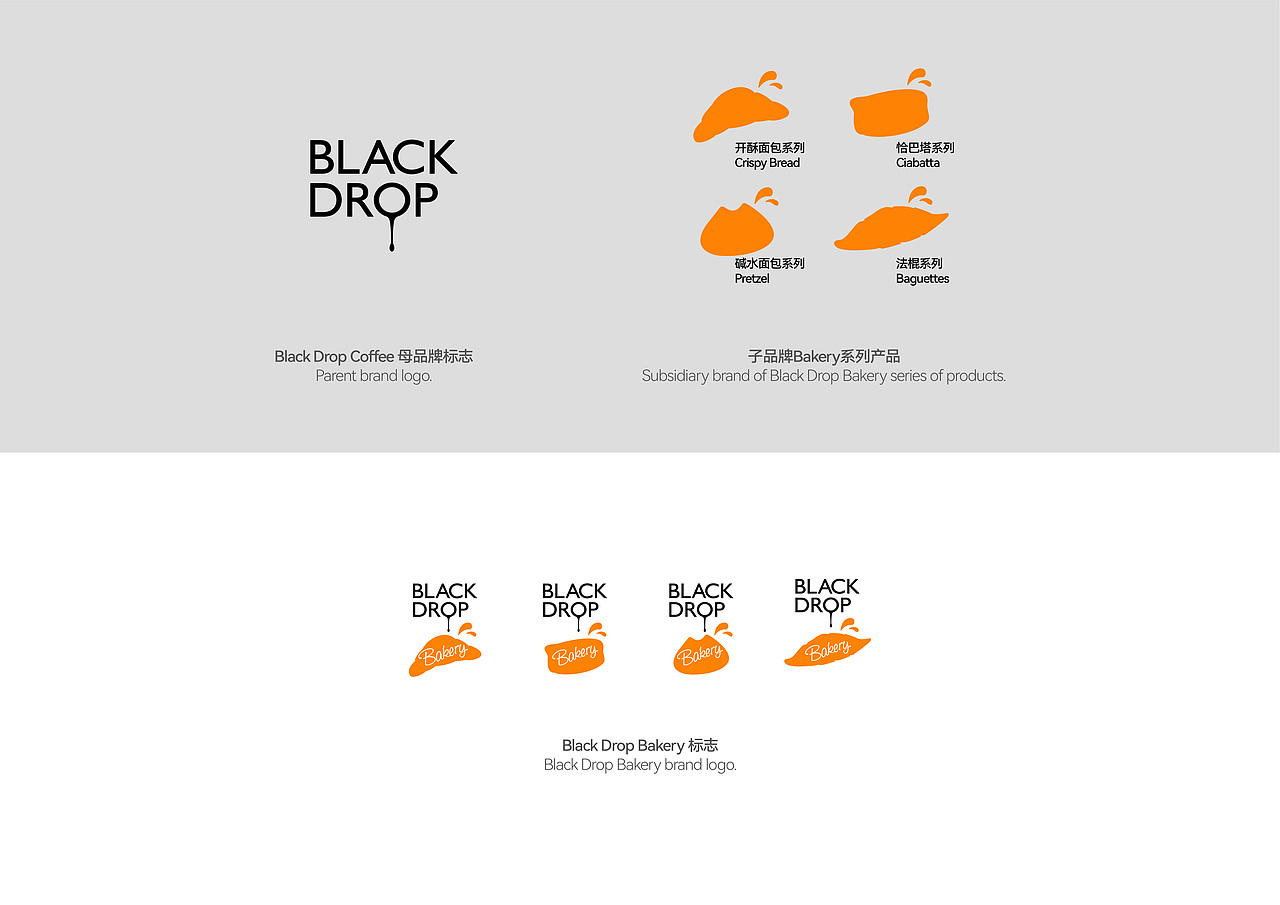
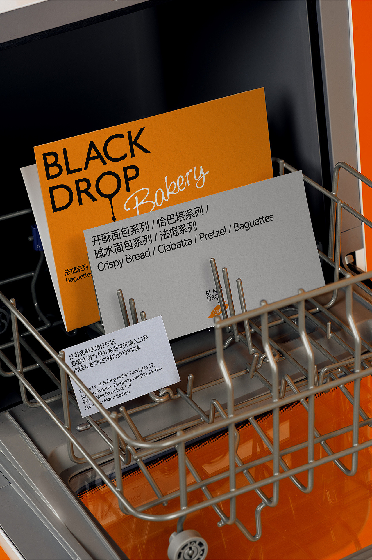
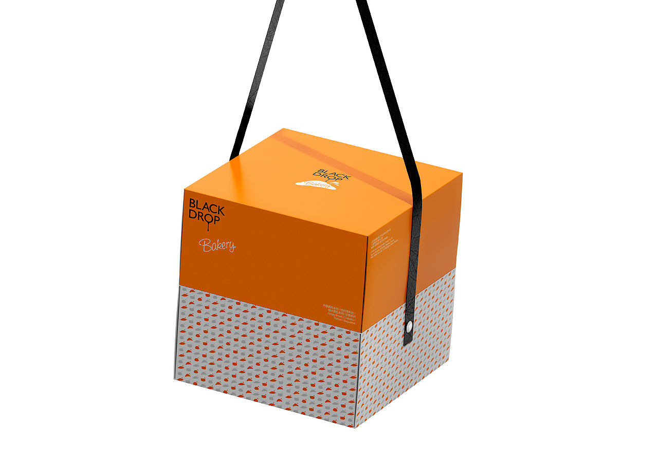
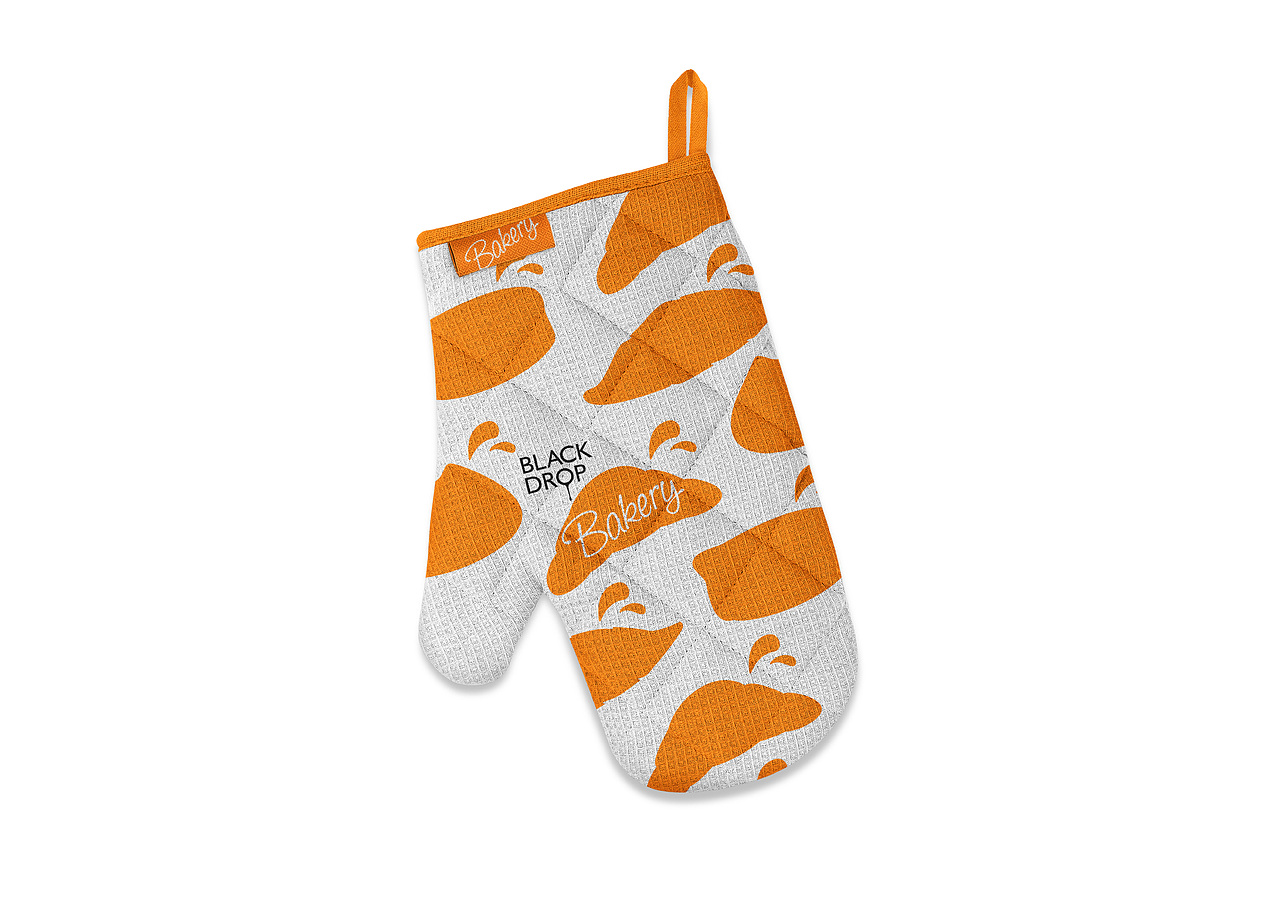
如何将子母品牌在视觉表现中,既能够巧妙地融合在一起,又能很好地传达它们之间的关系?为了解决母品牌Black Drop与Black Drop Bakery支线品牌之间的关系,又能传达品牌之间独特的品牌个性,将Bakery支线品牌中的四大类别产品变成四个图形,加入液体溅起的图形元素,与母品牌标志上下结构组合构成动态感的标志:就像Black Drop滴下来的液体组成了新的Bakery支线品牌,不仅传达了品牌“新鲜、活力、年轻化”的理念,同时也传达了Black Drop Bakery是属于Black Drop的衍生品牌之间的关系。四个类别产品图形都可作为标志,不但增加了品牌活力和趣味,而且良好的产品分类能够让消费者找到自己喜欢的口味。
How can the parent and sub-brands be skillfully integrated and the relationship between them be conveyed well in the visual representation? In order to solve the relationship between the parent brand Black Drop and the Black Drop Bakery branch brand, and to convey the unique brand personality between the brands, the four major categories of products in the Bakery branch brand were changed into four graphics, and liquid splashing graphics were added. Elements, combined with the upper and lower structure of the parent brand logo, form a dynamic logo: just like the liquid dripping from Black Drop, it forms the new Bakery branch brand, which not only conveys the brand’s concept of “freshness, vitality, and youthfulness”, but also conveys Black Drop Bakery is a relationship between spin-off brands belonging to Black Drop. The four categories of product graphics can be used as logos, which not only increases brand vitality and interest, but also good product classification allows consumers to find their favorite flavors.
-
Design:小盆地
Client:Black Drop Bakery


0
Report
声明
1
Share
相关推荐


in to comment
Add emoji
喜欢TA的作品吗?喜欢就快来夸夸TA吧!
推荐素材


You may like


相关收藏夹


Log in
推荐Log in and synchronize recommended records
1Log in and add to My Favorites
评论Log in and comment your thoughts
分享Share