白鸟:传统米酒的现代面貌|包装设计

上海/平面设计师/2年前/206浏览
版权
白鸟:传统米酒的现代面貌|包装设计
WIBIRD
白鸟
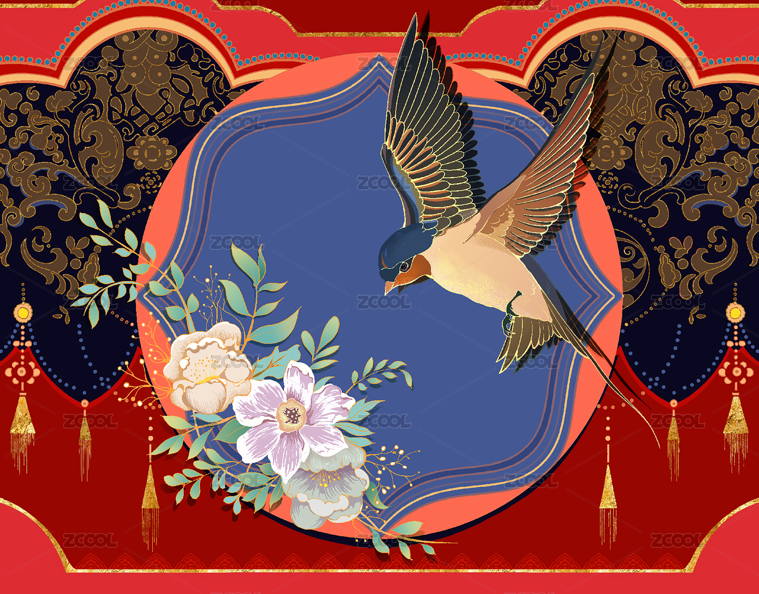
WIBIRD is the brand of a craft rice wine made for the younger generation. Though it is a traditional Chinese wine, we did not want to follow the conventional approach and package it with traditional Chinese culture. Instead, relying on the inherent quality of the product and based on the insight into today’s young customers, we believed that the sense of quality brought by the idea of “craft” would be more conducive to the long-term growth of the brand value. So, starting from the meaning of the brand name, we designed a unique graphic of the white bird and a package of pure silvery white, giving birth to a distinctive brand icon, which stands out immediately from all conventional competitions.
白鸟是一款面向年轻受众的精酿米酒产品。虽是本土酒种,但我们并不想简单诉诸传统文化。审视产品本身的特质,并根据对当今年轻消费者的洞察,我们认为精酿的品质感更有利于积累长期的品牌价值。从品牌名的语义出发,通过造型独特的白鸟图形,与通体银白色的包装,建立起鲜明的品牌符号。同时也与众多传统风格包装的竞品形成明显差异。
ART DIRECTOR: Zhang Lianggang 张椋刚
CLIENT: WIBIRD 白鸟
PRESENTED BY: CES 创元系(原奇点传达)


3
Report
声明
4
Share
相关推荐


in to comment
Add emoji
喜欢TA的作品吗?喜欢就快来夸夸TA吧!
推荐素材


You may like


相关收藏夹


Log in
3Log in and synchronize recommended records
4Log in and add to My Favorites
评论Log in and comment your thoughts
分享Share