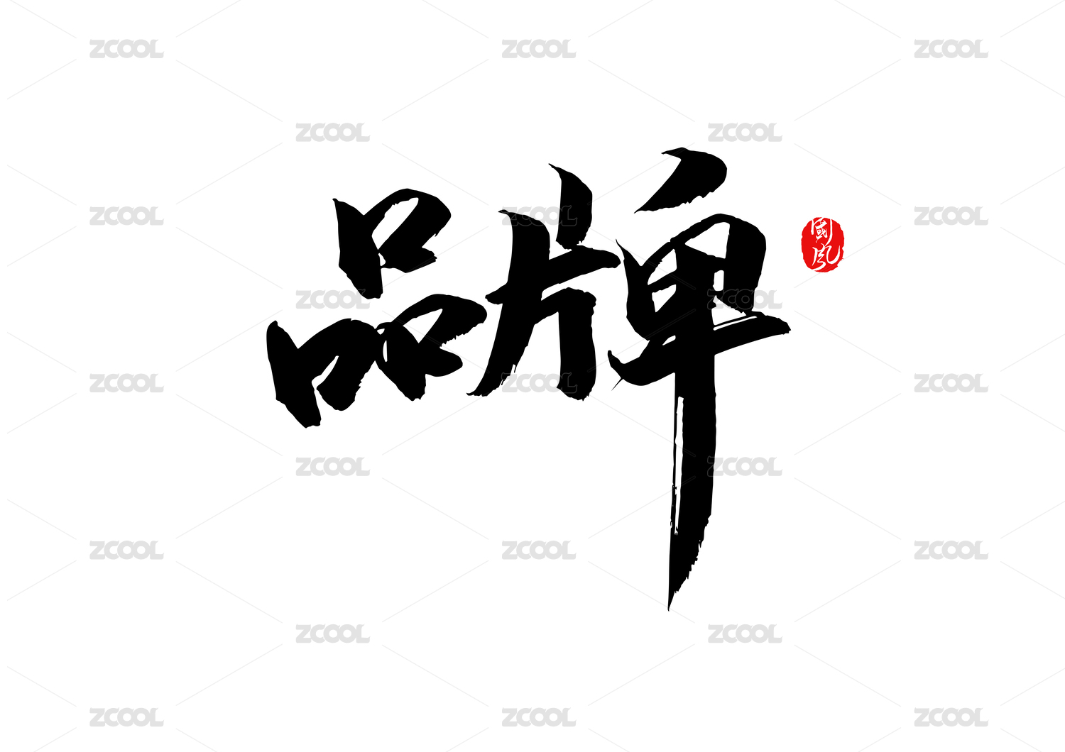
四时雅集。加上新年没有应用的纯视觉。

广州/平面设计师/2年前/265浏览
版权
四时雅集。加上新年没有应用的纯视觉。
视觉方面要延续领导想要的“红”然后也结合了现代设计的美感。
从logo名称提取四个季节的辅助图形“春叶、夏荷、秋杏、冬梅”来完成延展性,
图形大气简洁,线条遵循自然万物、数学公式,一眼便可知晓其神态。
主色彩经过多次调节最后确定了“枣红色”优雅明亮不失大气,
辅助色皆由中国传统色中挑选,整个色彩系统的搭配遵循自然舒适。
底纹相互规律的排序形成高端品牌的质感。最后在面对甲方大领导提案时更是一稿过。
Client: Poly Serves
Producer: ZQF
Art Director & Designer: ZQF
Studio: GOLDESWALLOW & PHILOSOPHICAL
Year: 2022
In terms of vision, the "red" desired by the leaders should be continued and then combined with the aesthetic feeling of modern design. Extract the auxiliary graphics of the four seasons "spring leaves, summer lotus, autumn apricot, winter plum" from the logo name to complete the extensibility. The graphics are atmospheric and concise, and the lines follow the natural things and mathematical formulas, so you can know its expression at a glance.
After several adjustments, the main color finally determined that "maroon red" is elegant, bright and atmospheric, and the auxiliary colors are all selected from traditional Chinese colors. The matching of the entire color system is natural and comfortable. The shading patterns are arranged regularly to form the texture of a high-end brand.


5
举报
声明
14
分享
相关推荐


评论你的想法~
表情
喜欢TA的作品吗?喜欢就快来夸夸TA吧!
推荐素材


你可能喜欢


相关收藏夹


登录注册
5登录即可同步推荐记录哦
14登录即可加入我的收藏
评论登录即可评论想法
分享分享