
杭州/插画师/3年前/226浏览
版权
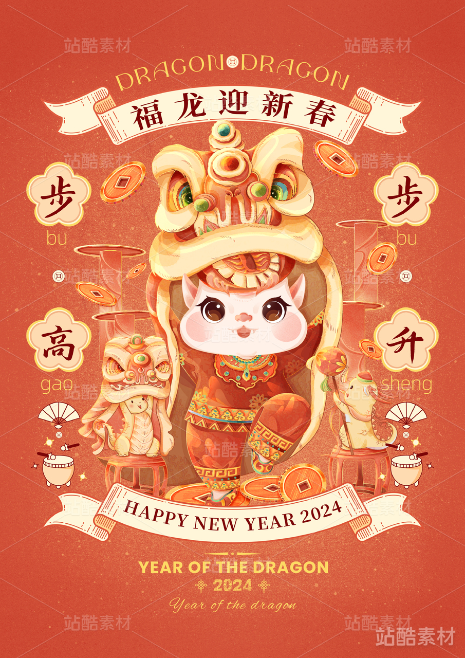
华润万象生活IP设计 | DONG LONG!咚咙
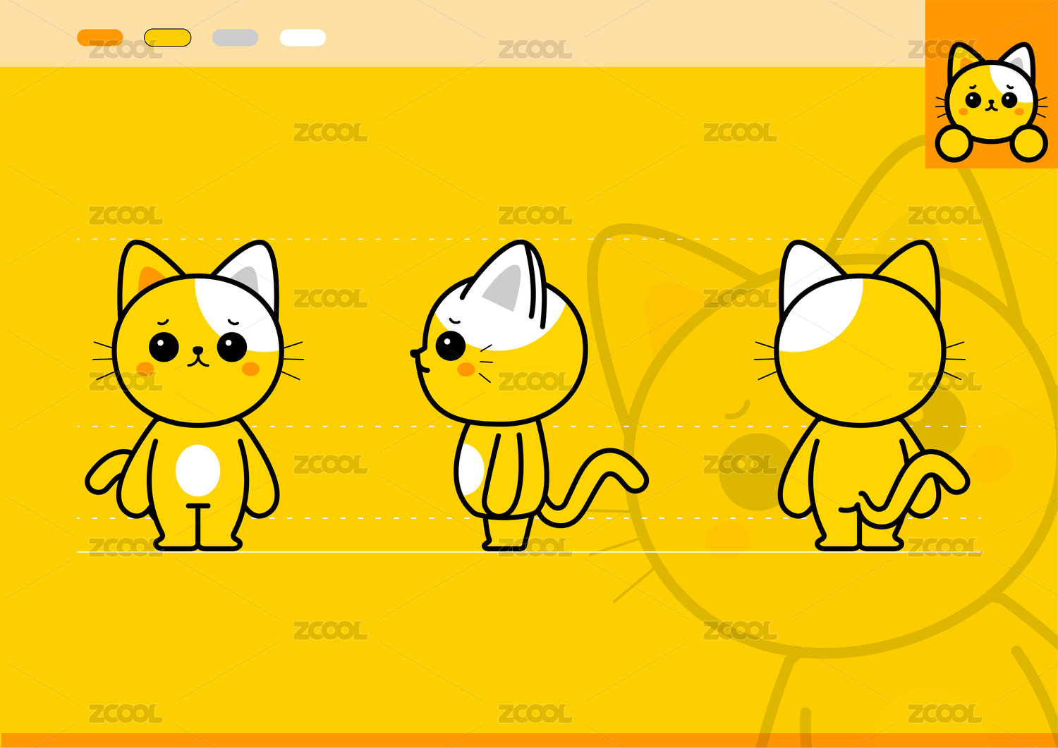
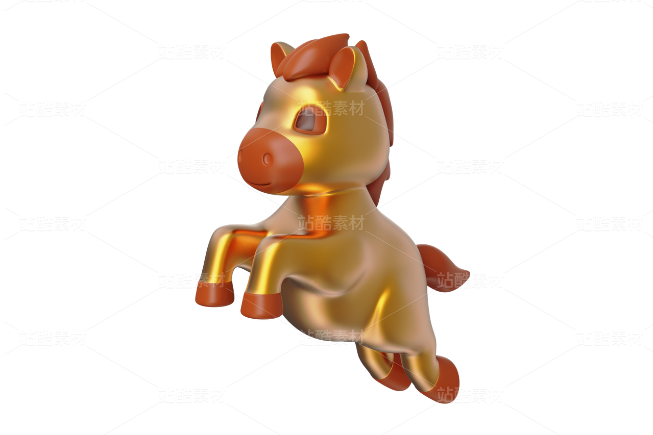
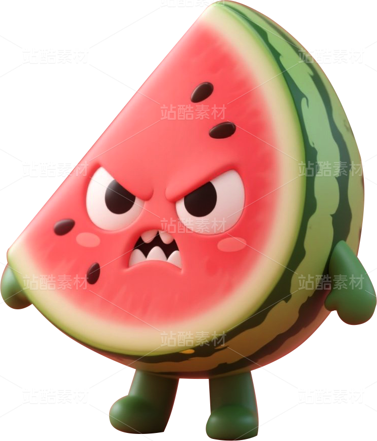
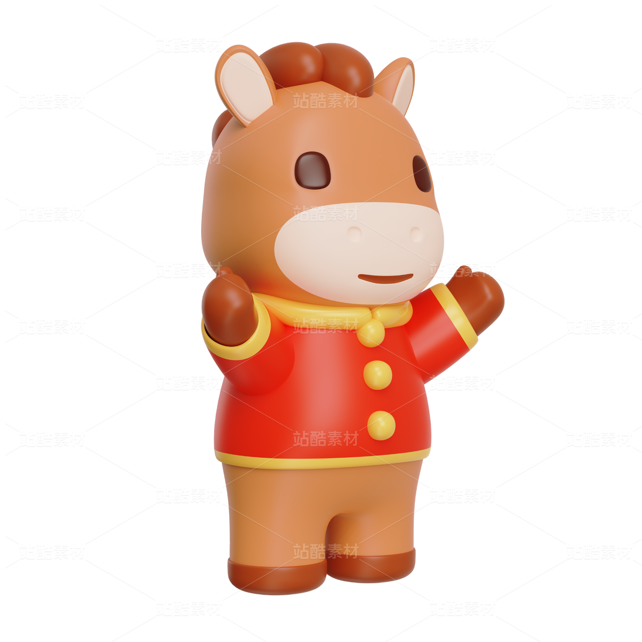
设计说明:设计以“非凡万象”为中心点,采用大象为ip载体,符合用户对于万象品牌的第一印象已经整体品牌调性与理念。用龙元素进行结合,完成巧妙的设计特点。龙元素,采用龙角与龙鳞进行与大象的形象进行结合。
龙,自古以来即是非凡的象征,紧扣设计主题再巧妙不过。且龙是多动物的组合幻想生物,本身即是万物共生,万物之源的象征。借组合的象征手法,与龙的意向,抓住“万”的表现,与品牌高度契合,准确表达。
Design description: The design takes "Vientiane" as the central point and uses elephant as the ip carrier, which is in line with users' first impression of Vientiane brand and the overall tone and concept of the brand. With the combination of dragon elements, to complete the ingenious design features. Dragon elements, using dragon horns and dragon scales to combine with the image of elephants.
The dragon, since ancient times, has been an extraordinary symbol, and the design theme could not be more clever. And dragon is a combination of many animals fantasy creatures, itself is the symbiosis of all things, the symbol of the source of all things. By the combination of symbolic techniques, with the intention of the dragon, seize the performance of "Wan", and the brand highly fit, accurate expression.
DESIGNER:翔小鲨


3
Report
声明
1
Share
相关推荐


in to comment
Add emoji
喜欢TA的作品吗?喜欢就快来夸夸TA吧!
推荐素材


You may like


相关收藏夹


Log in
3Log in and synchronize recommended records
1Log in and add to My Favorites
评论Log in and comment your thoughts
分享Share