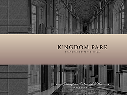
B端产品LOGO设计

大连/UI设计师/3年前/432浏览
版权
B端产品LOGO设计
设计说明:
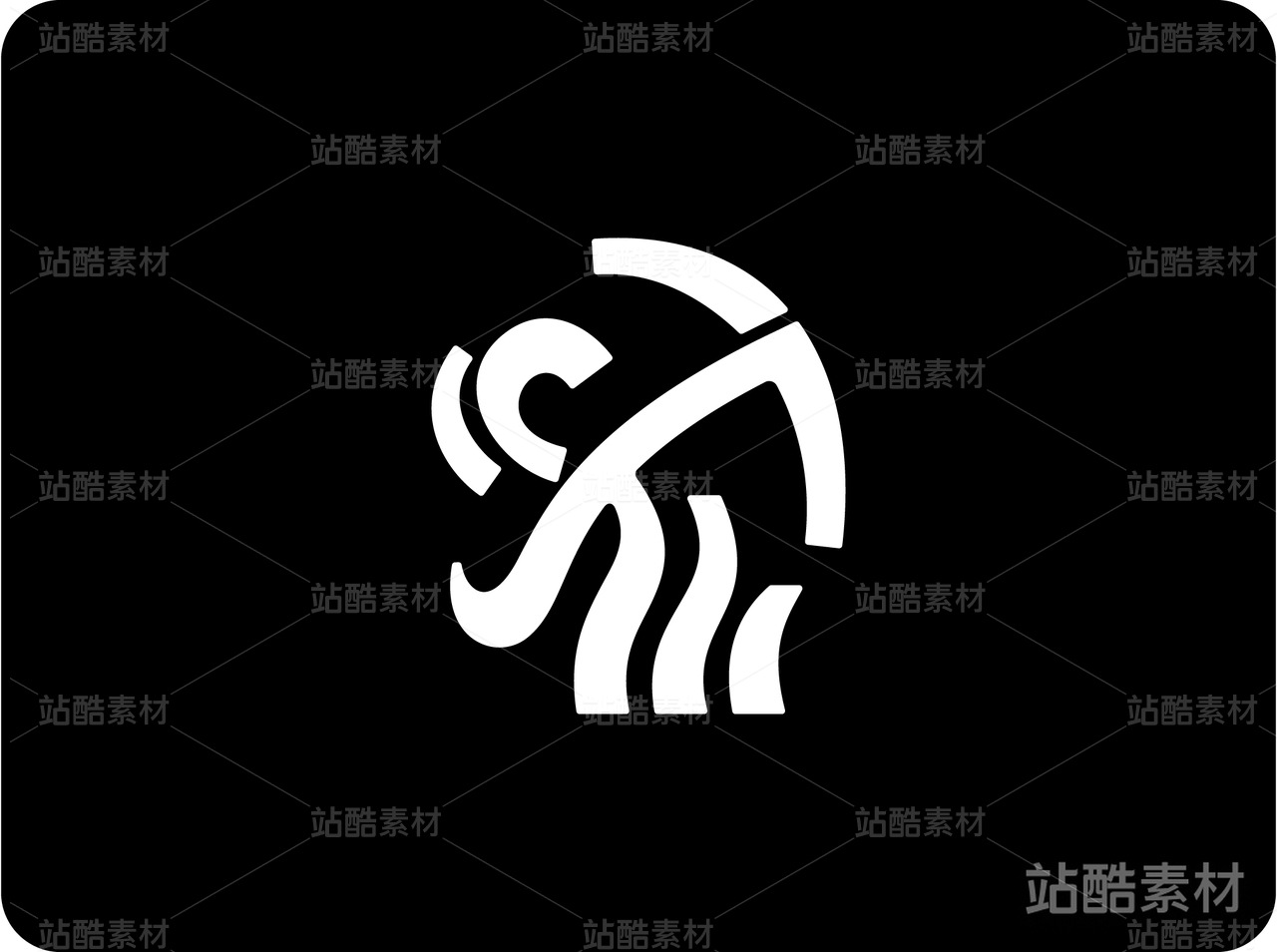
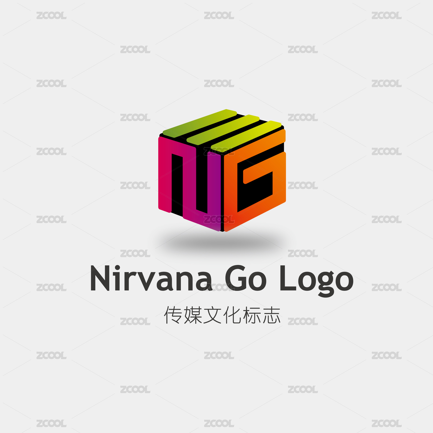
由两片叶子组合而成,中间五角星代表着积分管理平台,契合自身的产品特色。彩色的叶子由绿色、橙红、蓝色组成,既有大树名称的含义,颜色组合的含义又有哲学、业绩、团队、科技的表达也对应了三环九项的含义
By the combination of two leaves, the middle five-pointed star represents the integral management platform, fit its own product characteristics. The colorful leaves are composed of green, orange red and blue, which not only means the name of the tree, but also means the expression of philosophy, performance, team and science and technology, which also corresponds to the meaning of the three rings and nine


3
举报
声明
2
分享
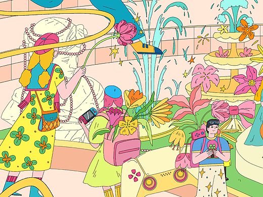
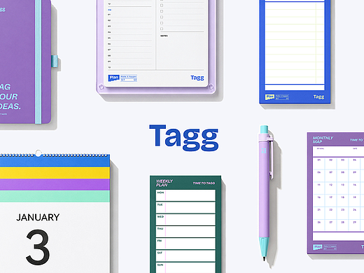
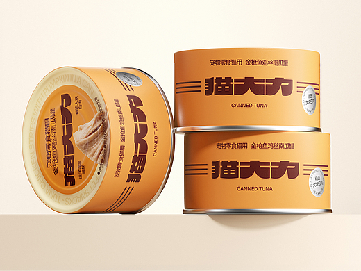
相关推荐


评论你的想法~
表情
喜欢TA的作品吗?喜欢就快来夸夸TA吧!
推荐素材


你可能喜欢


相关收藏夹


登录注册
3登录即可同步推荐记录哦
2登录即可加入我的收藏
评论登录即可评论想法
分享分享