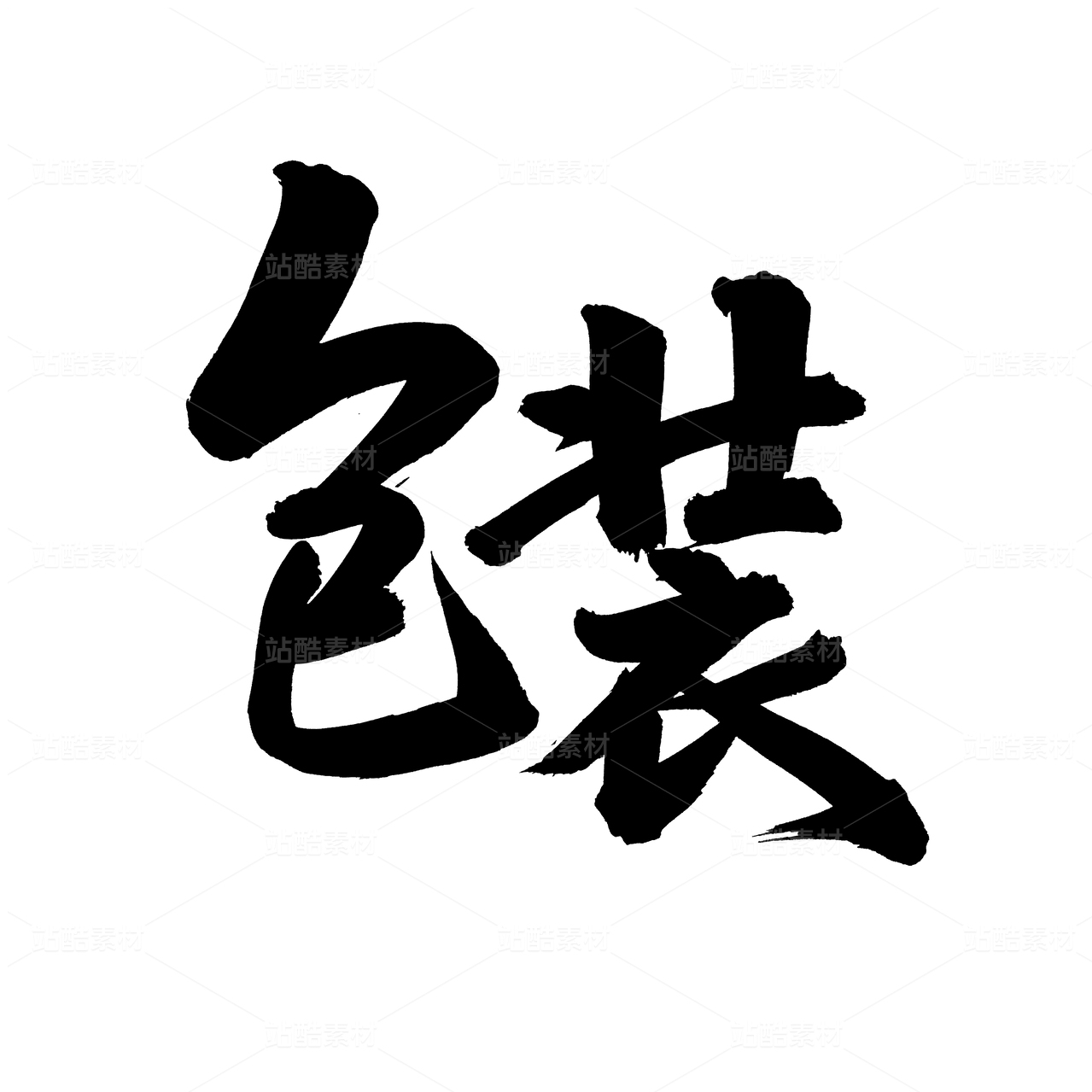
张得胜|精装牛肉外盒(2019)

成都/设计爱好者/5年前/123浏览
版权
张得胜|精装牛肉外盒(2019)
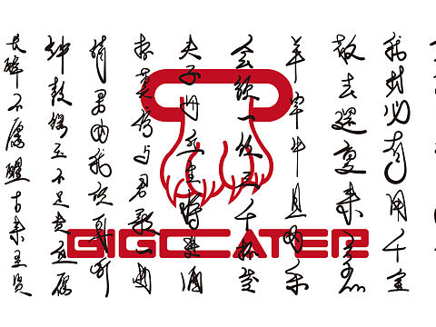
项目名称:张得胜牛肉系列
风格:古风
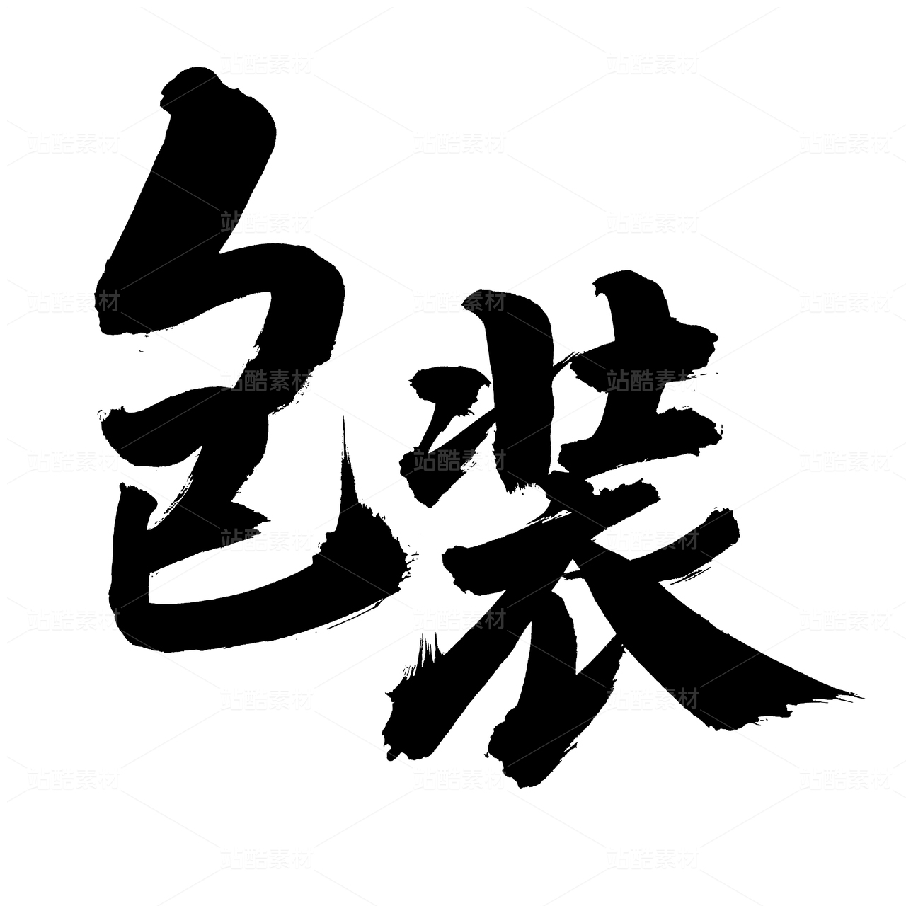
素材:墨迹/毛笔字/对撞色
这套产品是之前牛市口他们家老板的另一个牌子,产品还是那些产品,设计方式以主人公好武的形式力求最直接的表达武术的精神,经过查阅无数各种资料以后汇总出如下四个文字针对不同的产品进行命名,纯色墨迹的加入使外观具有古风历史感,对撞色的应用让整个品牌更博眼球,设计其实很简单,关键是汇总/组合/应用的整体能力;
(原谅这只老狗狂浪的笑声)
Project Name: appearance upgrade of niushikou products
Project time: 2019
Creative source: product process / product color / industry color / Cattle
The works were set up in May, 19, and went online in October. The core is to simplify each variety out of a cow head, and to complete the design of the whole series of products through graphical image of concrete brand. The color selection is carried out through the artistic conception of brewing technology to select the color as a whole, striving to make the package unique and independent;
Unfortunately... Just two months after listing, an unknown manufacturer took away the appearance packaging of tearing beef, and the track for it was long. You still copy and cherish it. Don't be so neat. Why do you have to go with the same company? Today, it is to sort it out for a thought.


0
Report
声明
收藏
Share
相关推荐


in to comment
Add emoji
喜欢TA的作品吗?喜欢就快来夸夸TA吧!
推荐素材


You may like


相关收藏夹


Log in
推荐Log in and synchronize recommended records
收藏Log in and add to My Favorites
评论Log in and comment your thoughts
分享Share