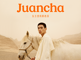
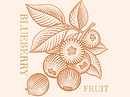
麺子拉面(旧金山)X 三欧创意 品牌主视觉插画设计

济南/平面设计师/5年前/9004浏览
版权
麺子拉面(旧金山)X 三欧创意 品牌主视觉插画设计
插画主笔:三木1989
插画执行:三欧创意插画部
服务客户:美国旧金山华人餐饮品牌麺子拉面
创作时间:2020年2月
创作思路,从中美文化上入手。首先客户的初心就是透过面条传递中国的文化与印象,面条是作为桥梁,媒介的存在。其次,加州,特别旧金山湾区本来就是一个大融炉,这里汇集了大量的移民,其中以华裔,拉丁语系,印度人,越南人,日本人,韩国人居多,还包含了许许多多的其他国家的移民,所以文化的交融本就是当地的特色。最后,以中美文化符号图腾为切入点,让品牌更具东西方文化属性,从而让更多元化的消费者所接受。
The creative thinking starts from the Chinese and American culture. First of all, the initial intention of customers is to convey Chinese culture and impression through noodles. Noodles serve as a bridge and a medium. Secondly, California, especially the San Francisco Bay Area, is originally a melting pot, where a large number of immigrants are gathered, most of which are Chinese, Latino, Indian, Vietnamese, Japanese, Korean, as well as immigrants from many other countries. Therefore, cultural integration is the local characteristics. Finally, with the totem of Chinese and American cultural symbols as the entry point, the brand has more Oriental and western cultural attributes, so as to be accepted by more diversified consumers.


163
举报
声明
377
分享
相关推荐


评论你的想法~
表情
喜欢TA的作品吗?喜欢就快来夸夸TA吧!
推荐素材


你可能喜欢


相关收藏夹


登录注册
99+登录即可同步推荐记录哦
99+登录即可加入我的收藏
评论登录即可评论想法
分享分享