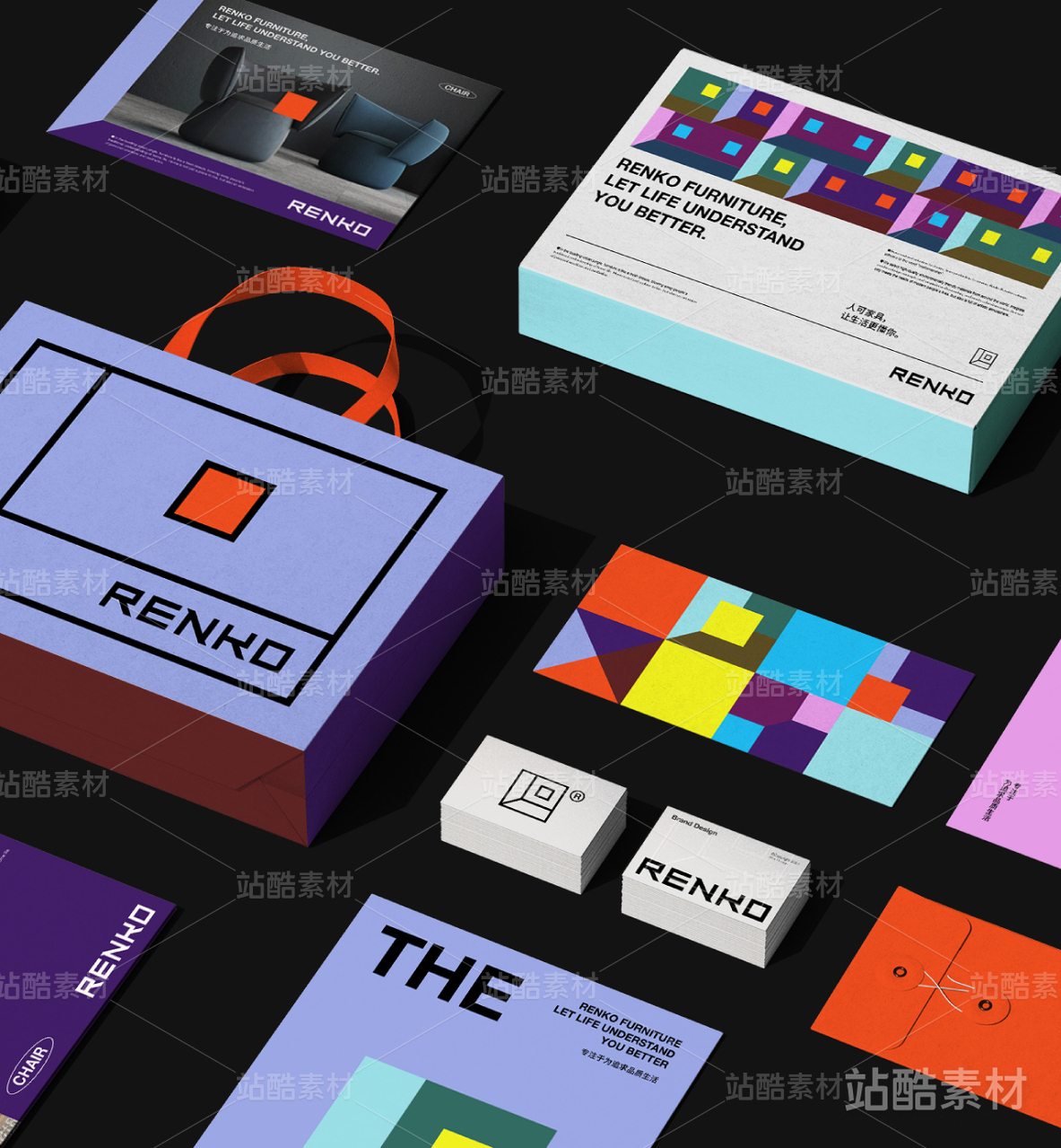
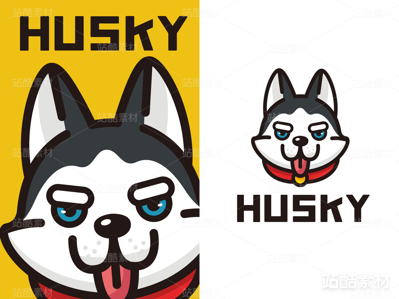
品牌设计 | BOW_LAB

北京/平面设计师/4年前/139浏览
版权
品牌设计 | BOW_LAB
原创品牌设计 | BOW_LAB
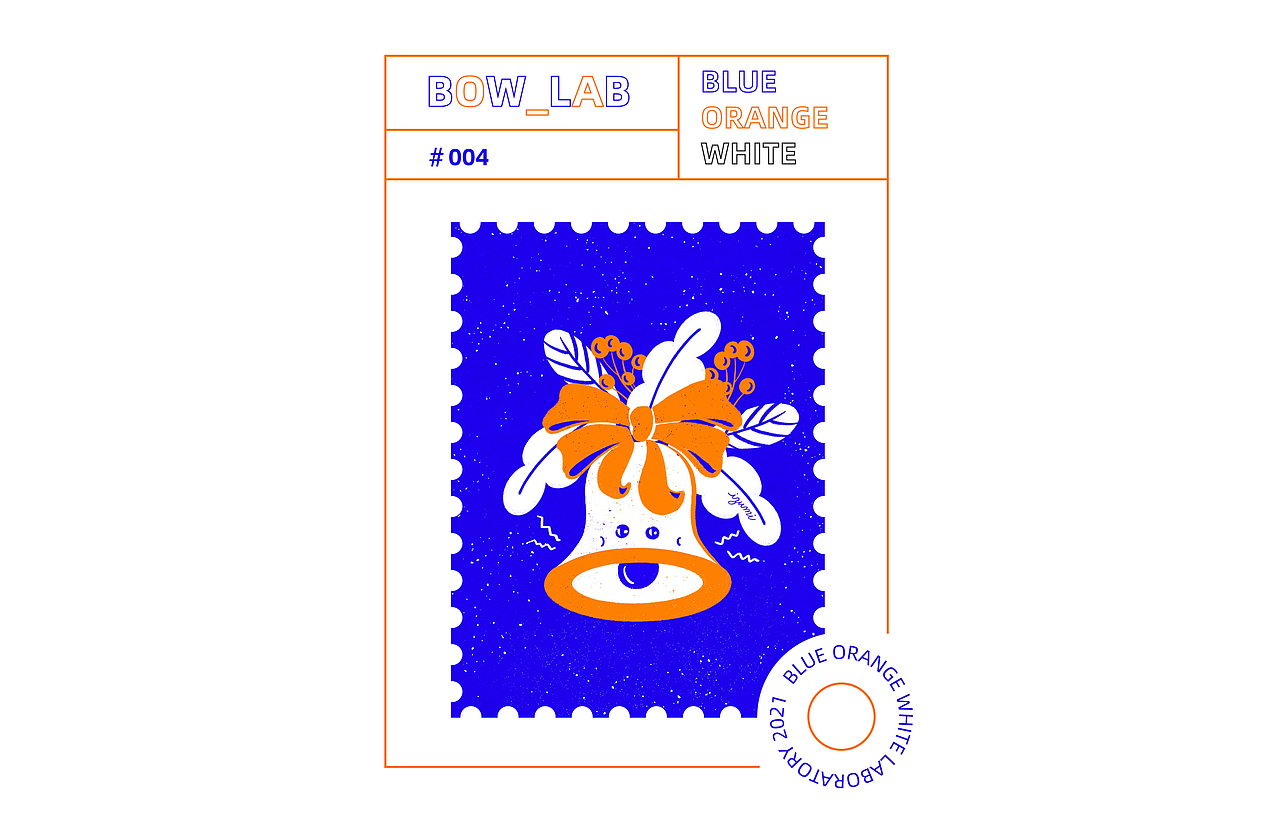
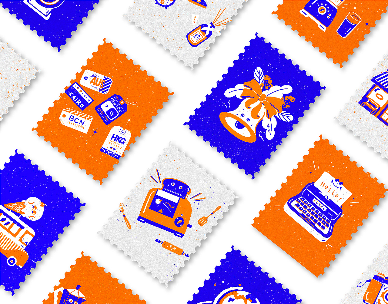
蓝色——B FOR BLUE
橙色——O FOR ORANGE
白色——W FOR WHITE
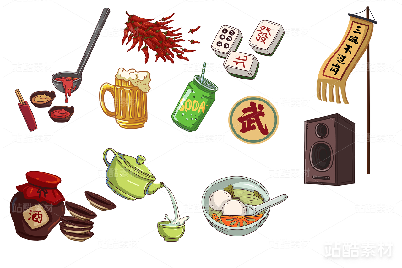
品牌名称来源于设计中的三个主色——蓝色,橙色和白色,BOW的单词有蝴蝶结的意思,也代表着活泼可爱的品牌DNA,插画灵感来源于生活中的小物件,配上可爱的表情,给平平无奇的生活用品赋予了活力。


1
Report
声明
6
Share
相关推荐


in to comment
Add emoji
喜欢TA的作品吗?喜欢就快来夸夸TA吧!
推荐素材


You may like


相关收藏夹


Log in
1Log in and synchronize recommended records
6Log in and add to My Favorites
评论Log in and comment your thoughts
分享Share