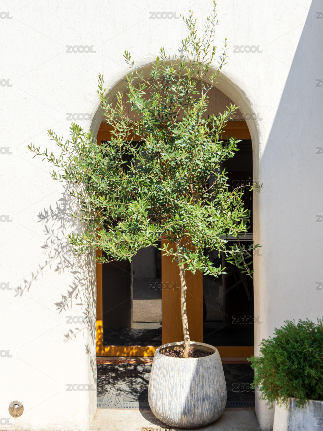
喜释品牌空间设计

深圳/平面设计师/7年前/578浏览
版权
喜释品牌空间设计
喜释品牌空间设计
Xishi Brand Space Design
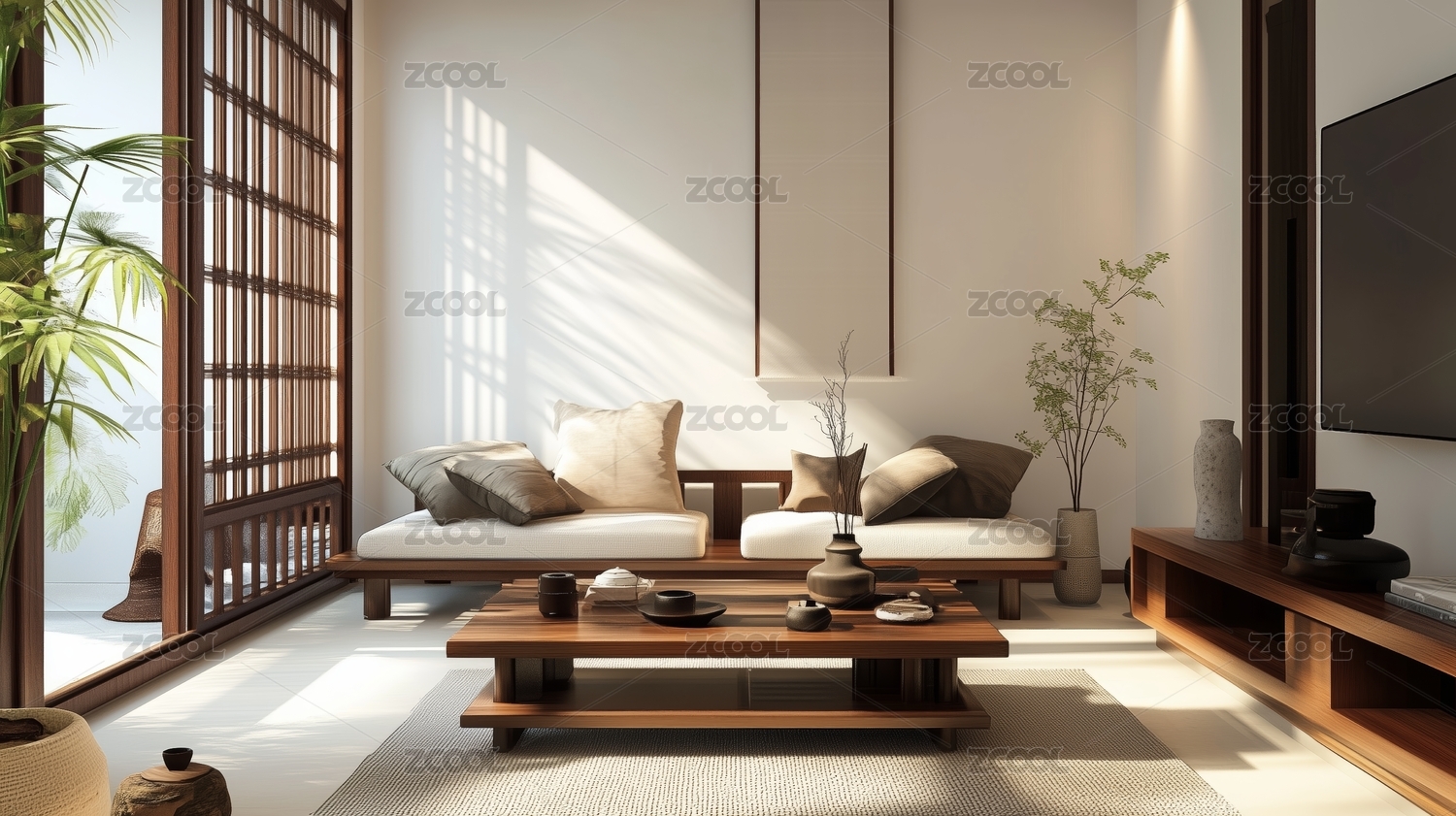
喜释定位手工吐司专家。2017年,迎来品牌形象全面升级,由原邱哥的吐司更名为喜释,始终专注于高品质手工吐司的细分品类。
聚焦品牌空间设计,离茧提炼手工、真实、精致为核心关键词。以面包棒槌为具象化视觉元素,采用原木、黄铜金属、清漆水泥板为主素材,打造真实手作的品牌印记。
空间中,持续强化面包棒槌的空间符号,同时,融入简洁、明快、手工感的细节设计,重新演绎当下生活形态下的手作美学。
Xishi brand positioning handmade toast master. In 2017, the brand image was upgraded in an all-round way. The brand name was changed from the original Chukor toaste to Xishi . The brand always focuses on high quality hand-made toast.
Focus on brand space design, from cocoon refining manual, real, exquisite core keywords. With bread mallet as the visual element, using log, brass metal, varnish cement board as the main material, to create a real hand-made brand imprint. In space, the space symbols of bread hammer are continuously strengthened, and at the same time, the detail design is succinct, bright and manual. Re deduce the aesthetics of hand in contemporary life.
项目名称 / 喜释品牌空间设计
设计机构 / 离茧品牌
完成时间 / 2017
PROJECT / Xishi Brand Space Design
DESIGNED BY /Cocoon Brand
COMPLETED IN / 2017


5
举报
声明
12
分享
相关推荐


评论你的想法~
表情
喜欢TA的作品吗?喜欢就快来夸夸TA吧!
推荐素材


你可能喜欢


相关收藏夹


登录注册
5登录即可同步推荐记录哦
12登录即可加入我的收藏
评论登录即可评论想法
分享分享