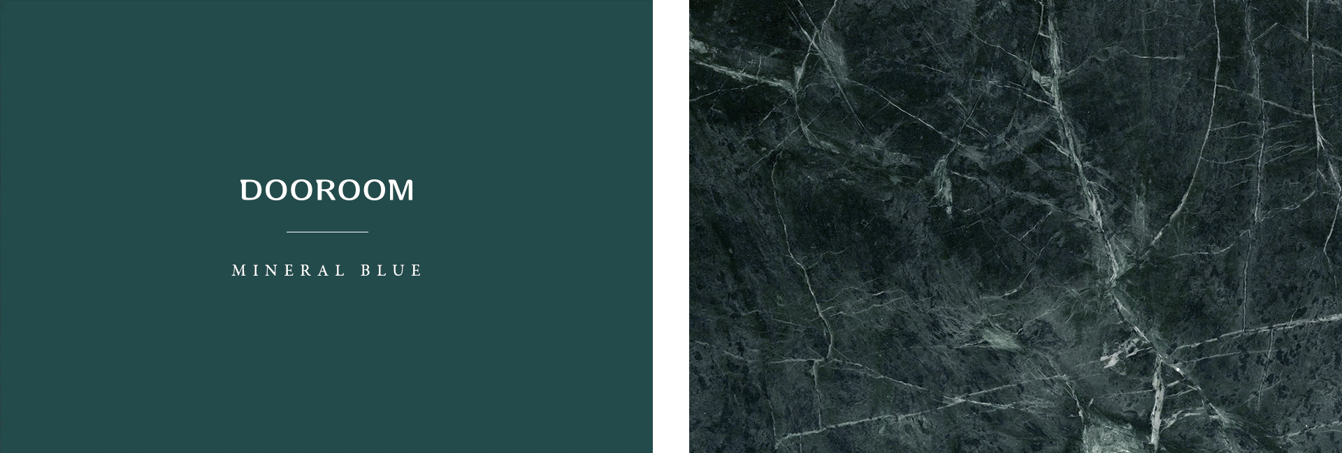
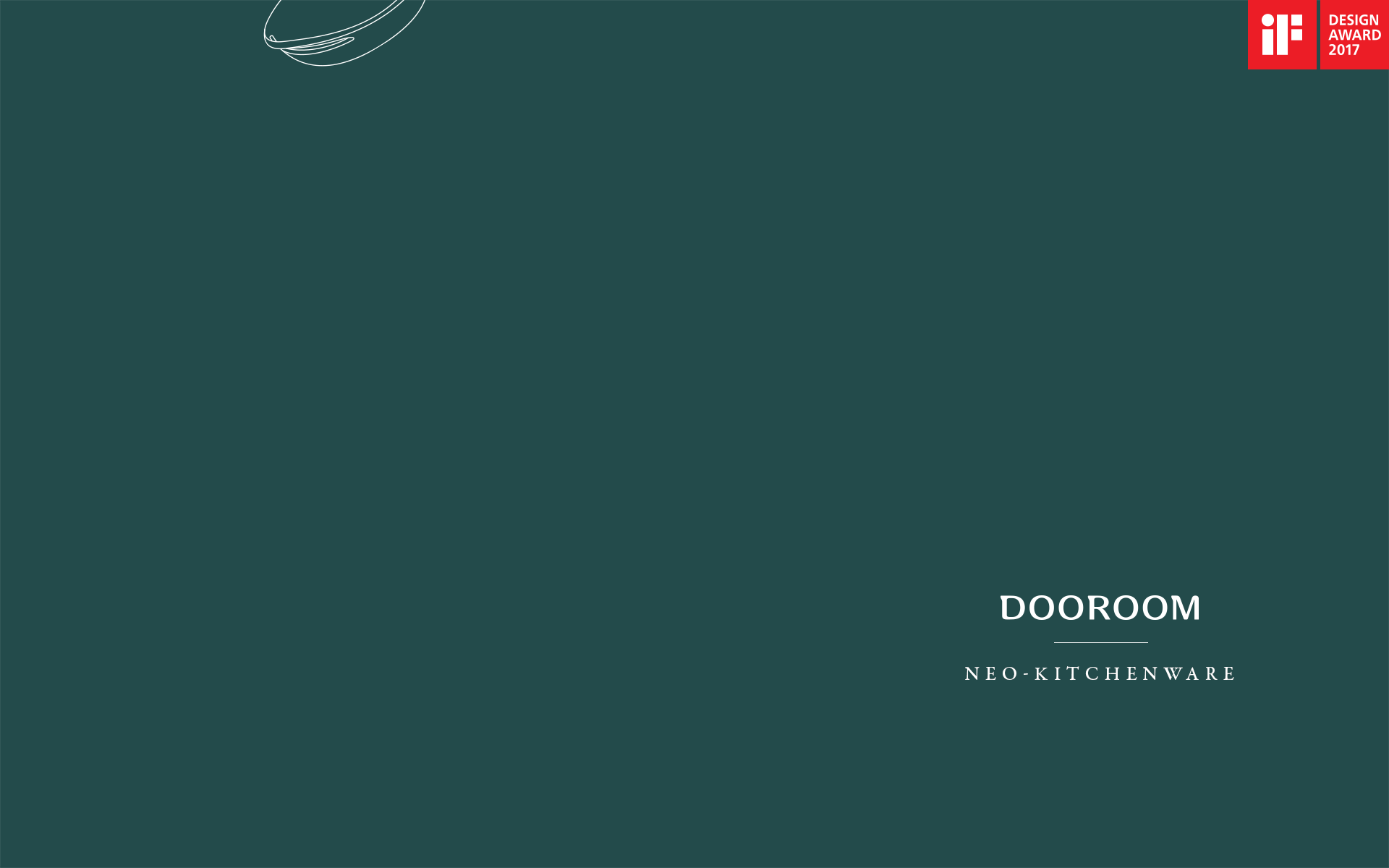
Dooroom | 归·禾器

上海/平面设计师/8年前/8609浏览
版权
Dooroom | 归·禾器
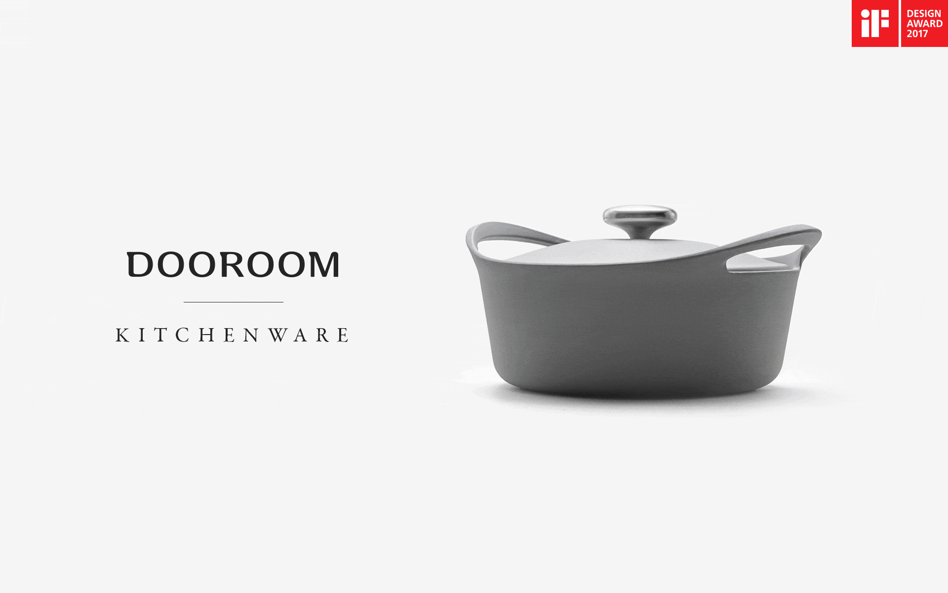
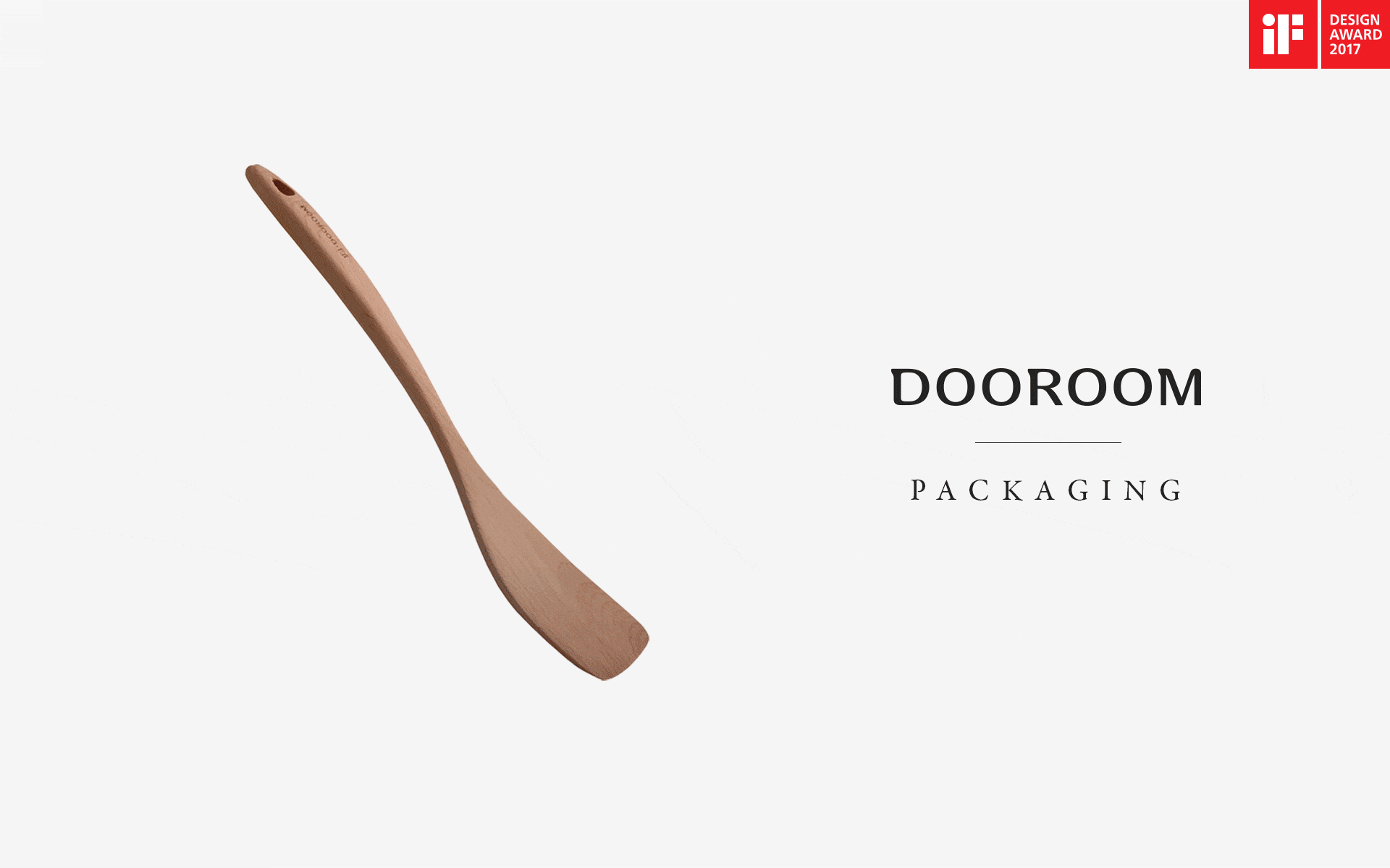
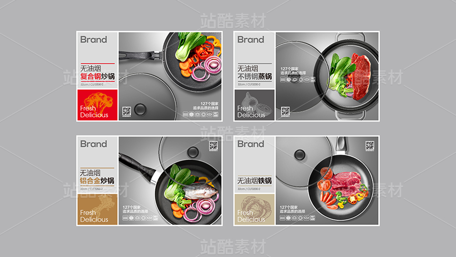
Dooroom | 归·禾器,致力于新中式高端厨房品牌,以其专业、创新、极致的理念打造「每一个家中的世外桃源」。Alan_Qin 从品牌命名、品牌化进程、产品、视觉,全链路地实现了Dooroom的品牌塑造,并获得2017年iF设计奖。「归」一字,寓意「回归」,回归食材本身,回归家庭本位,回归生活本质。Logo是一扇半开的门,等待迎接归家的人,其造型简洁、别样、谦和。Dooroom第一款系列产品,「归禾」厨具,以明宣德炉为灵感,融古典与现代于一身,造型温润细腻,工艺精致绝佳。
Dooroom is a new high-end Chinese kitchenware brand. The brand is devoting itself in creating an Arcadia for each family by its profession, innovation and perfection. Alan_Qin has helped Dooroom build its brand in naming, branding and product designing. As a result, Dooroom was awarded the iF Design in 2017.「归」 means ‘back’. Dooroom insists in the idea of backing to food material, to family and to life. The Logo of Dooroom is a half-opened, simply-designed, unique door, waiting its families backing home. The logo shows the brand‘s humble attitude to life. 「归禾」is Dooroom‘s initial series kitchenwares. The designer got the idea from the Xuande Furnace in Ming dynasty, from which, the kitchenware is of exquisite and gentle styling and fabulous manufacture, combining both classical elements and modern concepts.
branding design: Alan_Qin
product design: Zhou Yapeng
packaging design: Alan_Qin
photography: YUM汤汤


60
举报
声明
102
分享
相关推荐


评论你的想法~
表情
喜欢TA的作品吗?喜欢就快来夸夸TA吧!
推荐素材


你可能喜欢


相关收藏夹


登录注册
60登录即可同步推荐记录哦
99+登录即可加入我的收藏
评论登录即可评论想法
分享分享