七言企业管理有限公司

青岛/平面设计师/9年前/175浏览
版权
七言企业管理有限公司
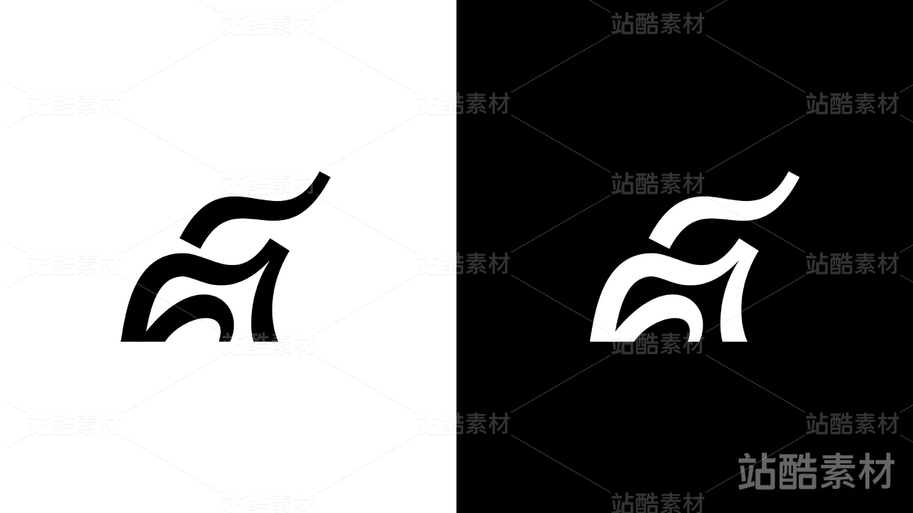
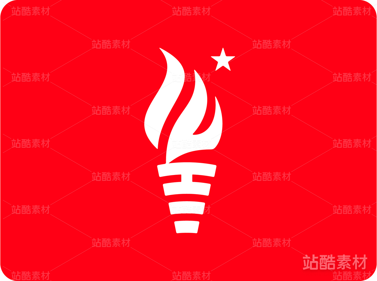
将图形的外轮廓依据七言的言字进行变形,依托了方块汉字的完美形态,该标志整体比例来源于黑体七于言的长宽比例关系,形成了线条的空间变化,QIYAN英文字体则采用圆润的设计,LOGO标准色为红色,寓意红火,辅助色为灰黑色。
2
Report
声明
收藏
Share
相关推荐


in to comment
Add emoji
喜欢TA的作品吗?喜欢就快来夸夸TA吧!
推荐素材


You may like


相关收藏夹


Log in
2Log in and synchronize recommended records
收藏Log in and add to My Favorites
评论Log in and comment your thoughts
分享Share