
上海/UI设计师/9年前/12787浏览
版权
Wanda Group's 30 Anniversary Logo Design
-
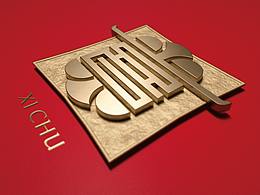
从1988年的“西岗住宅开发”,到1992年正式更名“万达”,直至今日26年来万达拔地而起庞大的商业帝国,涉及地产,酒店,影院,旅游,体育等领域,30年临近之际,万达而立之年,完成了它的蜕变,“国际万达,百年企业”万达正向着国际一流企业进军。
创意理念:众所周知此次是万达30周年庆典logo,因此不做过多修饰,把“30”这个数字完整的展示出来,用文字记录万达30年来的重大事迹。
视觉传达:创意点有了,为了解决画面艺术性及视觉张力,我把“万达”30年的重大事迹用镂空的方式嵌套在“3”里,这样的画面呈现可以很艺术性的表现出“3”以及凝聚成“3”这个数字背后代表的意义,接着再用“万达”logo中的帆船演变成“0”这个数字,紧贴万达“logo”设计理念,终而形成一整套统一的万达标志,最终的设计稿画面素雅、轻奢、精炼而富有艺术性,同时不失视觉冲击力。
-
制作软件:
Ai(线性、图形设计)
Ps(位图合成、色泽处理)
-
Wanda Group's 30 Anniversary Logo Design
-
From 1988 "Xigang residential development", in 1992, officially changed its name to "Wanda", 26 years to Wanda erected huge business empire, involved in real estate, hotels, cinemas, tourism, sports, 30 years is approaching, Wanda thirties, completed the transformation, "Wanda International, a hundred years enterprise Wanda towards world-class enterprises to expand.
Idea: it is well-known that this is the 30 anniversary of the celebration of logo, so do not do too much modification, the "30" this figure is a complete display, with a record of 30 years of major events.
Visual communication: creative point, in order to solve the picture art and visual tension, I put "Wanda" 30 years of major stories hollow nesting mode in "3", this picture presented can be very artistic performance a "3" and condensed into "behind the number 3", sailing and then use "Wanda" logo evolved into the number "0", close to the Wanda "logo" design concept, into symbol of a uniform set of Wanda, final draft for the picture of elegance, luxury light, refined and artistic, and visual impact.
-
Making software:
Ai (linear, graphic design)
Ps (bitmap synthesis, color processing)
-


74
Report
声明
59
Share
相关推荐


in to comment
Add emoji
喜欢TA的作品吗?喜欢就快来夸夸TA吧!
推荐素材


You may like


相关收藏夹


Log in
74Log in and synchronize recommended records
59Log in and add to My Favorites
评论Log in and comment your thoughts
分享Share