W - Steak


汉堡/平面设计师/11年前/80452浏览
版权
W - Steak
The client is a couple selling since 2010 Foreign, High Class and frozen Steak.
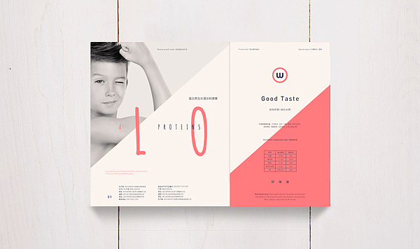
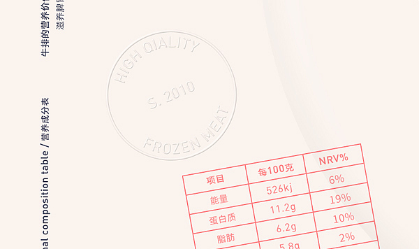
Steak is most often branded to appeal to men, but with some market research, I discovered that in China, it's mainly mothers that purchase steak for kids. Since steak is considered to be a meal that's special and extremely good for a child's development, I created a design for W Steak to highlight its numerous benefits.That motivated me to propose a different and new solution to the steak market in China.
While working on the project we decided to soflty redesign there logo, so that it can fit more well to there new packaging.
Key words: Fresh, family, young, safety, mothers choice.
Growth Steak - for Children and young people.
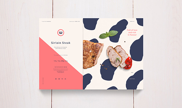
Sirloin Steak - for Children and women.
Short Loin S. - for Children and the whole family.
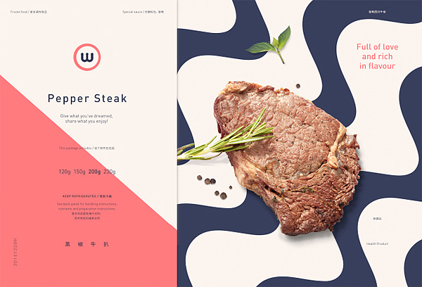
Pepper Steak. - for children and teh ones in need for a delicious Sauce (already inside the Steak)
"Promising lots of protein, good taste and tons of nourishment for a child, the 'Growth Steak' in particular appeals to mothers who want to make sure their young ones are well-fed. Rather than adopting a packaging design that's dark or black as many other meat products do, W Steak's high-end frozen food boxes feature a playful design in light colors and spots that mimic those that can be found on a cow."
“W” - Three & Aeon was a small task, but the persistence and determination turned it into a “great” project.
—
Branding, Packaging, Art Direction
Tom Jueris, 2015
Thanks to Laura McQuarrie (Text edit be)









807
举报
声明
775
分享
相关推荐









评论你的想法~
表情
喜欢TA的作品吗?喜欢就快来夸夸TA吧!
推荐素材










你可能喜欢









相关收藏夹














登录注册
99+登录即可同步推荐记录哦
99+登录即可加入我的收藏
评论登录即可评论想法
分享分享