简序 SIMPLE|酒店旅行伴手礼包装设计

成都/设计爱好者/21小时前/498浏览
版权
简序 SIMPLE|酒店旅行伴手礼包装设计
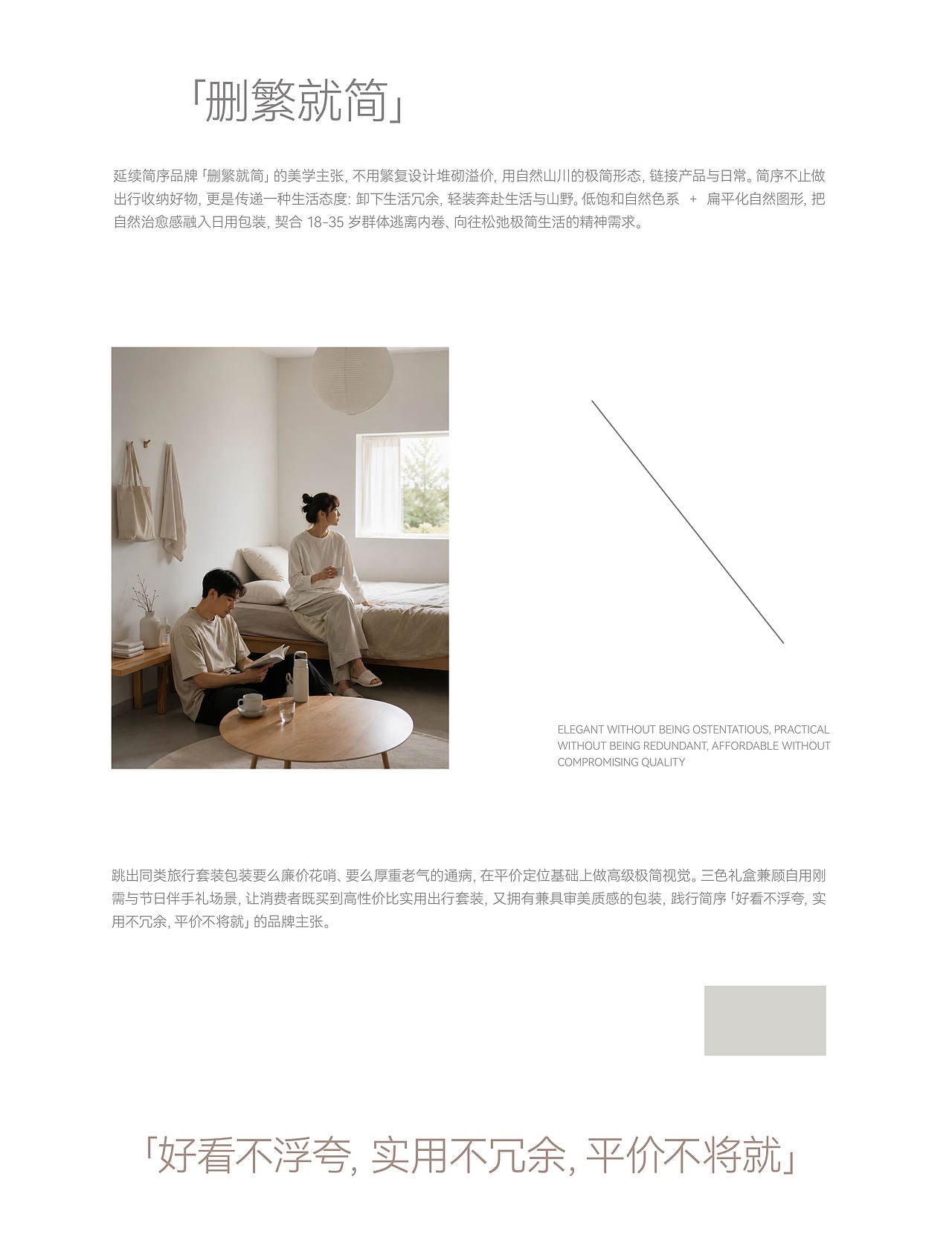
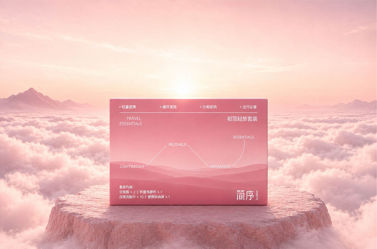
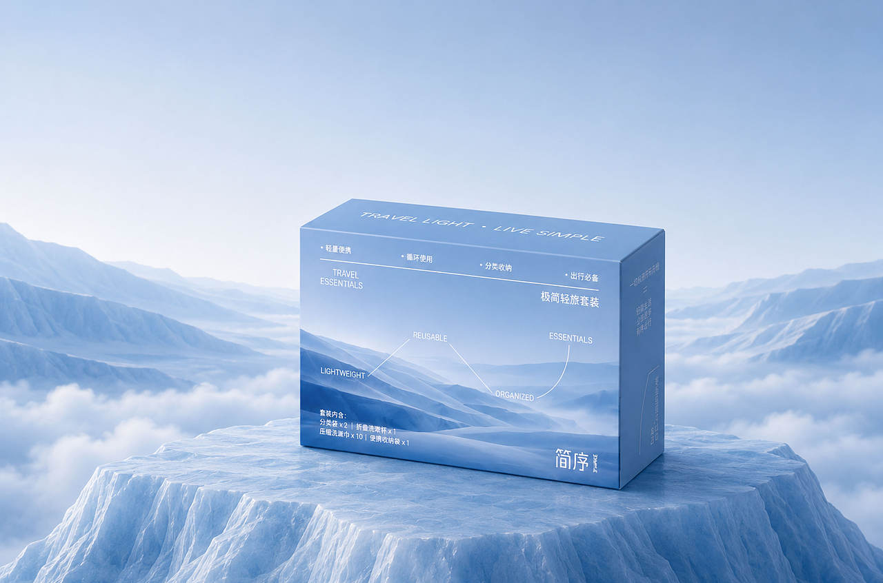
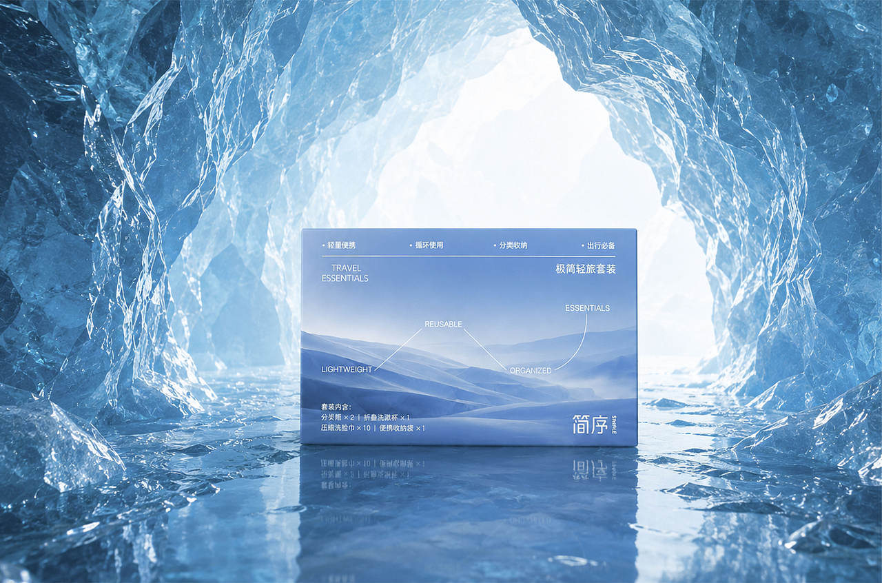
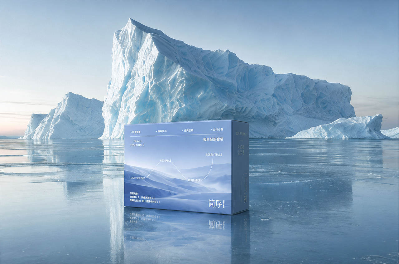
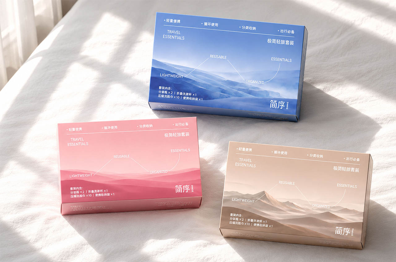
「简序」是一套以旅行情绪为核心的酒店伴手礼包装设计。项目从旅途中不断变化的云层、海面与地貌汲取灵感,希望把短暂的停留转化为一份可以被带走、被收藏的记忆。
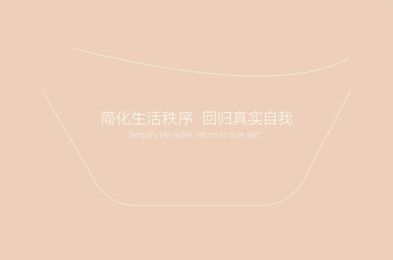
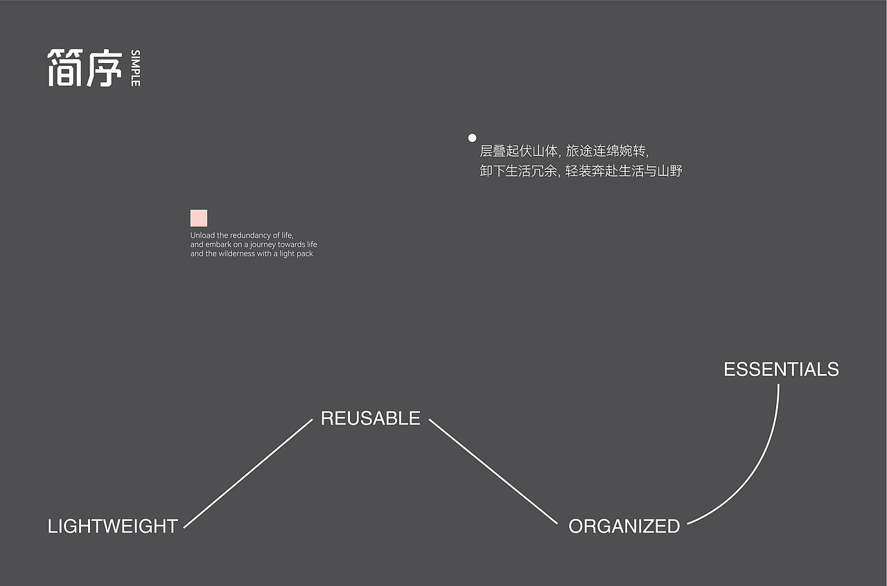
设计以“景色有序,体验从简”为概念主线,用克制的版式、留白与轻盈的色彩建立安静而富有呼吸感的品牌气质。标志与文字系统强调清晰、简洁和现代感,让视觉能够适配不同酒店空间及多样化旅行场景。
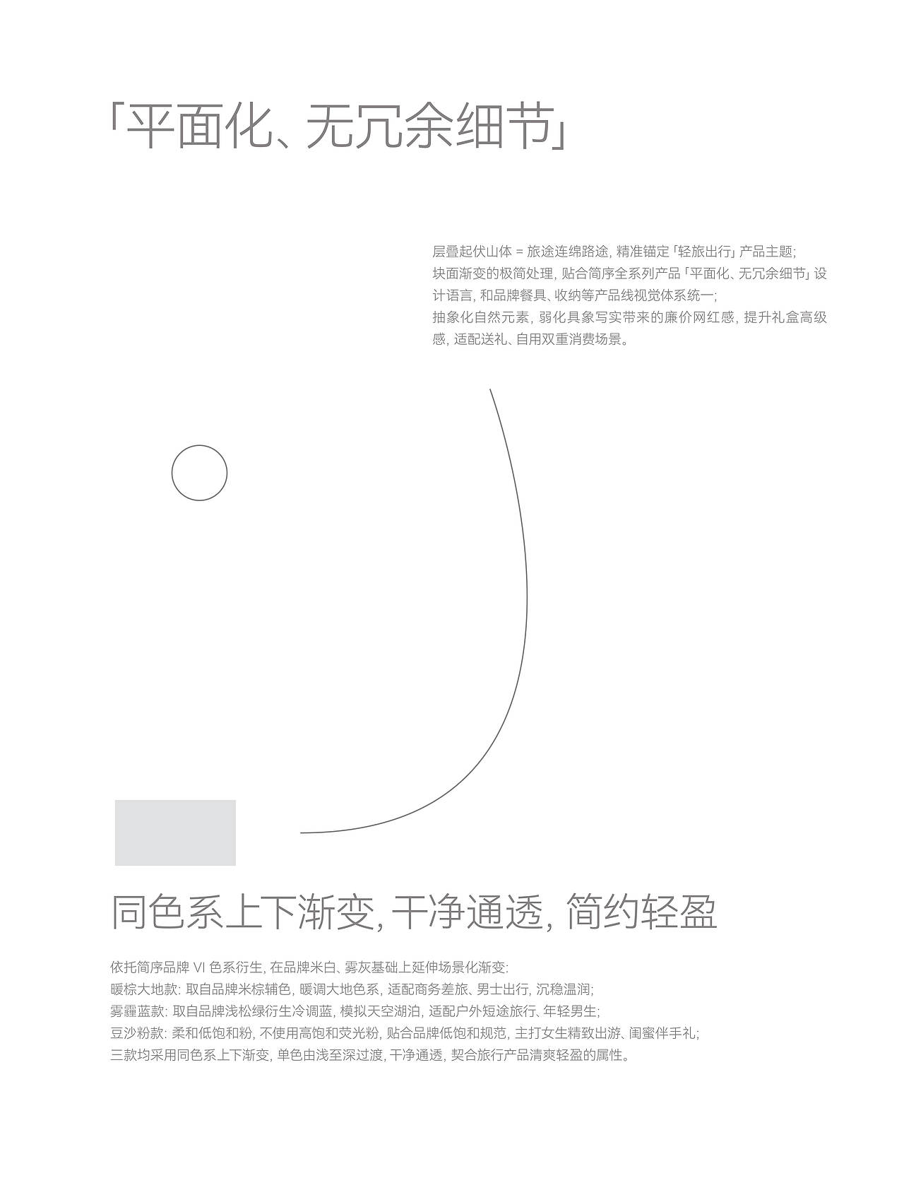
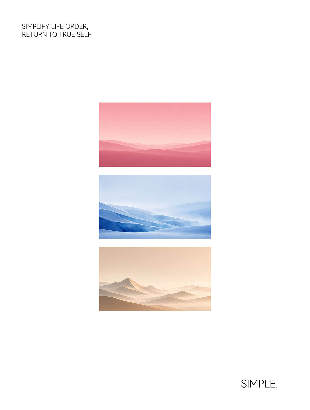
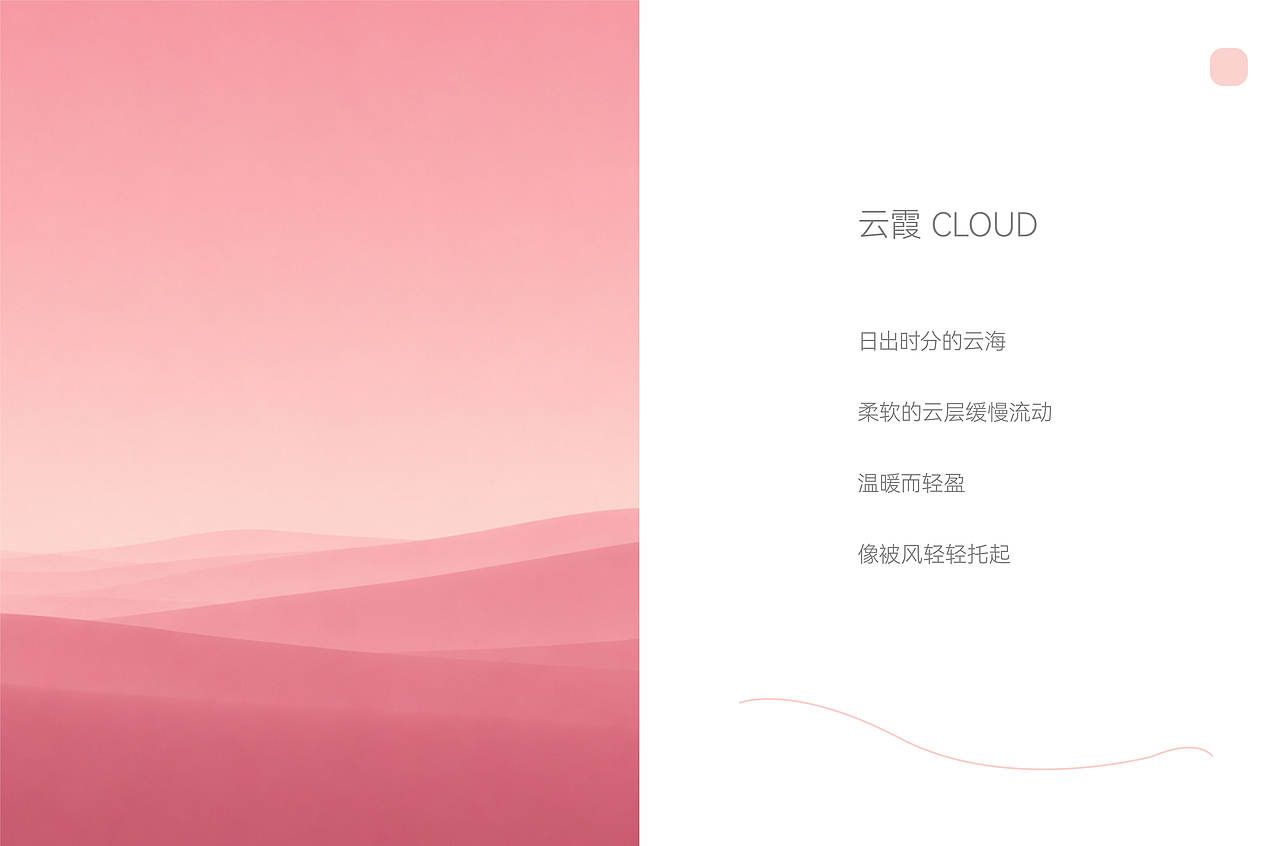
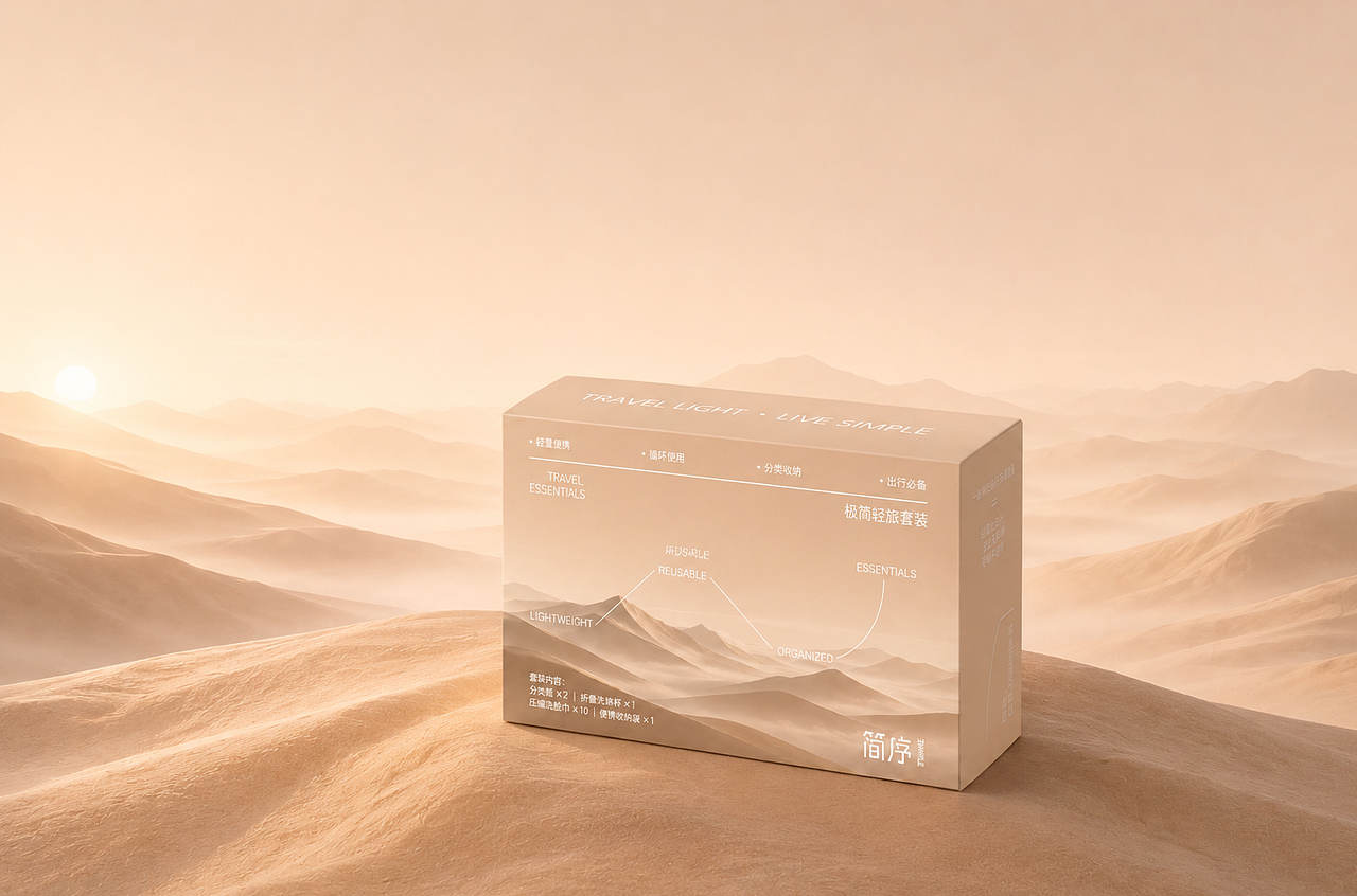
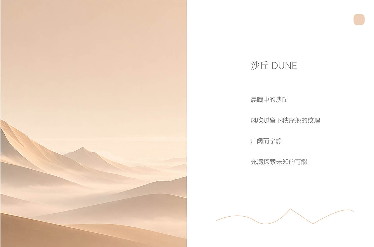
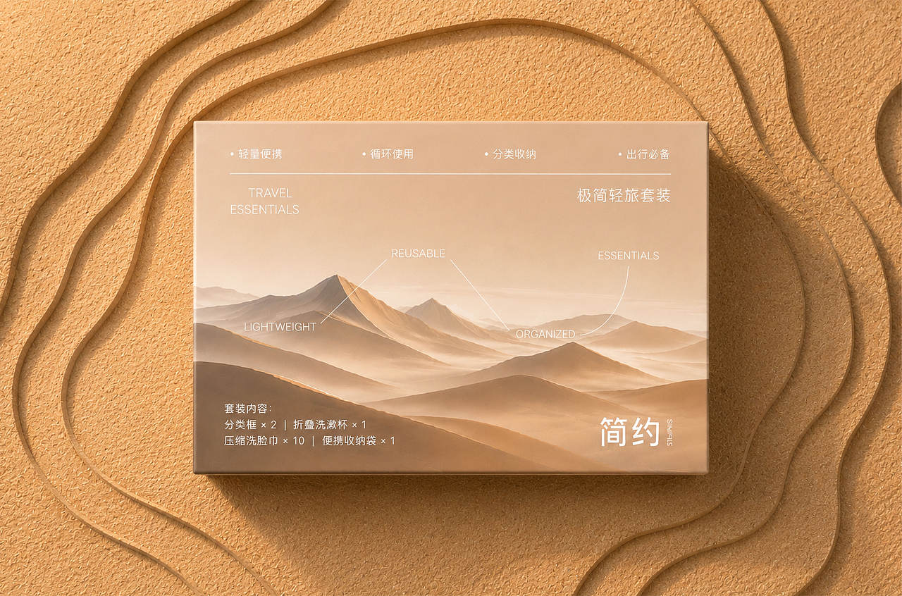
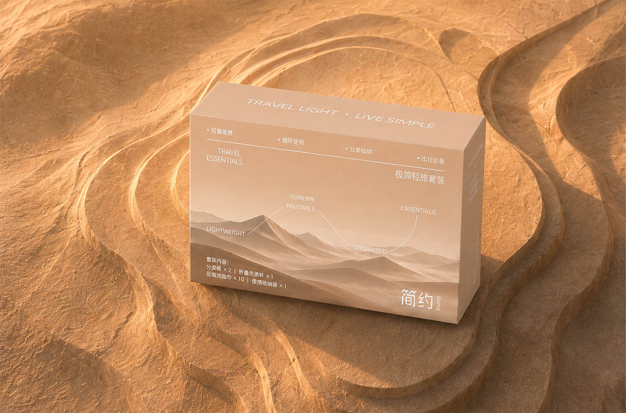
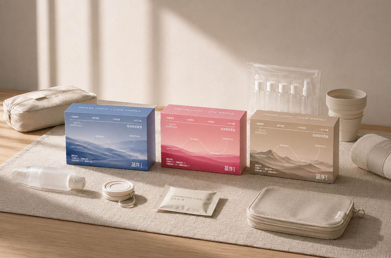
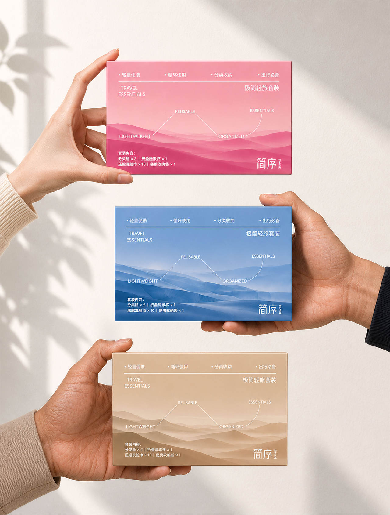
色彩系统从晨曦粉、天空蓝与沙丘棕三种自然意象展开:粉色表达日出与云海的温柔;蓝色对应海面、冰川与远方;棕色来自沙漠、岩层和大地。三组系列既保持统一识别,也形成不同目的地的情绪区分。
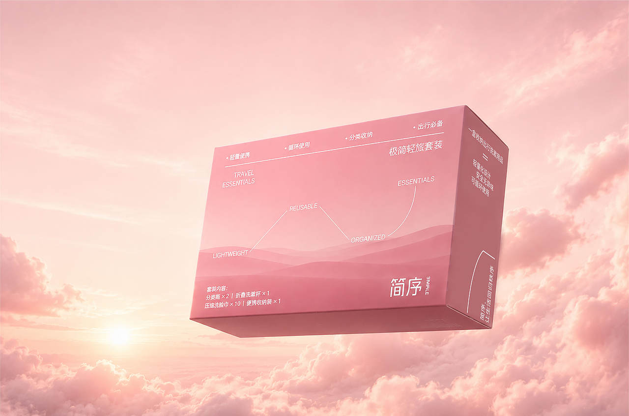
包装结构兼顾伴手礼的携带、陈列与赠予体验。大面积色块和渐变强化远距离识别,细节信息则以秩序化网格呈现。
"Simple" is a hotel souvenir packaging design centered around travel emotions. The project draws inspiration from the constantly changing clouds, sea surfaces, and landscapes during a journey, aiming to transform a brief stay into a memory that can be taken away and cherished.
The design is centered around the concept of "orderly scenery, minimalistic experience", utilizing restrained layouts, white space, and light colors to establish a brand temperament that is both serene and breathable. The logo and text system emphasize clarity, simplicity, and modernity, allowing the visuals to adapt to different hotel spaces and diverse travel scenarios.
The color system is inspired by three natural elements: Dawn Pink, Sky Blue, and Dune Brown. Pink embodies the gentleness of sunrise and the sea of clouds; blue corresponds to the sea, glaciers, and the distant horizon; and brown derives from deserts, rock formations, and the earth. These three series not only maintain a unified identity but also differentiate the moods of different destinations.
The packaging structure takes into account the carrying, display, and gift-giving experience of the souvenir. Large color blocks and gradients enhance recognition from a distance, while detailed information is presented in an orderly grid.








2
举报
声明
1
分享
相关推荐








评论你的想法~
表情
喜欢TA的作品吗?喜欢就快来夸夸TA吧!
推荐素材

你可能喜欢










相关收藏夹


登录注册
2登录即可同步推荐记录哦
1登录即可加入我的收藏
评论登录即可评论想法
分享分享