罗斯丁俄式西餐品牌视觉

上海/产品设计师/172天前/245浏览
版权
罗斯丁俄式西餐品牌视觉
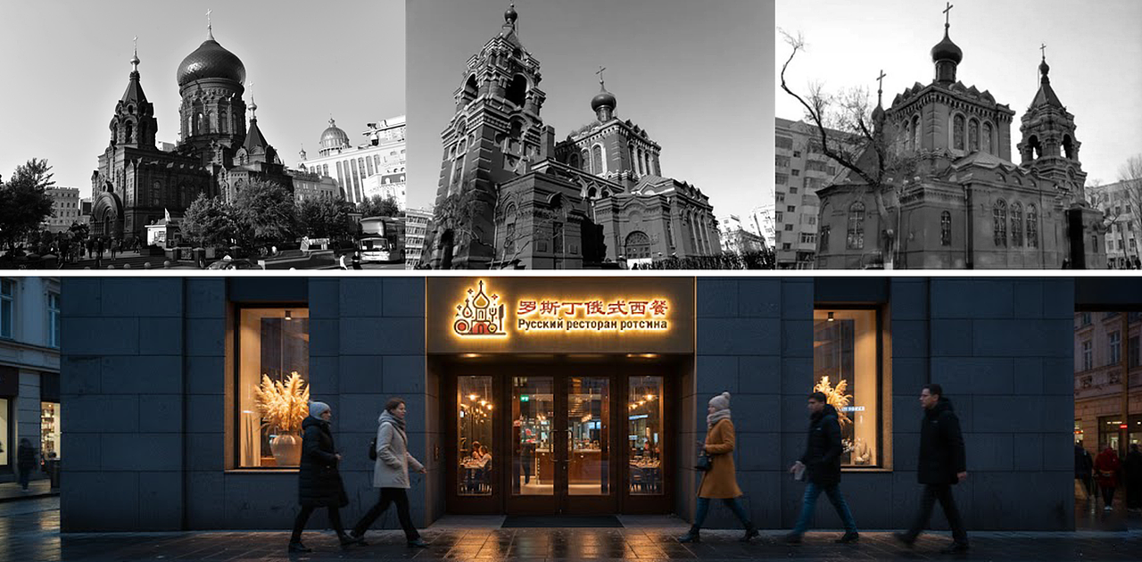
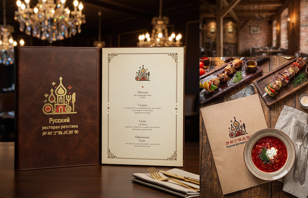
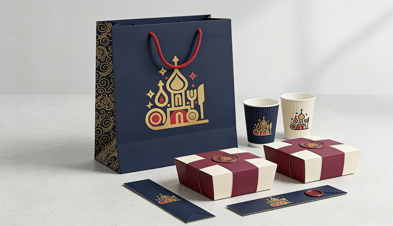
在哈尔滨这座充满异域风情的城市,我们为「罗斯丁俄式西餐」打造了兼具在地文化与品牌个性的视觉符号。设计以哈尔滨标志性的俄式洋葱头穹顶为核心元素,融入刀叉等餐饮符号,用红、金、黑的复古配色还原俄式建筑的厚重质感。同时,线条上采用现代简约的扁平化处理,让传统符号更具年轻感与传播性。整体视觉既传递出俄式西餐的经典底蕴,又贴合当下消费者的审美偏好,为品牌构建起 “传统新生” 的视觉记忆点。
Nestled in Harbin, a city brimming with exotic allure, we crafted a distinctive visual identity for Rostin Russian Cuisine—one that weaves local cultural essence with unique brand character seamlessly.
Taking Harbin’s iconic Russian onion dome as the core visual motif, the design incorporates dining symbols such as forks and knives to anchor the brand’s culinary attribute. A retro color scheme of red, gold, and black recaptures the profound, time-honored texture of classic Russian architecture, while modern minimalist flat lines infuse these traditional elements with youthful vibrancy and high communicability.
Balancing the timeless heritage of Russian cuisine with contemporary aesthetic preferences, the overall visual system forges a striking brand signature rooted in "tradition reborn"—a memorable visual touchpoint that resonates deeply with modern audiences.





设计出品 · Credits
设计机构 / Design Studio
上海五石工业设计有限公司 / 哈尔滨李铁彬工业设计有限公司
Shanghai Wushi Industrial Design Co., Ltd. / Harbin Li Tiebin Industrial Design Co., Ltd.
项目执行 / Project TeamArt Direction: Li Tiebin
1
举报
声明
收藏
分享
相关推荐









评论你的想法~
表情
喜欢TA的作品吗?喜欢就快来夸夸TA吧!
推荐素材











你可能喜欢






![Amazon亚马逊 I 主图A+ [合集]](https://img.zcool.cn/community/6a38dcce3687ayo427oj4f8979.png?k=80d296bac7d8085da7b7ab987dc355d3&t=6a68d200&x-oss-process=image/resize,m_fill,w_520,h_390,limit_1/auto-orient,1/sharpen,100/quality,q_80)


相关收藏夹












登录注册
1登录即可同步推荐记录哦
收藏登录即可加入我的收藏
评论登录即可评论想法
分享分享