Polesie - сorporate identity and brandbook


戈梅利/平面设计师/133天前/812浏览
版权
Polesie - сorporate identity and brandbook

Polesie is a company that specializes in the sale of spare parts for Belarusian agricultural machinery. The spare parts are sold outside of Belarus. The main objective was to convey friendliness in a rather serious industry. For the company, every client is treated like a best friend.
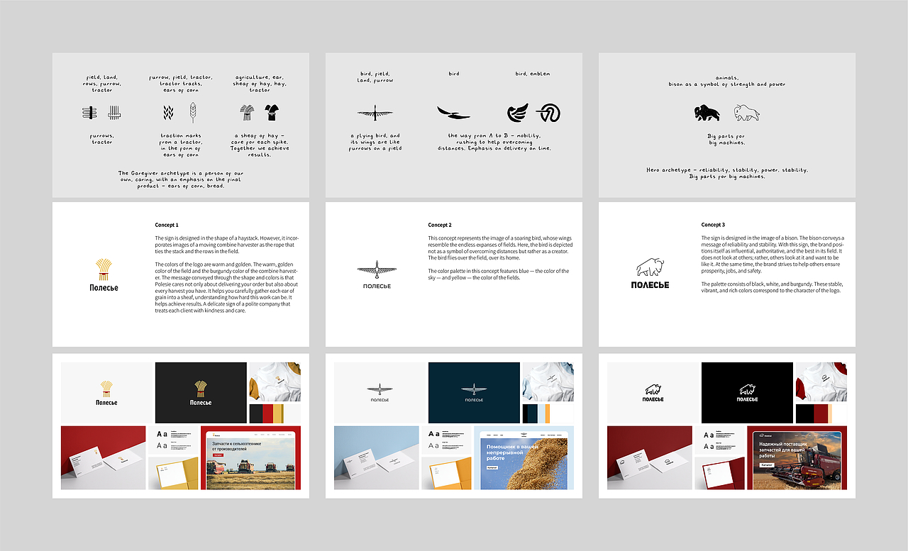
The logo is designed in the shape of a haystack, incorporating images of a moving combine harvester as the rope that ties the stack and the rows in the field. The colors of the logo are warm and golden, representing the warm golden color of the field and the burgundy color of the combine. The message conveyed through the form and colors is that Polesie cares not only about delivering your order but also about each of your harvests. It helps you carefully gather every ear of grain into a sheaf, understanding how hard this work can be. It assists in achieving results. The delicate logo reflects a polite company that treats every client with kindness and care. Friendliness is also expressed in the smoothness and curves of the lines in the icons and illustrations.
In this presentation I will talk about all stages of logo and corporate identity development from sketches to brandbook.


Printing and Pattern


Icons, Illustrations, Favicon


Presentation


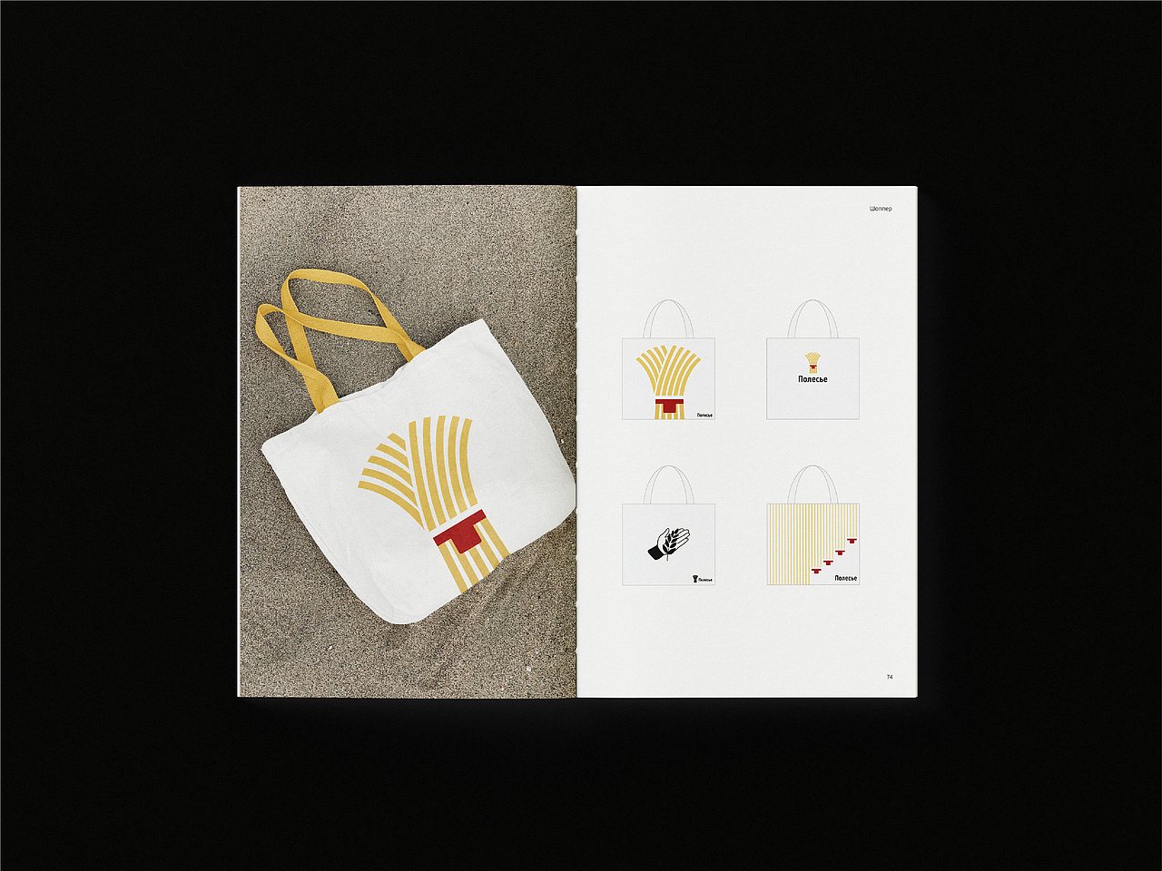
Souvenir Products


Advertising Products


12
举报
声明
13
分享
相关推荐


评论你的想法~
表情
喜欢TA的作品吗?喜欢就快来夸夸TA吧!
你可能喜欢


相关收藏夹


登录注册
12登录即可同步推荐记录哦
13登录即可加入我的收藏
评论登录即可评论想法
分享分享